
4 Visualization
Geography is regularly identified as the discipline that makes maps. While geography is, of course, much more than this, geographers do create maps to show how processes play out across space at various scales. Why maps? It’s because maps are very effective at helping us see what’s happening within some region. When spatial patterns are important – and they very often are – then looking at maps can be much more efficient and effective than looking at paragraphs of text or tables of data.
For example, suppose we want to learn the presidential election results by county in a given year, The animated map below shows the information. By displaying the information geographically, the map helps us learn what we want to know. In particular, the map makes it easier to identify the patterns in the data across space and over time. Throughout Geog 30N, we will view and even create maps to visualize spatial information.
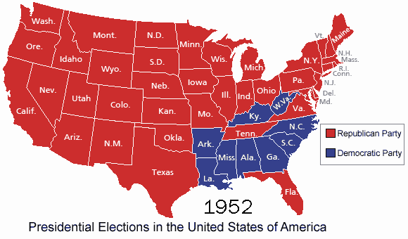
See the raw data(link is external).
Cartographic Projection
The world is round, but maps are flat. A projection is a scheme for converting points on the round world to points on a flat map. There are many different types of projections, each with advantages and disadvantages. Some projections make it easy to see what is north, south, east, and west. Some projections make it easy to see how large a given land mass is. Some projections make it easy to navigate ships on the ocean. (Cartography has a long history of association with navigation.) Finally, some projections can even be used to advance political agendas, as this excerpt from the TV show The West Wing(link is external) shows (four minute video):
Which of the projections shown in the video do you think should be used? Why? Note that the video claims that a certain projection is wrong. Technically, all projections are in some ways wrong, in the sense that they do not accurately portray the world. The only way to achieve accuracy is to use a spherical object – a globe. A projection should be chosen to fit the purpose of the map, so the best projection to use will depend on the circumstances of the map.
Some maps don’t even try to have an accurate projection. They distort distances in ways that are geographically inaccurate but useful for other purposes. A classic example of this is the map of the London subway system, which is known as the London Underground or the Tube and operated by a government agency called Transport for London. Here is a portion of the standard system map:
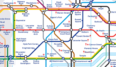
The full map can be found on the Transport for London website(link is external). This map is beautifully designed and user-friendly. The mix of colors and layout of the different subway lines on the map make it easy to interpret. However, the map is very geographically inaccurate, meaning the relative distances between the different stops are not shown. In fact, the center of the map (which is downtown London) shows the stops at some distance from each other when in reality they are very close to each other. Alternatively, the stops further out from the city (in the corners of the maps) are some distance away from each other. This makes it impossible to know how long a particular trip will be from the map. So while the map aids in the comprehension of the different lines and stops, it sacrifices accuracy in terms of distances. Maps, therefore, are imperfect documents that can distort or omit information, and, in some cases, bias our understandings of spatial patterns and processes.
Here is a geographically accurate Tube map, produced independently of Transport for London:
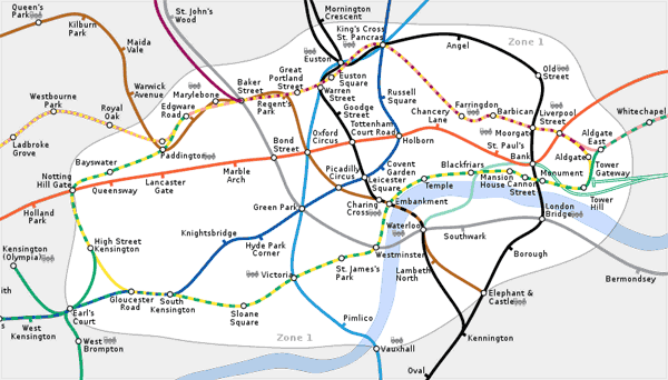
If you were riding the Tube, which map would you rather have?
