
Consider This: Hans Rosling, Rockstar Demographer
Hans Rosling is a Swedish demographer and teacher who has gained global fame through lively videos about global demographics, in particular at the TED conferences. If you’re not already familiar, TED is a wonderful resource of entertaining and informative talks from a great variety of people. Here’s a TED talk from Rosling (20:35): “The Best Stats You’ve Ever Seen.”
Rosling makes several important points in this video:
- Many of us have misperceptions about global demographic data such as child mortality.
- The variation within regions (such as sub-Saharan Africa) and within countries can be larger than the variation between different regions or countries.
- The divide between the more-developed and less-developed countries no longer exists. Instead, there is a continuum of development around the world with no gap in the middle.
- Most countries move towards the same goals with longer lives and smaller families.
- Quality visualization is essential for understanding and communicating demographic data.
All of these points are important for Geography 30.
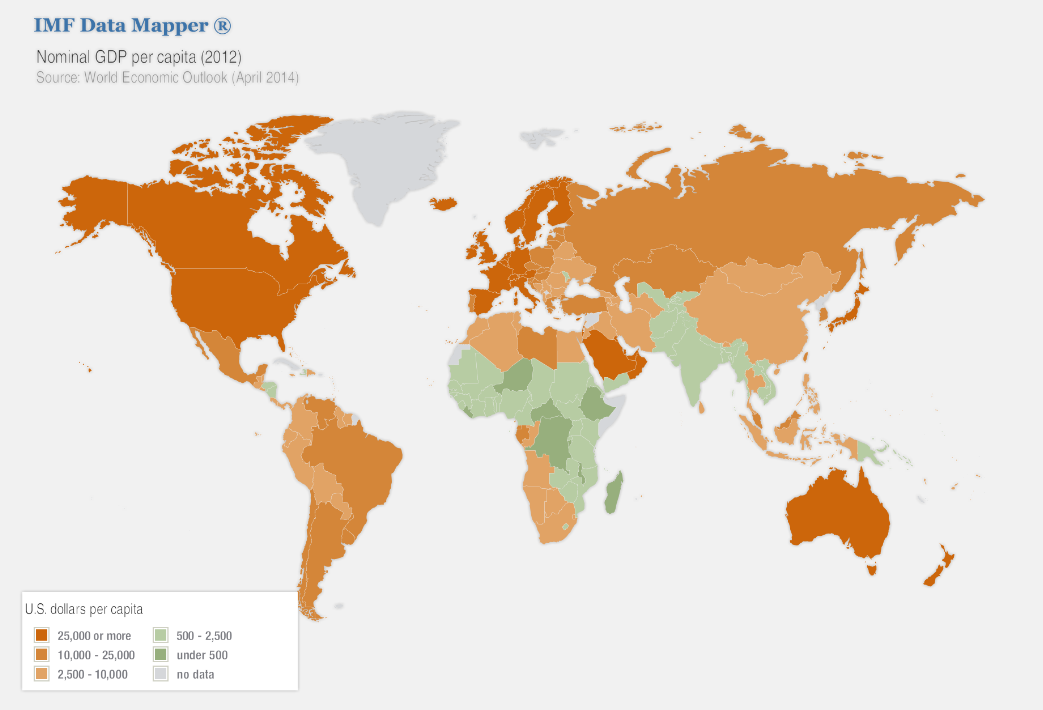
Now, let’s take a look at the map of GDP per capita, of course bearing in mind the limitations of the GDP statistic.
Click link to expand for a text description of Figure 5.4
A few points are worth making about this map. First, the map shows GDP per capita, i.e., per person. Per capita statistics are usually more helpful for showing what’s going on in a place. Recall the map of world GDP from the previous page. That map would show, for example, that China has a much larger GDP than, say, Switzerland. But that is because China has a much larger population than Switzerland, not because China has reached a more advanced level of development. Most people would consider Switzerland to be more developed than China.
Second, the wealthier areas are North America, Western Europe, Australia, New Zealand, Japan, South Korea, and a few countries in the Middle East. These are the countries that are commonly considered to be “developed.” The rest of the countries are commonly considered to be “developing.” But there is no clear divide between “developed” and “developing” visible on this map. Instead, there are countries at all points along the continuum from “developed” to “developing.”
Third, there are a few places on the map that are colored gray. These are places where no data is available. Usually, there is an interesting reason for data as basic as GDP to be unavailable. The map here uses data from the International Monetary Fund (IMF), so the gray represents places that the IMF has no data for. Here are probable reasons for why some data is unavailable for this map: Greenland is not an independent country but is a territory of Denmark. French Guiana (in northern South America) is also not an independent country but is a territory of France. Western Sahara is a disputed territory fighting for independence from Morocco. Somalia has dysfunctional government and probably didn’t report data to the IMF. Finally, Cuba and North Korea are not part of the IMF. GDP statistics are available for most of these regions from sources other than the IMF.
Note that Cuba left the IMF when Fidel Castro came to power, claiming that the IMF was too slanted in favor of US capitalism. It is an interesting case worth considering further.
Consider This: How Developed is Cuba?
Cuba is an interesting case of development. To illustrate, Cuba’s 2015 GDP per capita is $7,602, far behind the United States’ 2015 GDP per capita of $56,207. Since Cuba isn’t in the IMF, the data here comes from the World Bank, which is an excellent resource for demographic and other data. Meanwhile, Cuba’s life expectancy as of 2015 is 79.55 years, which is significantly higher than the world average of 71.66 years and slightly higher than the United States’ life expectancy of 78.74. Cuba’s high life expectancy can be seen on the life expectancy map on the previous page.
Why is it that Cuba performs so much better in a health statistic like life expectancy than with a monetary statistic like GDP?
The answer is the unusual nature of Cuba’s economy. Cuba also has a socialist economy with a high degree of central planning. It is also relatively isolated from the globalized economy, especially now that the Soviet Union no longer exists. Because of this, its government has emphasized healthcare, education, and other social development practices instead of activities that would generate a large GDP (like automobiles as most of the vehicles present in the country are from the days of US trade in the time before Castro (aka 1950s)). While Cuba lacks the expensive medical facilities found in the United States and other wealthy countries, it has universal healthcare and the most doctors per person of any country in the world.
Recently, there was a fuss in the media to report that diplomatic relations had finally been established between Cuba and United States as of July 20, 2015. This means that, up until July 2015, U.S. citizens had not been allowed to even travel to Cuba. The relations between the two countries had been poor ever since the Castro regime tied Cuba to the Soviet Union. Relations remained poor for a long time even after the dissolution of the Soviet Union, in part because of disagreements about economic issues and in part because of US concern about Cuba’s limited political freedoms. Regardless of what your view of Cuba is, it is important to recognize and learn from its unique approach to development.
