
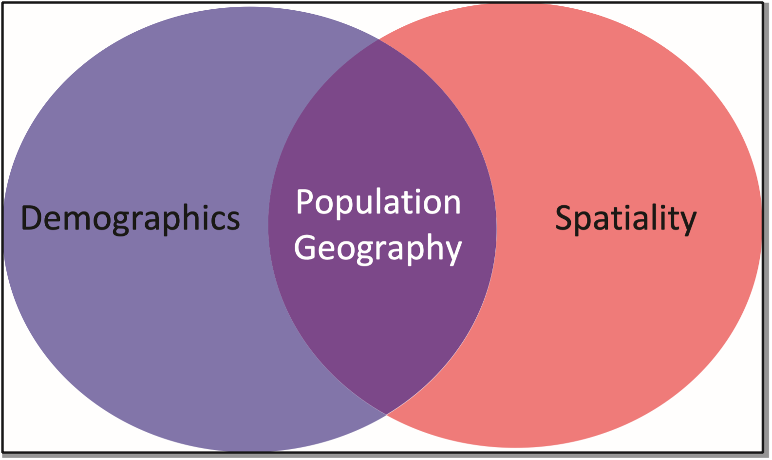
21 Population and Health
David Dorrell
Learning Objectives
By the end of this section, the student will be able to:
- Understand: the spatial organization of the human population
- Explain: the dynamics of population as they are reflected in fertility, morbidity, and mortality
- Describe: the relationship between population and other spatial phenomena such as living standards, agriculture, and health
- Connect: development, migration and population as a fluid self-balancing system
CHAPTER OUTLINE
20.1 Introduction
20.2 Thinking About Population
20.3 Population and Development
20.4 Population is Dynamic
20.5 The Demographic Transition
20.6 Measuring the Impact of Population
20.7 Future Population
20.8 Geography of Health
20.9 Summary
20.10 Key Terms Defined
20.11 Works Consulted and Further Reading
20.12 Endnotes
20.1 INTRODUCTION
“You are one in a million, there are 1700 people in China exactly like you.”
In this chapter we will look at the human population. We’ll look at the size of it, and whether it may be growing or shrinking. We’ll explore the role of scale. We’ll look at differences between countries. And we’ll do all of this through the lens of spatiality.
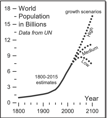
The human population is at 7.5 billion, an all-time high. In the space of a few centuries it has gone from less than one billion to more than seven, with projections of several billions more in the relatively near future (Figure 20.2).
At the global level we can talk about population without consideration of migration, since the earth is a closed system in this regard, but when we discuss countries, it is useful to separate the natural increase rate—the rate of population change only accounting for births and deaths—from the effect of migration. A full discussion of migration occurs in Chapter Three. The following map shows a choropleth map of countries of the world categorized by population (Figure 20.3). Notice Bangladesh, the small country nearly surrounded by India. Now look at Russia.
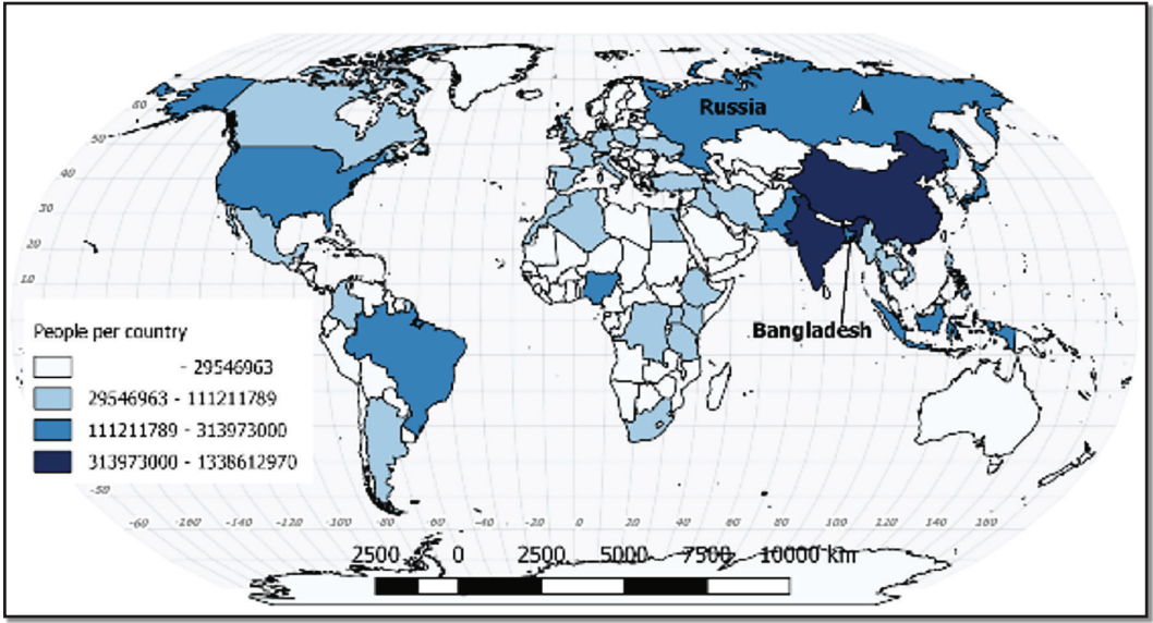
Hold that in your mind while you look at Table 20.4. Although they are vastly different in size, the population of Bangladesh is almost 20 million larger than Russia. Not only that, but the population of Russia is shrinking and the population of Bangladesh is growing!
| Rank | Country | Population as of July 2016 |
| 1 | China | 1,382,323,332 |
| 2 | India | 1,326,801,576 |
| 3 | Unites States | 324,118,787 |
| 4 | Indonesia | 260,581,100 |
| 5 | Brazil | 209,567,920 |
| 6 | Pakistan | 192,826,502 |
| 7 | Nigeria | 186,987,563 |
| 8 | Bangladesh | 162,910,864 |
| 9 | Russia | 143,439,832 |
| 10 | Mexico | 128,632,004 |
As image 20.3 showed there are some spatial patterns that present themselves, but there is a great deal of noise in the signal. Many of the countries with large populations are physically large themselves. Places like China and India have had comparably large populations for a long time. Very often, explorations of population growth are short circuited by discussions of religion or levels of development. Although religion and development are not irrelevant, they are not as important as is often assumed. Individual characteristics have come to mean less than they have in the past.
The most obvious characteristic that often leads to higher population growth is poverty. There are many reasons for this, two of which were mentioned previously, but there are others. The effect of infant mortality drives some people to have a large number of children in the forlorn hope that some of them survive to adulthood. Another is the effect of migration, which can boost incomes by sending some population to other countries to work, but depopulate the places that are sending migrants.
In almost all countries, the rate of population growth has slowed. Two countries, China and India, account for 36 percent of the world’s population. Any change in these two places will have a large impact on the values for the entire planet. According to the World Bank for 2013, the population of China is growing .5 percent per year, India is growing 1.2 percent per year, the United States is growing by .7 percent per year, and Indonesia is growing by 1.2 percent per year. The rates for all these countries have been falling for decades, even Indonesia and India.
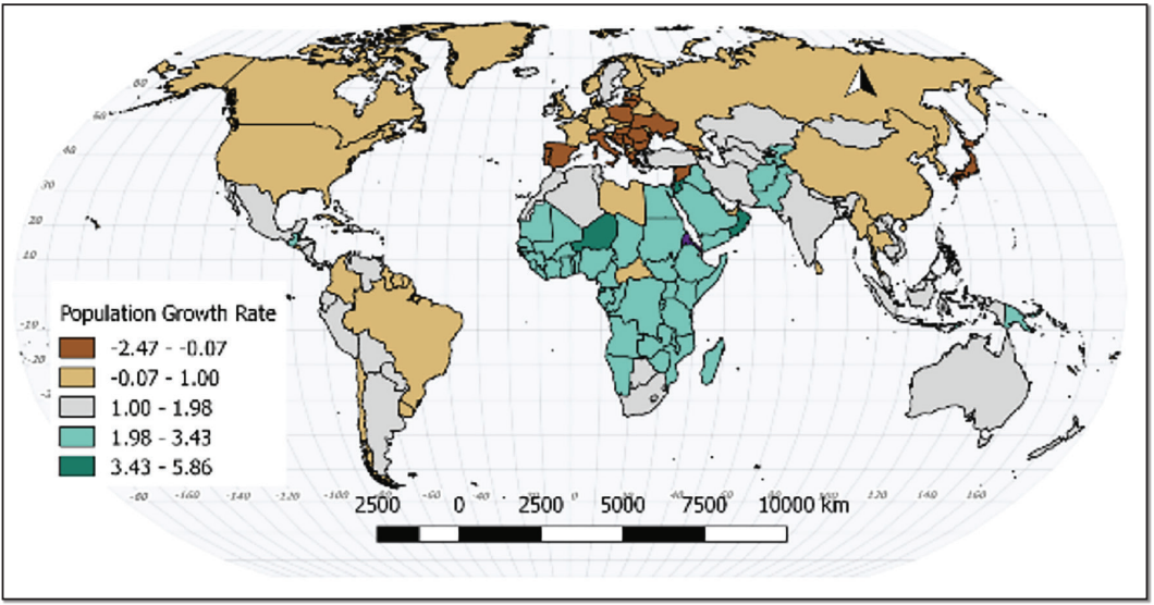
The populations of the countries of Japan, Russia, Germany, Spain, and Ukraine are all shrinking whereas the populations of Nigeria, the Democratic Republic of Congo, Iraq, and Kenya are expanding rapidly (Figure 20.5). In developed countries, population decline has implications for social programs such as retirement, which is funded by a shrinking pool of workers. In very advanced societies, a worker shortage is driving rapid development of robotics. In poorer places rapid population growth can trigger large-scale migration and social disruption.
Why is it so difficult to find one characteristic that explains the population dynamics of a particular country? Because places matter. Each place is a unique combination of factors, and their interactions.
20.2 THINKING ABOUT POPULATION
20.20.1 The Greeks and Ecumene
No discussion of population is complete without a brief history of the philosophical understanding of population. This discussion starts as it often does, with the ancient Greeks. The Greeks considered that they lived in the best place on Earth. In fact, they believed in the exact center of the habitable part of the Earth. They called the habitable part of the Earth ecumene. To the Greeks, places north of them were too cold, and places to the south were too hot. Placing your own homeland in the center of goodness is common; many groups have done this. The Greeks decided that the environment explained the distribution of people. To an extent, their thinking persists, but only at the most extreme definitions. Many places that the Greeks would have found too cold (Moscow, Stockholm) too hot (Kuwait City, Las Vegas) too wet (Manaus, Singapore) or too dry (Timbuktu, Lima) have very large populations.
20.20.2 Modern Ideas About Population
Thomas Malthus (1766-1834) “Population, when unchecked, increases in a geometrical ratio.” 4
Ester Boserup (1910-1999) “The power of ingenuity would always outmatch that of demand.” 5
Modern discussions of population begin with food. From the time of Thomas Malthus (quoted above), modern humans have acknowledged the rapidly expanding human population and its relationship with the food supply. Malthus himself was a cleric in England who spent much of his time studying political economy. His views were a product not only of his time, but also of his place. In Malthus’ case his time and place were a time of social, political, and economic change.
Karl Marx (1818–1883) took issue with Malthus’ ideas. Marx wrote that population growth alone was not responsible for a population’s inability to feed itself, but that imbalanced social, political, and economic structures created artificial shortages. He also believed that growing populations reinforced the power of capitalists, since large pools of underemployed laborers could more easily be exploited.
The post-World War II period saw a flurry of books warning of the dangers of population growth with books like Fairfield Osborn’s Our Plundered Planet and William Vogt’s Road to Survival. Perhaps most explicit was Paul and Anne Ehrlich’s The Population Bomb.
These books are warnings of the dangers of unchecked population growth. Malthus wrote that populations tend to grow faster than the expansion of food production and that populations will grow until they outstrip their food supplies. This is to say that starvation, war, and disease were all predictions of Malthus and were revived in these Neo-Malthusian publications. Some part of the current conversation of environmentalism regards limiting the growth of the human population, echoing Malthus.
A common theme of these books is that they all attempt to predict the future. One of the advantages we have living centuries or decades after these books is the opportunity to see if these predictions were accurate or not. Ehrlich’s book predicted that by the 1970s, starvation would be widespread because of food shortages and a collapse in food production. That did not happen. In fact, the global disasters predicted in all these books have yet to arrive decades later. What saved us?
Perhaps nothing has saved us. We have just managed to push the reckoning a bit further down the road.
If we have been saved, then the assumptions inherent in the predictions were wrong. What were they?
1. Humans would not voluntarily limit their reproduction.
2. Farming technology would suddenly stop advancing.
3. Food distribution systems would not improve.
4. Land would become unusable from overuse.
All of these assumptions have proven to be wrong, at least so far. Only the most negative interpretation of any particular factor in this equation could be accepted.
One the other hand, Ester Boserup, an agricultural economist in the twentieth century, drew nearly the opposite conclusion from her study of human population. Her reason for doing so were manifold. First, she was born one and one -half centuries later, which gave her considerably more data to interpret. Second, she didn’t grow to adulthood in the center of a burgeoning empire. She was a functionary in the early days of the United Nations. Third, she was a trained as an economist, and finally, she was a woman. Each one of these factors was important.
20.2.3 Let’s Investigate Each One of These Assumptions
In preindustrial societies, children are a workforce and a retirement plan. Families can try to use large numbers of children to improve their economic prospects. Children are literally an economic asset. Birth rates fall when societies industrialize. They fall dramatically when women enter the paid workforce. Children in industrialized societies are generally not working and are not economic assets. The focus in such societies tends to be preparing children through education for a technologically-skilled livelihood. Developed societies tend to care for their elderly population, decreasing the need for a large family. Developed societies also have lower rates of infant mortality, meaning that more children survive to adulthood.
The increasing social power of women factors into this. Women who control their own lives rarely choose to have large numbers of children. Related to this, the invention and distribution of birth control technologies has reduced human numbers in places where it is available.
Farming technology has increased tremendously. More food is now produced on less land than was farmed a century ago. Some of these increases are due to manipulations of the food itself—more productive seeds and pesticides, but some part of this is due to improvements in food processing and distribution. Just think of the advantages that refrigeration, freezing, canning and dehydrating have given us. Add to that the ability to move food tremendous distances at relatively low cost. Somehow, during the time that all these technologies were becoming available, Neo-Malthusians were discounting them.
Some marginal land has become unusable, either through desertification or erosion, but this land was not particularly productive anyway, hence the term marginal. The loss of this land has been more than compensated by improved production.
At this point, it looks like a win for Boserup, but maybe it isn’t. Up to this point we have been mixing our discussions of scale. Malthus was largely writing about the British Isles, and Boserup was really writing about the developed countries of the world. The local realities can be much more complex.
At the global scale there is enough food, and that has been true for decades. In fact, many developed societies produce more food than they can either consume or sell. The local situation is completely different. There are developed countries that have been unable to grow food to feed themselves for over a century. The United Kingdom, Malthus’ home, is one of them. However, no one ever calls the U.K. overpopulated. Why not? Because they can buy food on the world market.
Local-scale famines happen because poorer places cannot produce enough food for themselves and then cannot or will not buy food from other places. Places that are politically marginalized within a country can also experience famines when central governments choose not to mobilize resources toward the disfavored. Politically unstable places may not even have the necessary infrastructure to deliver free food from other parts of the world. This is assuming that food aid is even a good idea (a concept revisited in the agriculture chapter). These sorts of problems persist to this day and they have an impact of population, although often in unpredictable ways, such as triggering large-scale migration or armed conflict.
To recap, at the global level, population has not been limited by food production. However, people do not live at the “global level.” They live locally with whatever circumstances they may have. In many places the realities of food insecurity are paramount.
Although discussions of population tend to start with food, they cannot end with it. People have more needs than their immediate nutrition. They need clothing and shelter as well. They also have desires for a high standard of living- heating, electricity, automobiles and technology. All of these needs and desires require energy and materials. The pressure put on the planet over the last two centuries has less to do with the burgeoning population and more to do with burgeoning expectations of quality of life.
20.2.4 Scale and the Ecological Fallacy
Numbers can be a little bit misleading. You may read that the “average woman” in the United Sates has 1.86 births and wonder, “What does this tell me about a particular woman?” And the answer is . . . it tells you nothing. Remember that number is an aggregate of the data for the entire country, which means it only works at that scale; it only tells you about the country as a whole. The Ecological
Fallacy is the idea that statistics generated at one level of aggregation can be applied at other levels of aggregation.
Similarly, one of the biggest problems with maps is that they can make us think that a place is the same (homogenous) within a border. We see a country like the United States, and it has one color for the entire area on the map and we tell ourselves that the U.S. is just one place. And it is. But it’s made of many smaller places. It’s fifty states, and those states combined have 3144 counties (and county-like things). And each one of those things is a level of aggregation. It looks a bit like this (Figure 20.6).
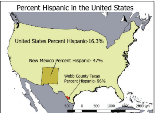
Webb County only uses the data from one county. New Mexico uses the data for its 33 counties, and the U.S. uses the data for all its counties. Each level of aggregation has its calculated value. They are all different. And they still tell you nothing about an individual person.
20.3 POPULATION AND DEVELOPMENT
We can return to the diverging ideas of Malthus and Boserup. Does population growth spur innovation or starvation? Is population growth good or bad?
Population growth has spurred innovation, but interestingly enough, not usually in the places that are experiencing that growth right now. If population growth is dramatically higher than economic growth, the result will not be new technologies and paradigm shifts; it will be emigration or civil unrest.
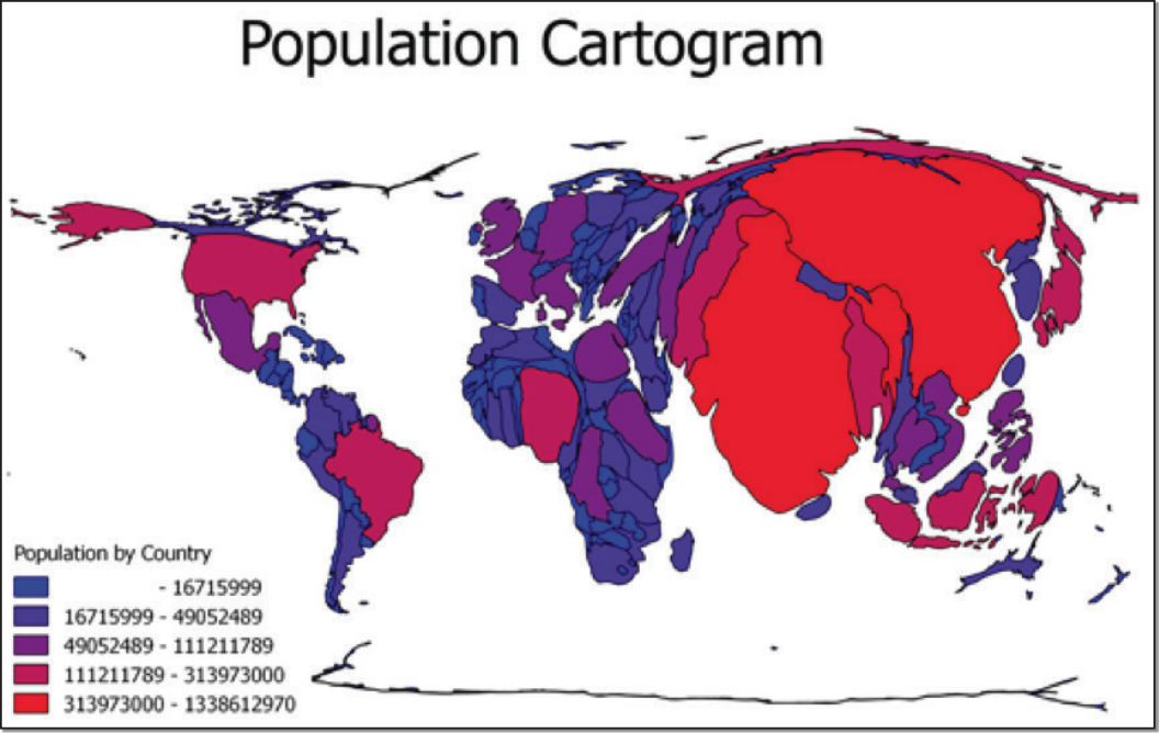
A country like Russia with a large land mass and a relatively small population may be underpopulated compared to its neighbor, China (Figure 20.7). Having large tracts of uninhabited land has historically invited the attention of outsiders. Underpopulation is not normally the problem that most people would associate with population. When we think of population problems, we generally think of overpopulation. What is overpopulation? Like so many other questions we have asked so far, the answer depends. Overpopulation means an inability to support a population with the resources available.
This population cartogram takes the borders of each country and adjusts the size of the country by the size of the population. What happens to China and India? What happens to Canada and Russia? What does this tell you?
20.4 POPULATION IS DYNAMIC
Although the world’s population is still growing, the overall growth has slowed and the growth has become very uneven. Some places are still growing very rapidly. Others are growing much more slowly and some are shrinking in terms of population. We can compare differences between places using a series of different rates. Rates are ratios that divide the occurrence of a phenomenon with the population hosting the phenomenon. For example, crude birth rate is calculated as the number of births per 1000 people in a particular place in a particular year. The crude death rate is similar. It is calculated as deaths per 1000 people in a particular place in a particular year. These numbers can be used to compare places, but they have great limitations.
For one thing, they are aggregated variables describing the entire country; they tell you nothing about individuals within the country. Just because the average woman in a country has 20.3 children tells you nothing about a particular woman. The ecological fallacy is the idea that aggregated data tell you anything about individuals. It does not because it cannot. Once the data are lumped together, they lose their individual characteristics.
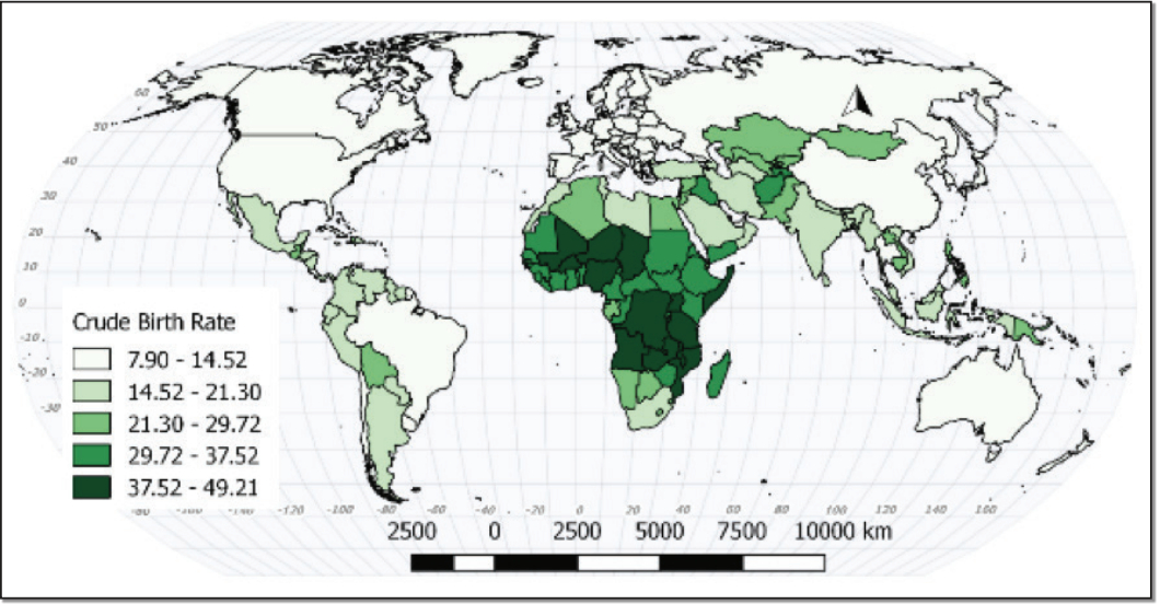
The rates do not necessarily relate to one another, either. The crude birth rate doesn’t tell you anything about the average number of children born per woman, at what stage in their lives women tend to have children, etc. The crude death rates don’t separate deaths of elderly people from deaths of infants. High rates of death are often found in developed societies; in many ways it’s a sign of development, since developed countries tend to have older populations. A high rate of infant mortality (children under 1 year of age) is a near-universal sign of underdevelopment. The countries with the highest crude birth rates tend to be low income (Figure 20.8).
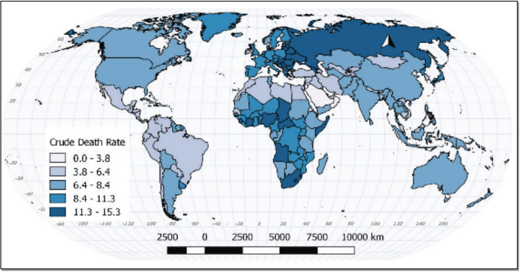
The crude death rate is more nuanced (Figure 20.9). Some countries on the map, for example, Chad, have a high crude death rate due to a high rate of infant and child mortality. Russia, on the other hand, has a rapidly aging population and a partially collapsed social security network.
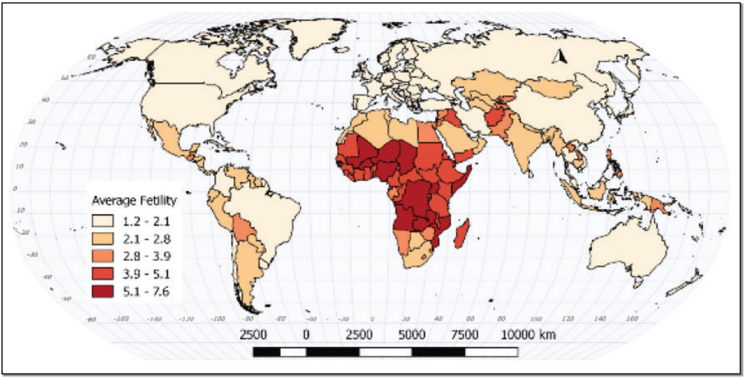
The replacement level of a population refers to the number of births that are necessary to offset deaths. This is often referred to in terms of average fertility of women. In modern societies, on average, women need to produce 20.1 children in a lifetime to keep a place demographically stable. This number is derived by counting a mother and her partner, and accounts for those who never reproduce.
Places with a fertility rate below 20.1 will shrink over time. Those places above that will grow, and those well above that will grow quickly (Figure 20.10). The preceding graphic demonstrates that in the same way that many places are growing very rapidly, many places are at or below replacement. The United States is below replacement. It is demographically buoyed by immigration.
What kinds of places are growing fastest? These are places that are poor or economically or politically unstable. This may seem counterintuitive. Why would people have children in places that are already so poor? Remember that individual families have children. Children can seem like a mechanism for surviving bad situations. What kinds of places are declining? This is more complicated, but in general the more educated and empowered the female population is, the lower the birth rate. This isn’t a perfect, linear relationship, but it’s useful as a start. Why is there so much variability? Because places matter. Uganda has a government advocating population growth, while Afghanistan and Somalia have little governance at all. Russia and Australia have similar fertility rates, and few other similarities.
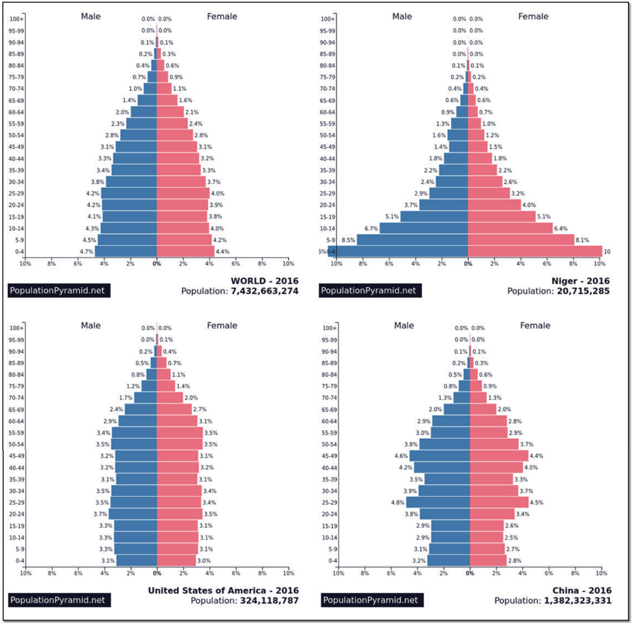
General measurements of population are useful, but often if is useful to know the age and gender structure of a population. This is shown using a population pyramid. A population pyramid breaks the population into groups sorted by age ranges, called cohorts, as well as by sex. The resulting shape tells you a great deal about the population dynamic of the country. If the shape is actually a pyramid, then the country has a high birth rate and a high death rate. Countries with stable populations look like a column. Some countries even have their greatest population in the older cohorts with comparably few young people. Figure 20.11 shows some examples of current populations. Some examples of estimated future populations are shown in Figure 20.120.
First, it is important that you understand that all these numbers are estimates. Current population numbers are good enough for general comparison. As you can see, the differences between places becomes more pronounced as we look toward the future. The world population increases by over two billion people, but what is interesting are the shifting dynamics between countries. China shrinks by more than 30 million, the US grows by 64 million, and Niger- a poor Saharan country- grows by 52 million, more than double its current size! One of the most useful measures of population is doubling time, which is how much time it would take at current levels of population growth for a population to double. According to Figure 20.2, most of human history saw very slow growth with doubling times measured in centuries. During the 19th and 20th centuries, doubling time at the global level fell to as short as 35 years.
This has numerous implications. At the global level, those extra billions will need food and water, houses and clothing. That is to say that they will require resources. They will also have desires that require even more materials and energy expenditure.
In places like Niger, this will be very difficult, if not impossible, to meet.
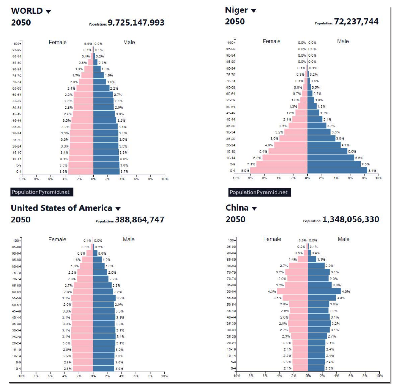
In places like China, a completely different problem presents itself. These populations are both shrinking and aging. Life expectancy, the average lifespan in a country, has been increasing for decades in developed and some developing countries. At the same time, birth rates have fallen for a variety of reasons. This means that as time passes, the elderly portion of the population has grown. Many countries will see their populations age until large percentages will be unable to work. Societies for the past several centuries have prepared themselves for population growth, and much of modern society is predicated on it. Population growth is what has paid for social security for the elderly. Few places have prepared themselves for fewer workers in the future (although robotics may address this problem). This change will not happen at once, but the effects will be tremendous. Another characteristic that must be acknowledged is population momentum. When much of your population is older than 45, it isn’t reasonable to expect that population will continue to grow quickly. Countries with young populations should expect that their populations will grow when the large pool of young people have children of their own.
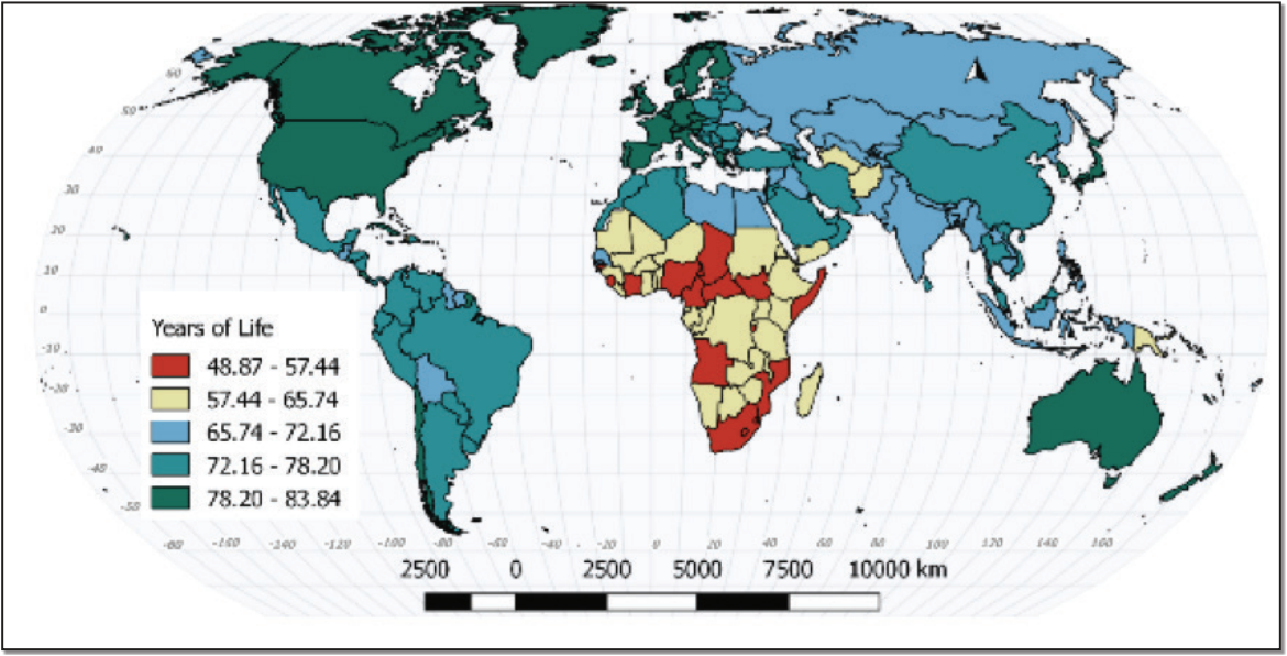
This map shows the tremendous differences in life expectancy from one country to another (Figure 20.13). In some places, people tend to live into their ninth decade. In others, they are unlikely to make it into their sixth.
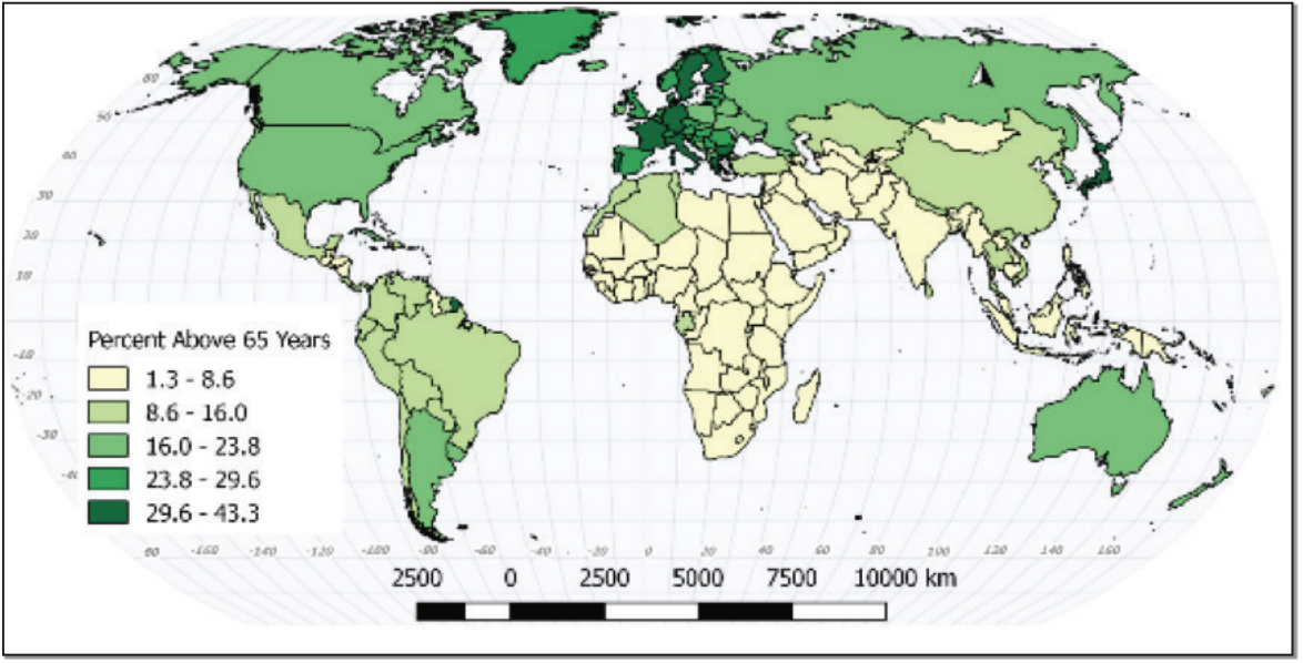
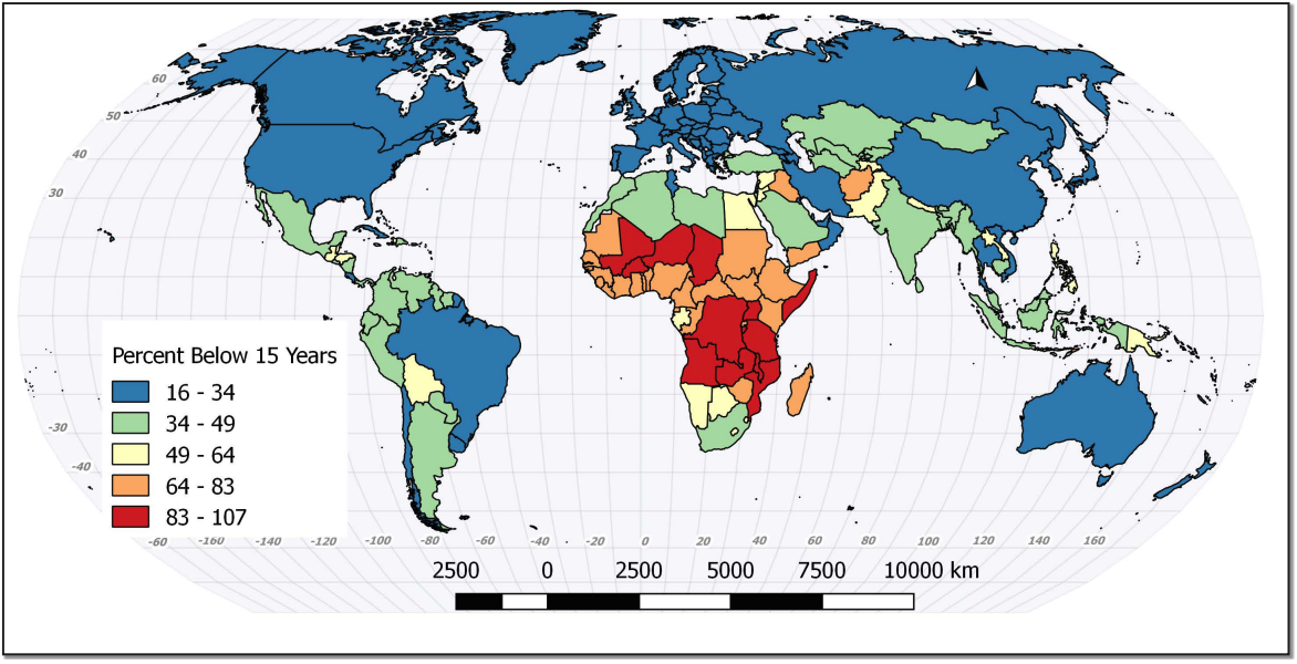
The dependency ratio is simply the number of people within a society who do not work compared to the number who do work. There are two main components of the dependency ratio- children under 15 years old and the elderly over 65 years old, although the degree to which either group is dependent is variable (Figures 20.14 and 20.15). Children need care and schooling, but generally produce little of economic value. Elderly populations can be too infirm to work and are the part of
the population with the highest medical costs. Where does the wealth come from to take care of these two groups? It comes from the people working and producing wealth. If the dependency ratio is high, then each worker can be responsible for a large number of dependents and less wealth will be left for the workers.
Although the dependency ratio is used to compare places, this particular ratio can be somewhat misleading. In many less developed places, children are not dependent. They are not in school and they are employed. They are not consuming a family’s resources, but are instead contributing to them. In other places, the elderly may still be in the workplace. The dependency ratio informs decisions regarding the future. Will a country need more schools or assisted living centers. What does this mean for retirement or pensions? Perhaps more importantly, will the supply of workers increase or decrease? Comparing China, Niger, and the U.S. shows you that different places have different options and challenges.
20.5 THE DEMOGRAPHIC TRANSITION
Geographers have modeled the population dynamics of places for decades. The result of these models is called the Demographic Transition model (Figure 20.16). It describes a series of stages that societies pass through as they develop and industrialize. These models represent the general demographic conditions that countries experience.
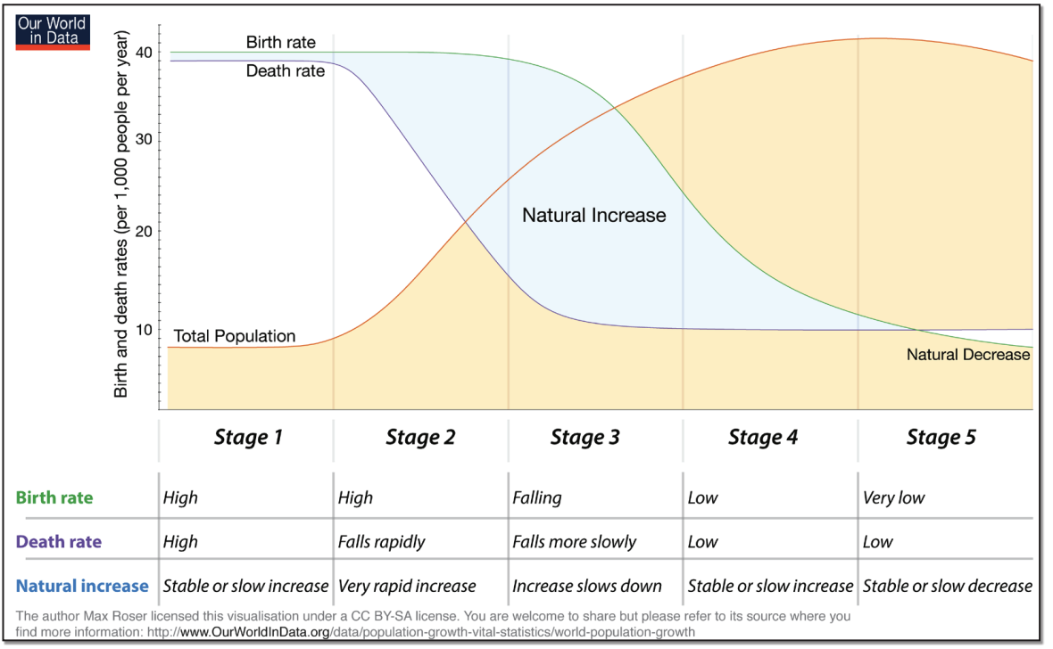
In Stage One, which is pre-modern, birth rates are high, and death rates are high. As a result of these two factors, the population remains low, but stable.
By Stage Two as the society industrializes food becomes more steadily available, water supplies get cleaner and sanitation and medical care improves. Death rates fall, particularly infant mortality rates. However, there is a lag in the decline in birth rates. It takes time for people to adjust to the new reality of urban industrial life. Since the birth rate is still high and the death rate is low, population grows very rapidly.
Stage Three is characterized by a falling birth rate as the society begins to find an equilibrium between birth and deaths. The birth rates are still higher than death rates and population continues to increase. This continuation of population increase is known as population momentum. The end of Stage Three is characterized by the general balance between births and deaths.
Stage Four shows a return to population stability, but at a much greater number of people.
20.6 MEASURING THE IMPACT OF POPULATION
Remember the earlier comparison of Russia and Bangladesh? This is the section where we discuss the different ways of calculating the pressure that populations put onto the land that they inhabit. You’ll recall that we began by looking simply at people per country. This is a good way to start, but the limitations are fairly obvious. Countries that are physically larger can hold more people. We need to use a method that changes from a measure of overall population to some kind of per capita measure. There are many of these and each has its merits.
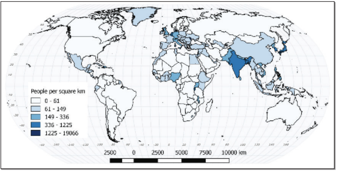
Arithmetic density is the simplest one. It is simply the number of people divided by the area of the country. The area is usually measured in square kilometers, since most of the world uses the metric system (Figure 20.17).
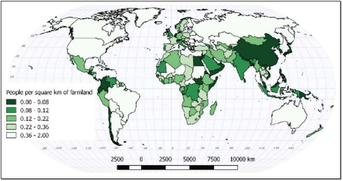
Physiological density has the same numerator (population), but the denominator is different. Instead of using all the land in a country, it only accounts for arable (farmable) land (Figure 20.18). Places that are not used for agriculturedeserts, lakes, mountaintops and similar places – are subtracted from the land total. This is useful for demonstrating how much pressure is being put on the farmland that is available. Be aware that food that is gathered or hunted from nonagricultural land is not considered in this number.
Agricultural density has the same denominator as physiological density, but has a different numerator. Instead of using the entire population, it only uses farmers (Figure 20.19). This provides a number that is a good measure of development, or rather it’s a good measure of underdevelopment. Developed countries have mechanized agriculture and few farmers per capita. Each farm tends
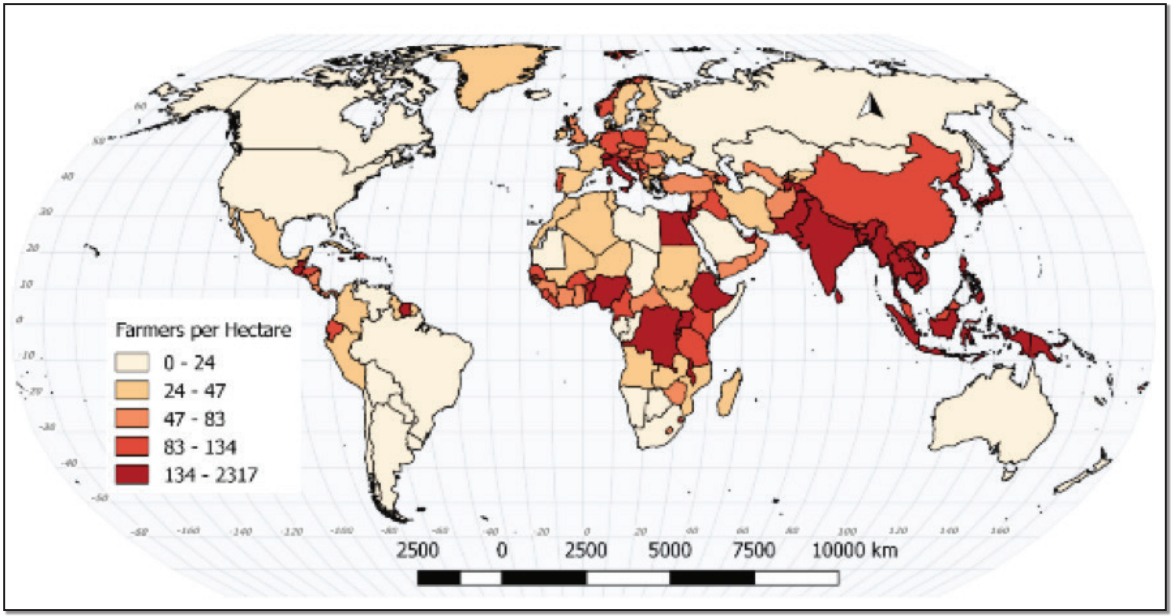
to be large in order to generate a sufficient income. Places with high agricultural densities have more farmers per hectare, meaning that farms will likely produce less revenue. Of course, an underlying assumption of this number is the idea that people are growing food to earn a living. If they are eating the produce directly, outside the cash economy, then the comparison is less valid.
Related to food production is the concept of carrying capacity. Carrying capacity is simply how many people can live from a given piece of land. However, it’s not really that simple. Carrying capacity is not static throughout time. Not only do environmental characteristics change (due to desertification, for example) but technology changes as well. The carrying capacity of land in wealthy developed countries has expanded tremendously due to the application of technology. These technologies could be something as simple as irrigation ditches to something as complex as genetic modification of the plants and animals themselves. Carrying capacity is snapshot taken at a particular time.
20.7 FUTURE POPULATION
When we looked at the population pyramids we considered both the current population conditions and the projected population pyramids. When we looked at the first graph in the chapter, it didn’t stop at the current year. It provided three different estimates of the near future. Estimating future populations is important, both at the global level and the national level, but also at the local level as well. Societies large and small attempt to plan their futures in terms of resource allocation and economic development. Population projections are difficult. They attempt to take current circumstances and use them to plot the likeliest future.
The problem is that the future may not be like the present. A disease that is suppressing fertility may be cured. The climate may change more than expected. We could experience another world war. Any number of unexpected large scale events could occur that completely invalidate the reasoning behind a projection. Nicholas Talib calls these Black Swan events. They are things that you don’t know about until you do know about them. Irrespective projections will be made because they are necessary.
20.8 GEOGRAPHY OF HEALTH
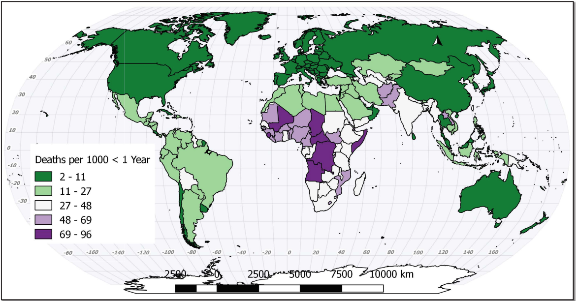
Although the health of populations has been considered in most sections of this chapter, there are some aspects that can be addressed most appropriately on their own. The geography of health or medical geography is the study sickness or health across space. In the same way that it is possible to compare places by their population characteristics, it is possible to compare places by their health characteristics. Also in the same way that societies tend to pass through the stages of demographic transition, they also tend to pass through an epidemiological transition. The demographic transition and epidemiological transition are somewhat related. The improvements in food supply and better sanitation that lead to larger populations also lead to healthier populations. They are not exactly the same thing however. Epidemiology is the study of diseases themselves and the way that they function. The epidemiological transition is a way of representing the relationship between development and disease. In less developed places, infant mortality is high (Figure 20.20) and infectious disease is the greatest threat. In more developed societies, the health threats tend to be chronic afflictions- cancer, diabetes, or heart disease. One of the reasons for the difference between the developed and less developed places is the fact that in developed countries people tend to live longer. Countries in which people die in their forties will not have a problem with Alzheimer’s disease.
Mortality refers to death and morbidity refers to sickness. We can look at different rates of mortality and morbidity to gain some insight into the health of a population.
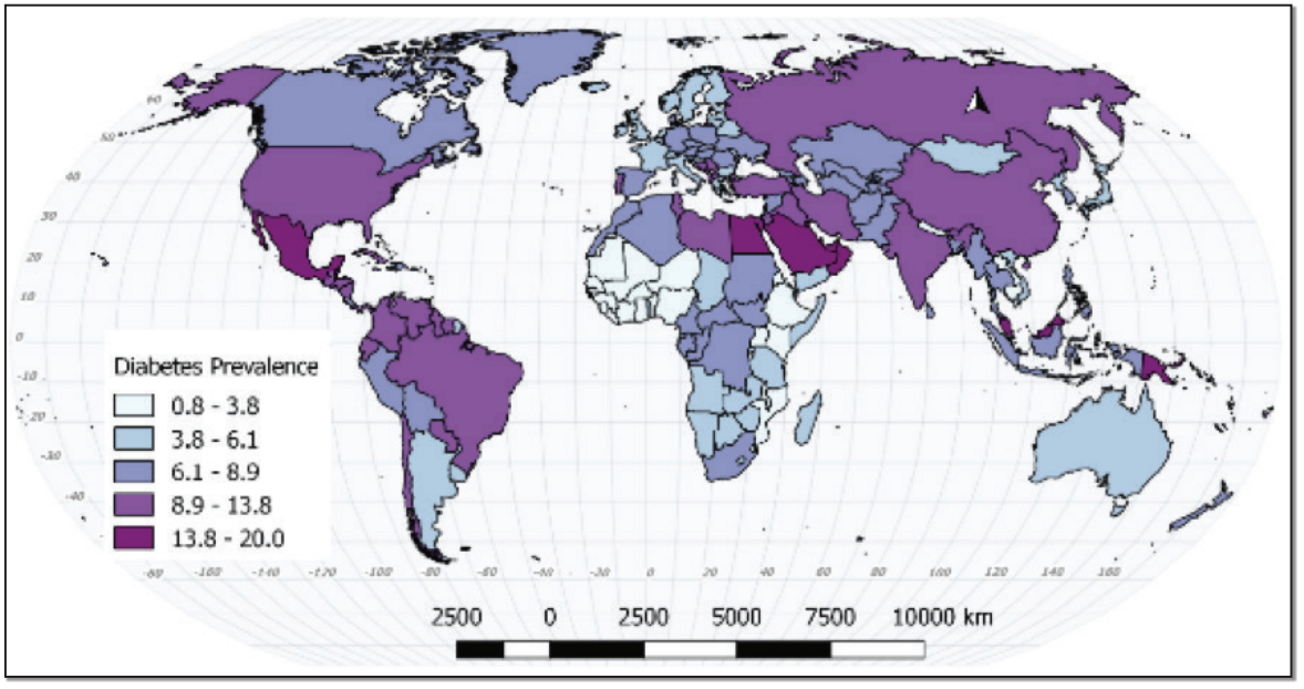
Diabetes was once related to development, but the relationship is weakening (Figure 20.21). As obesity becomes a greater problem in developing countries, so does diabetes.
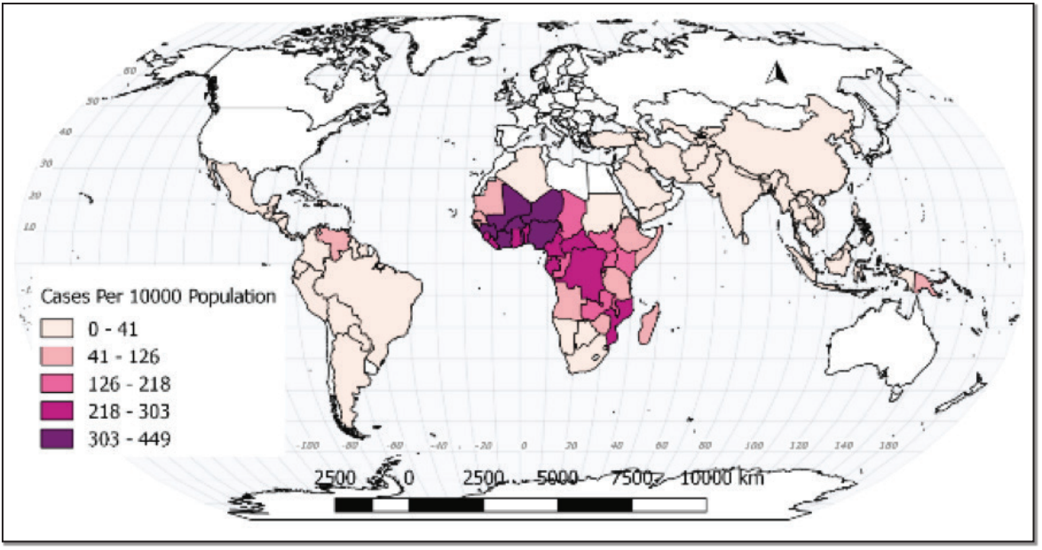
On the other hand, malaria is a disease of poor countries, or at least it is a disease of poor places (Figure 20.22). The poorer parts of developing countries will likely have malaria problems, while the wealthier parts may not.
One of the changes that has occurred in medical geography is that the differences between the developed and less developed countries have been narrowing. Obesity was once considered fully within the sphere of developed world problems, but the obesity crisis has diffused into many parts of the developing world now. In the same way, infectious diseases such as HIV and Hepatitis C have become problems in developed countries.
Due to the work of numerous organizations, a number of diseases in many parts of the world have been reduced and some have been eradicated. Smallpox no longer exists in the wild and Dracunculiasis (Guinea worm) has gone from millions of cases thirty years ago to single digits in recent years. Other diseases have been dramatically reduced. Polio once infected millions of people per year across the world, but through vaccination programs, its range has been reduced to just two countries.
There is now even a category of diseases known as re-emerging diseases. These are diseases that were previously thought to be eradicable but are now returning to populations that had previously been largely free of them. Re-emerging diseases are diseases like tuberculosis and diphtheria that had been declining for decades that have begun to increase in prevalence.
20.9 SUMMARY
The human population is growing, but not as much as it has in the recent past. The growth is not even, with some places growing rapidly and other places losing population. Those places growing fastest tend to be poor. The effect of population growth is place-bound as well; highly developed places with low populations often use more resources than less developed places with more people. The impact of population can be measured in a number of ways, with each measurement providing a small insight into the dynamics of the human population. Uneven population growth and poverty are the two most important factors underlying the subject of our next chapter, Migration.
20.10 KEY TERMS DEFINED
Agricultural density: The number of farmers per unit area of arable land.
Arithmetic density: The population of a country divided by its total land area.
Carrying capacity: The maximum population size that the environment can sustain indefinitely.
Cartogram: map in which some thematic mapping variable—such as population—is substituted for land area or distance.
Cohort: A subset of a population, generally defined by an age range.
Crude birth rate: Total number of live births per 1,000 of a population in a year.
Crude death rate: Total number of deaths per 1,000 of a population in a year.
Demographic transition: The transition from high birth and death rates to lower birth and death rates as a country or region develops.
Dependency ratio: The ratio of those not in the labor force (generally ages 0 to 14 and 65+) and those in the labor force.
Doubling time: The period of time required for a population to double in size.
Ecological Fallacy: Characteristics about the nature of individuals are deduced from inference for the group to which those individuals belong.
Ecumene: The Greek concept of the habitable part of the Earth
Infant mortality rate: The number of infant deaths that occur for every 1,000 live births.
Life expectancy: The number of years that one is expected to live as determined by
statistics.
Morbidity: The state of being diseased or unhealthy within a population.
Mortality: The number of people who have died within a population.
Overpopulation: A condition in which a place has outstripped its ability to provide for its own needs.
Physiological density: The number of people per unit area of arable land.
Population density: A measurement of population per areal unit, such as the world, a region, a country or other area.
Population momentum: The tendency for population growth to continue due to high concentrations of people in the childbearing years.
Population projection: An estimate of future population.
Population pyramid: Graphical illustration that shows the distribution of various age groups in a population.
Rate of natural increase: The crude birth rate minus the crude death rate. This rate excludes the effect of migration.
Replacement level: The average number of children a woman needs to have to ensure the population replaces itself. The number is roughly 20.1.
Total fertility rate: The average number of children that would be born to a woman over her lifetime.
20.11 WORKS CONSULTED AND FURTHER READING
Bank, World. 2017. “Metadata Glossary.” DataBank. Accessed August 20. http://databank. worldbank.org/data/glossarymetadata/source/all/concepts/series.
Emch, Michael, Elisabeth D. Root, and Margaret Carrel. 2017. Health and Medical Geography. Fourth edition. New York: Guilford Press.
“Ester Boserup.” 2017. Wikipedia. https://en.wikipedia.org/w/index.php?title=Ester_ Boserup&oldid=783397776.
Gould, W. T. S. 2009. Population and Development. Routledge Perspectives on Development. London ; New York: Routledge.
Gregory, Derek, ed. 2009. The Dictionary of Human Geography. 5th ed. Malden, MA:
Blackwell.
Koch, Tom. 2017. Cartographies of Disease. Esri Press. http://www.myilibrary. com?id=965009.
Kurland, Kristen Seamens, and Wilpen L. Gorr. 2014. GIS Tutorial for Health. Fifth edition.
Redlands, California: ESRI Press.
“List of Countries by Population (United Nations).” 2017. Wikipedia. https://en.wikipedia. org/w/index.php?title=List_of_countries_by_population_(United_ Nations)&oldid=796051350.
“Maps & More | GIS | CDC.” 2017. Accessed August 20. https://www.cdc.gov/gis/ mapgallery/index.html.
Newbold, K. Bruce. 2017. Population Geography: Tools and Issues. Third edition. Lanham:
Rowman & Littlefield.
Taleb, Nassim Nicholas. 2010. The Black Swan: The Impact of the Highly Improbable. 2nd ed., Random trade pbk. ed. New York: Random House Trade Paperbacks.
“Thomas Robert Malthus.” 2017. Wikipedia. https://en.wikipedia.org/w/index. php?title=Thomas_Robert_Malthus&oldid=795798343.
US Census Bureau, Demographic Internet Staff. 2017. “International Programs, World Population.” Accessed August 20. https://www.census.gov/population/ international/data/worldpop/table_history.php.
20.12 ENDNOTES
- Data source: World Bank Health Nutrition and Population Statistics. http://databank. worldbank.org/data/glossarymetadata/source/all/concepts/series
- Data source: World Bank Health Nutrition and Population Statistics. http://databank. worldbank.org/data/glossarymetadata/source/all/concepts/series 7. Malthus, Thomas R. 1798. An Essay on the Principle of Population.
- Boserup, E. 1965. The Conditions of Agricultural Growth.
- Data source: United States Census Bureau 2010 http://www20.census.gov/geo/tiger/ TIGER_DP/2016ACS/ACS_2016_5YR_COUNTY.gdb.zip
- Data source: Natural Earth Data. Image produced with the cartogram plugin in QGIS. https://www.naturalearthdata.com/downloads/ S
- Data source: World Bank Health Nutrition and Population Statistics. http://databank. worldbank.org/data/glossarymetadata/source/all/concepts/series
- Data source: World Bank Health Nutrition and Population Statistics. http://databank. worldbank.org/data/glossarymetadata/source/all/concepts/series
- Data source: World Bank Health Nutrition and Population Statistics. http://databank. worldbank.org/data/glossarymetadata/source/all/concepts/series
- Data source: World Bank Health Nutrition and Population Statistics. http://databank. worldbank.org/data/glossarymetadata/source/all/concepts/series
- Data source: World Bank Health Nutrition and Population Statistics. http://databank. worldbank.org/data/glossarymetadata/source/all/concepts/series
- Data source: World Bank Health Nutrition and Population Statistics. http://databank. worldbank.org/data/glossarymetadata/source/all/concepts/series
- Data source: World Bank Health Nutrition and Population Statistics. http://databank. worldbank.org/data/glossarymetadata/source/all/concepts/series
- Data source: World Bank Health Nutrition and Population Statistics. http://databank. worldbank.org/data/glossarymetadata/source/all/concepts/series
- Data source: World Bank Health Nutrition and Population Statistics. http://databank. worldbank.org/data/glossarymetadata/source/all/concepts/series
- Data source: World Bank Health Nutrition and Population Statistics. http://databank.worldbank.org/data/glossarymetadata/source/all/concepts/series
- Data source: World Bank Health Nutrition and Population Statistics. http://databank.worldbank.org/data/glossarymetadata/source/all/concepts/series
- Data source: World Bank Health Nutrition and Population Statistics. http://databank.worldbank.org/data/glossarymetadata/source/all/concepts/series
