Chapter Five – Measuring the Least Squares Fit/Exponential Least Squares Regression
How Well Does the Linear Polynomial Fit the Data?
It is natural and useful to ask: How good a predictor is the resulting polynomial for the given values of x. In other words, how close do the predicted values of y come to the actual values of y for a particular value of x.
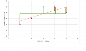
Let’s look at the chart for the linear regression we calculated (red dotted line) in Chapter Four. The length of red vertical lines between the actual and predicted values tells us how good the fit is. The smaller the red lines (closer), the better the fit.

Long Description
However, simply measuring each distance and adding them together presents some problems. We want to eliminate direction because the negatives and positives tend to cancel each other out. An easy way to do this is measure each distance and then square the result. Hence the name Least Squared Regression.
Next, we need a baseline or something to compare our summed squared regression. It turns out a horizontal line passing through the mean of the y values offers us a worst-case scenario. In other words, the distance between the given y and the horizontal line is essentially no fit. So we add the given y values and divide by 5 (number of data points in this example). [latex]\large Y_{mean} = \frac {2 + 3 + 5 + 5 + 4}{5} = 3.8[/latex] Shown in green above. The closer the predicted value is from the actual value and the farther it is from the mean value, the better our prediction.
Using the data above we will conduct a [latex]R^2[/latex] (Squared Regression) analysis to gauge numerically how well the linear and quadratic polynomials fit the data.
Squared Regression Analysis
| x | y | Generated y values [latex]Y_* = 0.6x + 2[/latex] |
Difference between actual and generated squared: [latex](y - y_*)^2[/latex] |
|---|---|---|---|
| 1 | 2 | 2.6 | 0.36 |
| 2 | 3 | 3.2 | 0.04 |
| 3 | 5 | 3.8 | 1.44 |
| 4 | 5 | 4.4 | 0.36 |
| 5 | 4 | 5 | 1 |
| - | - | - | [latex]Sum = 3.2[/latex] |
However, to put this in perspective we need to add a column and calculate the sum of the squared distance between the actual values of y and the mean value of y.
Squared Regression Analysis with Total Differences
| x | y | Generated y values [latex]Y_* = 0.6x + 2[/latex] | Difference between actual and generated squared: [latex](y - y_*)^2[/latex] | Total Squared difference between actual and mean. [latex](y - y_(mean) )^2[/latex] |
|---|---|---|---|---|
| 1 | 2 | 2.6 | 0.36 | 3.24 |
| 2 | 3 | 3.2 | 0.04 | 0.64 |
| 3 | 5 | 3.8 | 1.44 | 1.44 |
| 4 | 5 | 4.4 | 0.36 | 1.44 |
| 5 | 4 | 5 | 1 | 0.04 |
| - | - | - | [latex]Sum = 3.2[/latex] | [latex]Sum = 6.8[/latex] |
By taking the ratio of the sum of our squared error to the sum of the No-Fit values and subtracting from one we get a number (percent) that tells us how good our fit is in terms that is understandable.
[latex]\large R^2 = 1 - \frac{3.2}{6.8}[/latex]
[latex]\large R^2 = 0.53 = 53\%[/latex]
The [latex]\large R^2[/latex] value of 53% suggests that this may not be the best fit.
Let’s calculate [latex]\large R^2[/latex] for the quadratic fit to see if it is a better fit.
Squared Regression Analysis with Different Generated y Values
| x | y | Generated y values [latex]y = -0.4286x^2 + 3.1714x - 1[/latex] | Difference between actual and generated squared: [latex](y - y_*)^2[/latex] | Total Squared difference between actual and mean. [latex](y - y_{mean} )^2[/latex] |
|---|---|---|---|---|
| 1 | 2 | 1.7428 | 0.06615184 | 3.24 |
| 2 | 3 | 3.6284 | 0.39488656 | 0.64 |
| 3 | 5 | 4.6568 | 0.11778624 | 1.44 |
| 4 | 5 | 4.828 | 0.029584 | 1.44 |
| 5 | 4 | 4.142 | 0.020164 | 0.04 |
| - | - | - | [latex]Sum = 0.62857264[/latex] | [latex]Sum = 6.8[/latex] |
[latex]\large R^2 = 1 - \frac {0.62857264}{6.8}[/latex]
[latex]\large R^2 = 0.908 = 90.8\%[/latex]
The quadratic is a better fit than the straight line. However, part of the “Art” of interpolation means the analyst still has to decide which is more meaningful and representative of the situation being analyzed.
Exponential Least Squares Regression
An important interpolation is one involving exponential polynomials. It has many applications in finance, biochemistry, and radioactive decay.
We will focus on the standard form using the constant e. This is known as the natural number or Euler’s number value. Its importance lies in the fact that it represents the fundamental rate of growth shared by continually growing processes. One example is continuous compounding of money in a savings account.
The form of the polynomial is [latex]\large y = Ae^{rx}[/latex]
In this, we can think of r as the rate and A we can think of as both the y intercept and demonstrating whether it is growth (positive value) or decay (negative value).
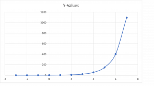
Graphically it looks like (A and r are both set to 1):

Long Description
[latex]\large y = Ae^{rx}[/latex] does not lend itself to directly calculating an interpolative polynomial. This is due in part because standard deviation does not apply to this type of continuous and ever accelerating growth.
Since we already know how to deal with standard polynomials that can be solved used linear techniques such as matrix arithmetic, our goal is to eliminate e. Solve for r and A then plug the results back into the original polynomial.
Since we are dealing with the natural number e, we can convert the above to a linear function by taking the natural log of both sides as follows:
[latex]\large lny = ln(Ae^{rx})[/latex]
[latex]\large lny = lnA + rx[/latex]
When we rearrange, we have a linear equation in slope intercept form:
[latex]\large lny = rx + lnA[/latex]
Let’s use the following sample set of data points and use Matrix math to develop the interpolated data:
Interpolated Data
| x | actual y | Iny |
|---|---|---|
| -1 | 0.4 | -0.916 |
| 0 | 1.1 | 0.095 |
| 1 | 2.62 | 0.963 |
| 2 | 8.1 | 2.092 |
| 3 | 24.03 | 3.179 |
| 4 | 57.9 | 4.059 |

Long Description

Long Description
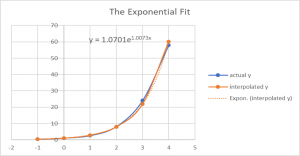
This resulted in a very good fit.
The graph illustrates that the measure of the fit is a ratio of the distance from interpolated values of y (shown in red) for a given x to the distance of the actual value of y (blue points) for the same x from the horizontal line shown in green. This line is considered the worst case scenario or the no fit line.
The blue line represents exponential growth when the A and r values of the equation are both set to one.
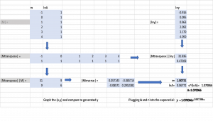
This illustrates the matrix math performed in a spreadsheet program. It involves the matrix M of given values as well as the inverse, transpose and matrix multiplication.
Illustrates and compares the actual values of y (blue line) to the interpolated y (orange line). The orange doted line was generated by the spreadsheet graphing function.


Feedback/Errata