
5 Inflation
5.1 tracking inflation
From: OpenStax Macroeconomics (http://cnx.org/content/col12190/1.4), Chapter 9.1
Inflation is a general and ongoing rise in the level of prices in an entire economy. Inflation does not refer to a change in relative prices. A relative price change occurs when you see that the price of tuition has risen, but the price of laptops has fallen. Inflation, on the other hand, means that there is pressure for prices to rise in most markets in the economy. In addition, price increases in the supply-and-demand model were one-time events, representing a shift from a previous equilibrium to a new one. Inflation implies an ongoing rise in prices. If inflation happened for one year and then stopped, then it would not be inflation any more.
This chapter begins by showing how to combine prices of individual goods and services to create a measure of overall inflation. It discusses the historical and recent experience of inflation, both in the United States and in other countries around the world. Other chapters have sometimes included a note under an exhibit or a parenthetical reminder in the text saying that the numbers have been adjusted for inflation. In this chapter, it is time to show how to use inflation statistics to adjust other economic variables, so that you can tell how much of, for example, we can attribute the rise in GDP over different periods of time to an actual increase in the production of goods and services and how much we should attribute to the fact that prices for most items have risen.
Inflation has consequences for people and firms throughout the economy, in their roles as lenders and borrowers, wage-earners, taxpayers, and consumers. The chapter concludes with a discussion of some imperfections and biases in the inflation statistics, and a preview of policies for fighting inflation that we will discuss in other chapters.
Dinner table conversations where you might have heard about inflation usually entail reminiscing about when “everything seemed to cost so much less. You used to be able to buy three gallons of gasoline for a dollar and then go see an afternoon movie for another dollar.” Table 5.1 compares some prices of common goods in 1950 and 2019. Of course, the average prices in this table may not reflect the prices where you live. The cost of living in New York City is much higher than in Houston, Texas, for example. In addition, certain products have evolved over recent decades. A new car in 2019, loaded with antipollution equipment, safety gear, computerized engine controls, and many other technological advances, is a more advanced machine (and more fuel efficient) than your typical 1950s car. However, put details like these to one side for the moment, and look at the overall pattern. The primary reason behind the price rises in Table 5.1—and all the price increases for the other products in the economy—is not specific to the market for housing or cars or gasoline or movie tickets. Instead, it is part of a general rise in the level of all prices. At the beginning of 2019, $1 had about the same purchasing power in overall terms of goods and services as 9 cents did in 1950, because of the amount of inflation that has occurred over that time period.
| Good | Price in 1950 | Price in 2019 |
| American Cheese | $0.45/lb | $5.99/lb |
| Apples | $0.19/lb | $1.99/lb |
| Cambells Tomato Soup | $0.10/can | $1.19/can |
| Eggs | $0.79/dz | $1.59/dz |
| Margarine | $0.19/lb | $0.99/lb |
| Sliced Bacon | $0.35/lb | $5.32/lb |
| T-Bone Steak | $0.59/lb | $12.99/lb |
| Median Home Price | $7,354 | $315,000 |
| Gallon of Gasoline | $0.18/gal | $2.73/gal |
| Median Income | $3,300 | $63,119 (2018) |
| Per Capita GDP | $1,977 | $62,853 (2018) |
Sources: foodtimeline.org (for 1950 grocery prices), median income and per capita gdp from St. Louis Federal Reserve, 2019 grocery prices from Wegman’s (all goods Wegman’s brand unless otherwise stated), and median income and per capita GDP from St. Louis Federal Reserve
Moreover, the power of inflation does not affect just goods and services, but wages and income levels, too. The second-to-last row of Table 5.1 shows that the median income in the United States increased nearly twenty-fold from 1950 to 2019. The average worker in 2019 is better educated and more productive than the average worker in 1950—but not twenty times more productive. Per capita GDP increased substantially from 1950 to 2019, but is the average person in the U.S. economy really more than 30 times better off in just 79 years? Not likely.
A modern economy has millions of goods and services whose prices are continually quivering in the breezes of supply and demand. How can all of these shifts in price attribute to a single inflation rate? As with many problems in economic measurement, the conceptual answer is reasonably straightforward: Economists combine prices of a variety of goods and services into a single price level. The inflation rate is simply the percentage change in the price level. Applying the concept, however, involves some practical difficulties.
The Price of a Basket of Goods
To calculate the price level, economists begin with the concept of a basket of goods and services, consisting of the different items individuals, businesses, or organizations typically buy. The next step is to look at how the prices of those items change over time. In thinking about how to combine individual prices into an overall price level, many people find that their first impulse is to calculate the average of the prices. Such a calculation, however, could easily be misleading because some products matter more than others.
Changes in the prices of goods for which people spend a larger share of their incomes will matter more than changes in the prices of goods for which people spend a smaller share of their incomes. For example, an increase of 10% in the rental rate on housing matters more to most people than whether the price of carrots rises by 10%. To construct an overall measure of the price level, economists compute a weighted average of the prices of the items in the basket, where the weights are based on the actual quantities of goods and services people buy.
Consider the simple basket of goods with only three items, represented in Table 5.2. Say that in any given month, a college student spends money on 20 hamburgers, one bottle of aspirin, and five movies. The table provides prices for these items over four years. Prices of some goods in the basket may rise while others fall. In this example, the price of aspirin does not change over the four years, while movies increase in price and hamburgers bounce up and down. The table shows the cost of buying the given basket of goods at the prices prevailing at that time.
| (blank) | Hamburgers | Aspirin | Movies |
| Quantity | 20 | 1 | 5 |
| 2017 | $3.10 | $10.00 | $6.00 |
| 2018 | $3.20 | $10.00 | $6.50 |
| 2019 | $3.10 | $10.00 | $7.00 |
| 2020 | $3.50 | $10.00 | $7.50 |
We can calculate the price of this basket of goods for each year. We will refer to the basket price as BP.
BP17 = ($3.10)(20) + ($10.00)(1) + ($6.00)(5) = $62.00 + $10.00 + $30.00 = $102.00
BP18 = ($3.20)(20) + ($10.00)(1) + ($6.50)(5) = $64.00 + $10.00 + $32.50 = $106.50
BP19 = ($3.10)(20) + ($10.00)(1) + ($7.00)(5) = $62.00 + $10.00 + $35.00 = $107.00
BP20 = ($3.50)(20) + ($10.00)(1) + ($7.50)(5) = $70.00 + $10.00 + $37.50 = $117.50
We can calculate the inflation rate using the basic percent change formula we learned in chapter 4. As a reminder, inflation is calculated as
[latex]\pi_{t-t+1}=100\cdot\frac{BP{t+1}-BP{t}}{BP{t}}.[/latex]
The inflation rates for the above example are as follows:
[latex]\pi_{2017-2018}=100\cdot\frac{106.50-102.00}{102.00}=100\cdot(0.044)=4.4\%[/latex]
[latex]\pi_{2018-2019}=100\cdot\frac{107.00-106.50}{106.50}=100\cdot(0.005)=0.5\%[/latex]
[latex]\pi_{2019-2020}=100\cdot\frac{117.50-107.00}{107.00}=100\cdot(0.098)=9.8\%[/latex]
This calculation of the change in the total cost of purchasing a basket of goods accounts for how much a student spends on each good. Hamburgers are the lowest-priced good in this example, and aspirin is the highest-priced. If an individual buys a greater quantity of a low-price good, then it makes sense that changes in the price of that good should have a larger impact on the buying power of that person’s money. The larger impact of hamburgers shows up in the “amount spent” row, where, in all time periods, hamburgers are the largest item within the amount spent row.
Consumer Price Index (CPI)
The numerical results of a calculation based on a basket of goods can get a little messy. The simplified example in Table 5.2 has only three goods and the prices are in even dollars, not numbers like 79 cents or $124.99. If the list of products were much longer, and we used more realistic prices, the total quantity spent over a year might be some messy-looking number like $17,147.51 or $27,654.92.
To simplify the task of interpreting the price levels for more realistic and complex baskets of goods, economists typically report the price level in each period as an index number, rather than as the dollar amount for buying the basket of goods. Economists create price indices to calculate an overall average change in relative prices over time. We refer to this as the consumer price index (CPI). To convert the money spent on the basket to an index number, economists arbitrarily choose one year to be the base year, or starting point from which we measure changes in prices. The base year, by definition, has an index number equal to 100. This sounds complicated, but it is really a simple math trick. We calculate the CPI using the following equation:
[latex]CPI_{t}=100\cdot\frac{BP_t}{BP_{base}}[/latex]
In the example above, say that we choose 2017 as the base year. Since the total amount of spending in that year is $100, we divide that amount by itself ($100) and multiply by 100. Again, this is because the index number in the base year always has to have a value of 100. The CPI calculations are all given below:
[latex]CPI_{2017}=100\cdot\frac{102.00}{102.00}=100\cdot(1)=100.0[/latex]
[latex]CPI_{2018}=100\cdot\frac{106.50}{102.00}=100\cdot(1.044)=104.4[/latex]
[latex]CPI_{2019}=100\cdot\frac{107.00}{102.00}=100\cdot(1.049)=104.9[/latex]
[latex]CPI_{2017}=100\cdot\frac{117.50}{102.00}=100\cdot(1.152)=115.2[/latex]
We can also calculate the inflation rates using the CPI values. But, when you do, you will discover that the inflation rates are exactly the same as the ones we found using the basket prices.
[latex]\pi_{2017-2018}=100\cdot\frac{104.4-100.00}{100.00}=100\cdot(0.044)=4.4\%[/latex]
[latex]\pi_{2018-2019}=100\cdot\frac{104.9-104.4}{104.4}=100\cdot(0.005)=0.5\%[/latex]
[latex]\pi_{2019-2020}=100\cdot\frac{115.2-104.9}{104.9}=100\cdot(0.098)=9.8\%[/latex]
If the inflation rate is the same whether it is based on dollar values or index numbers, then why bother with the index numbers? The advantage is that indexing allows easier eyeballing of the inflation numbers. If you glance at two index numbers like 107 and 110, you know automatically that the rate of inflation between the two years is about, but not quite exactly equal to, 3%. By contrast, imagine that we express the price levels in absolute dollars of a large basket of goods, so that when you looked at the data, the numbers were $19,493.62 and $20,040.17. Most people find it difficult to eyeball those kinds of numbers and say that it is a change of about 3%. However, the two numbers expressed in absolute dollars are exactly in the same proportion of 107 to 110 as the previous example.
Two final points about index numbers are worth remembering. First, index numbers have no dollar signs or other units attached to them. Although we can use index numbers to calculate a percentage inflation rate, the index numbers themselves do not have percentage signs. Index numbers just mirror the proportions that we find in other data. They transform the other data so that it is easier to work with the data.
Second, the choice of a base year for the index number—that is, the year that is automatically set equal to 100—is arbitrary. We choose it as a starting point from which we can track changes in prices. In the official inflation statistics, it is common to use one base year for a few years, and then to update it, so that the base year of 100 is relatively close to the present. However, any base year that we choose for the index numbers will result in exactly the same inflation rate. To see this in the previous example, imagine that period 1 is the base year when total spending was $100, and we assign it an index number of 100. At a glance, you can see that the index numbers would now exactly match the dollar figures, and the inflation rate in the first period would be 6.5%.
5.2 price indices
From: OpenStax Macroeconomics (http://cnx.org/content/col12190/1.4), Chapter 9.2
The Consumer Price Index
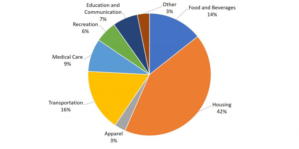
The most commonly cited measure of inflation in the United States is the Consumer Price Index (CPI). Government statisticians at the U.S. Bureau of Labor Statistics calculate the CPI based on the prices in a fixed basket of goods and services that represents the purchases of the average family of four. Figure 5.1 shows the breakdown of the United States CPI basket.
The Flaws of the Consumer Price Index
In recent years, the statisticians have paid considerable attention to a subtle problem: that the change in the total cost of buying a fixed basket of goods and services over time is conceptually not quite the same as the change in the cost of living, because the cost of living represents how much it costs for a person to feel that his or her consumption provides an equal level of satisfaction or utility.
To understand the distinction, imagine that over the past 10 years, the cost of purchasing a fixed basket of goods increased by 25% and your salary also increased by 25%. Has your personal standard of living held constant? If you do not necessarily purchase an identical fixed basket of goods every year, then an inflation calculation based on the cost of a fixed basket of goods may be a misleading measure of how your cost of living has changed. Two problems arise here: substitution bias and quality/new goods bias.
When the price of a good rises, consumers tend to purchase less of it and to seek out substitutes instead. Conversely, as the price of a good falls, people will tend to purchase more of it. This pattern implies that goods with generally rising prices should tend over time to become less important in the overall basket of goods used to calculate inflation, while goods with falling prices should tend to become more important. Consider, as an example, a rise in the price of peaches by $100 per pound. If consumers were utterly inflexible in their demand for peaches, this would lead to a big rise in the price of food for consumers. Alternatively, imagine that people are utterly indifferent to whether they have peaches or other types of fruit. Now, if peach prices rise, people completely switch to other fruit choices and the average price of food does not change at all. A fixed and unchanging basket of goods assumes that consumers are locked into buying exactly the same goods, regardless of price changes—not a very likely assumption. Thus, substitution bias—the rise in the price of a fixed basket of goods over time—tends to overstate the rise in a consumer’s true cost of living, because it does not take into account that the person can substitute away from goods whose relative prices have risen.
The other major problem in using a fixed basket of goods as the basis for calculating inflation is how to deal with the arrival of improved versions of older goods or altogether new goods. Consider the problem that arises if a cereal is improved by adding 12 essential vitamins and minerals—and also if a box of the cereal costs 5% more. It would clearly be misleading to count the entire resulting higher price as inflation, because the new price reflects a higher quality (or at least different) product. Ideally, one would like to know how much of the higher price is due to the quality change, and how much of it is just a higher price. The Bureau of Labor Statistics, which is responsible for computing the Consumer Price Index, must deal with these difficulties in adjusting for quality changes.
We can think of a new product as an extreme improvement in quality—from something that did not exist to something that does. However, the basket of goods that was fixed in the past obviously does not include new goods created since then. The basket of goods and services in the Consumer Price Index (CPI) is revised and updated over time, and so new products are gradually included. However, the process takes some time. For example, room air conditioners were widely sold in the early 1950s, but were not introduced into the basket of goods behind the Consumer Price Index until 1964. The VCR and personal computer were available in the late 1970s and widely sold by the early 1980s, but did not enter the CPI basket of goods until 1987. By 1996, there were more than 40 million cellular phone subscribers in the United States—but cell phones were not yet part of the CPI basket of goods. The parade of inventions has continued, with the CPI inevitably lagging a few years behind.
The arrival of new goods creates problems with respect to the accuracy of measuring inflation. The reason people buy new goods, presumably, is that the new goods offer better value for money than existing goods. Thus, if the price index leaves out new goods, it overlooks one of the ways in which the cost of living is improving. In addition, the price of a new good is often higher when it is first introduced and then declines over time. If the new good is not included in the CPI for some years, until its price is already lower, the CPI may miss counting this price decline altogether. Taking these arguments together, the quality/new goods bias means that the rise in the price of a fixed basket of goods over time tends to overstate the rise in a consumer’s true cost of living, because it does not account for how improvements in the quality of existing goods or the invention of new goods improves the standard of living.
The CPI and Core Index
Imagine if you were driving a company truck across the country- you probably would care about things like the prices of available roadside food and motel rooms as well as the truck’s operating condition. However, the manager of the firm might have different priorities. He would care mostly about the truck’s on-time performance and much less so about the food you were eating and the places you were staying. In other words, the company manager would be paying attention to the firm’s production, while ignoring transitory elements that impacted you, but did not affect the company’s bottom line.
In a sense, a similar situation occurs with regard to measures of inflation. As we’ve learned, CPI measures prices as they affect everyday household spending. Economists typically calculate a core inflation index by taking the CPI and excluding volatile economic variables. In this way, economists have a better sense of the underlying trends in prices that affect the cost of living.
Examples of excluded variables include energy and food prices, which can jump around from month to month because of the weather. According to an article by Kent Bernhard, during Hurricane Katrina in 2005, a key supply point for the nation’s gasoline was nearly knocked out. Gas prices quickly shot up across the nation, in some places by up to 40 cents a gallon in one day. This was not the cause of an economic policy but rather a short-lived event until the pumps were restored in the region. In this case, the CPI that month would register the change as a cost of living event to households, but the core inflation index would remain unchanged. As a result, the Federal Reserve’s decisions on interest rates would not be influenced. Similarly, droughts can cause world-wide spikes in food prices that, if temporary, do not affect the nation’s economic capability.
As former Chairman of the Federal Reserve Ben Bernanke noted in 1999 about the core inflation index, “It provide(s) a better guide to monetary policy than the other indices, since it measures the more persistent underlying inflation rather than transitory influences on the price level.” Bernanke also noted that it helps communicate that the Federal Reserve does not need to respond to every inflationary shock since some price changes are transitory and not part of a structural change in the economy.
In sum, both the CPI and the core inflation index are important, but serve different audiences. The CPI helps households understand their overall cost of living from month to month, while the core inflation index is a preferred gauge from which to make important government policy changes.
Practical Solutions for the Substitution and the Quality/New Goods Biases
By the early 2000s, the Bureau of Labor Statistics was using alternative mathematical methods for calculating the Consumer Price Index, more complicated than just adding up the cost of a fixed basket of goods, to allow for some substitution between goods. It was also updating the basket of goods behind the CPI more frequently, so that it could include new and improved goods more rapidly. For certain products, the BLS was carrying out studies to try to measure the quality improvement. For example, with computers, an economic study can try to adjust for changes in speed, memory, screen size, and other product characteristics, and then calculate the change in price after accounting for these product changes. However, these adjustments are inevitably imperfect, and exactly how to make these adjustments is often a source of controversy among professional economists.
By the early 2000s, the substitution bias and quality/new goods bias had been somewhat reduced, so that since then the rise in the CPI probably overstates the true rise in inflation by only about 0.5% per year. Over one or a few years, this is not much. Over a period of a decade or two, even half of a percent per year compounds to a more significant amount. In addition, the CPI tracks prices from physical locations, and not at online sites like Amazon, where prices can be lower.
When measuring inflation (and other economic statistics, too), a tradeoff arises between simplicity and interpretation. If we calculate the inflation rate with a basket of goods that is fixed and unchanging, then the calculation of an inflation rate is straightforward, but the problems of substitution bias and quality/new goods bias will arise. However, when the basket of goods is allowed to shift and evolve to reflect substitution toward lower relative prices, quality improvements, and new goods, the technical details of calculating the inflation rate grow more complex.
Other Price Indices
The basket of goods behind the Consumer Price Index represents an average hypothetical U.S. household’s consumption, which is to say that it does not exactly capture anyone’s personal experience. When the task is to calculate an average level of inflation, this approach works fine. What if, however, you are concerned about inflation experienced by a certain group, like the elderly, or the poor, or single-parent families with children, or Hispanic-Americans? In specific situations, a price index based on the buying power of the average consumer may not feel quite right.
This problem has a straightforward solution. If the Consumer Price Index does not serve the desired purpose, then invent another index, based on a basket of goods appropriate for the group of interest. The Bureau of Labor Statistics publishes a number of experimental price indices: some for particular groups like the elderly or the poor, some for different geographic areas, and some for certain broad categories of goods like food or housing.
The BLS also calculates several price indices that are not based on baskets of consumer goods. For example, the Producer Price Index (PPI) is based on prices paid for supplies and inputs by producers of goods and services. We can break it down into price indices for different industries, commodities, and stages of processing (like finished goods, intermediate goods, or crude materials for further processing). There is an International Price Index based on the prices of merchandise that is exported or imported. An Employment Cost Index measures wage inflation in the labor market. The GDP deflator, which the Bureau of Economic Analysis measures, is a price index that includes all the GDP components (that is, consumption plus investment plus government plus exports minus imports). Unlike the CPI, its baskets are not fixed but re-calculate what that year’s GDP would have been worth using the base-year’s prices. MIT’s Billion Prices Project is a more recent alternative attempt to measure prices: economists collect data online from retailers and then put them into an index that they compare to the CPI (Source: http://bpp.mit.edu/usa/).
What’s the best measure of inflation? If one is concerned with the most accurate measure of inflation, one should use the GDP deflator as it picks up the prices of goods and services produced. However, it is not a good measure of the cost of living as it includes prices of many products not purchased by households (for example, aircraft, fire engines, factory buildings, office complexes, and bulldozers). If one wants the most accurate measure of inflation as it impacts households, one should use the CPI, as it only picks up prices of products purchased by households. That is why economists sometimes refer to the CPI as the cost-of-living index. As the Bureau of Labor Statistics states on its website: “The ‘best’ measure of inflation for a given application depends on the intended use of the data.”
5.3 Using the consumer price index
From: OpenStax Macroeconomics (http://cnx.org/content/col12190/1.4), Chapter 9.5
When a price, wage, or interest rate is adjusted automatically with inflation, economists use the term indexed. An indexed payment increases according to the index number that measures inflation. Those in private markets and government programs observe a wide range of indexing arrangements. Since the negative effects of inflation depend in large part on having inflation unexpectedly affect one part of the economy but not another—say, increasing the prices that people pay but not the wages that workers receive—indexing will take some of the sting out of inflation.
Comparing Prices from One Time to Another
One of the most common uses of the CPI is easily comparing the cost-of-living from one year to another. For example, Michael Jordan earned $33.1 million during the 1997-1998 season. For simplicity, let us use 1998. Stephen Curry is currently the top paid player in the NBA earning $40.2 million. Who earned more?
Nominally, this is simple. The answer is Curry since $40.2 million is greater than $33.1 million. But Michael Jordan earned that money over 20 years ago. Since then, prices have gone up meaning that the value of a dollar has gone down. Therefore, we need to translate one of the salaries. We can either adjust Michael Jordan’s salary to see what is would be equivalent to today or we can adjust Stephen Curry’s salary to see what it would be equal to in 1998. We will do both. But, before we do, let us look at the translation equation.
Price Stated in Today’s Dollars = (Price in Previous Year’s Dollars) * (CPItoday)/(CPIthen)
Price Stated in Previous Year’s Dollars = (Price in Today’s Dollars) * (CPIthen)/(CPItoday)
Let us first adjust Michael Jordan’s salary from 1998 and see what he would have to earn today when including inflation. To do this, we need the CPI today and the CPI from 1998. The CPI in 1998 was 163 while the CPI today (latest available in November 2019) is 257. Therefore, when we adjust Jordan’s salary, we get
MJ’s Salary in 2019$ = ($33.1 million)(257/163) = ($33.1 million)(1.58) = $52.2 million.
We see that Michael Jordan, while earning less in nominal dollars than Steph Curry, was actually earning more in terms of purchasing power. This means that Jordan could afford to buy more with the $33.1 million he earned than Curry can with the $40.2 million he is currently earning. You can also think about it this way: if Michael Jordan was earning $33.1 million in 1998 and got a raise each year equal to the inflation rate, he would currently be earning $52.2 million. Now, let us take Curry’s current salary and scale it back to 1998:
Curry’s Salary in 1998$ = ($40.2 million)(163/257) = ($40.2 million)(0.63) = $25.5 million.
This mean’s that if we went backwards from 2019 to 1998 reducing his salary by the inflation rate each year, we would get to a salary of $25.5 million. That also means that $25.5 million in 1998 could purchase you about the same as what $40.2 million can today when accounting for inflation.
The next example will briefly look at the price of gas. The table below shows the nominal price of gas in each decade, the CPI in that year, and the calculation which allows us to view the real price of gas in 2019$. When people say “In my day, gas was only 25c per gallon,” they are correct, but wages were also significantly lower. The translation process allows for us to roughly adjust for all of that. Note: The gasoline data comes from Energy.Gov.
| Year | Nominal Price/Gal | CPI | Calculation | Real Price/Gal |
| 1930 | 0.20 | 16.7 | (0.20)(257.2/16.7) | $3.08 |
| 1940 | 0.18 | 14.0 | (0.18)(257.2/14.0) | $3.31 |
| 1950 | 0.27 | 24.1 | (0.27)(257.2/24.1) | $2.88 |
| 1960 | 0.31 | 29.6 | (0.31)(257.2/29.6) | $2.69 |
| 1970 | 0.36 | 38.8 | (0.36)(257.2/38.8) | $2.39 |
| 1980 | 1.19 | 82.4 | (1.19)(257.2/82.4) | $3.71 |
| 1990 | 1.15 | 130.7 | (1.15)(257.2/130.7) | $2.26 |
| 2000 | 1.51 | 172.2 | (1.51)(257.2/172.2) | $2.26 |
| 2010 | 2.79 | 218.1 | (2.79)(218.1/172.2) | $3.29 |
| 2019 | 2.80 | 257.2 | (2.80)(257.2/257.2) | $2.80 |
From this, we see that gas, while cheaper at times, has somewhat consistently fallen between $2.30 and $3.30 per gallon when we adjust prices to 2019$. The one major exception was in 1980. This was caused by an oil crisis we will discuss later in this book.
Indexation in Private Markets
In the 1970s and 1980s, labor unions commonly negotiated wage contracts that had cost-of-living adjustments (COLAs) which guaranteed that their wages would keep up with inflation. These contracts were sometimes written as, for example, COLA plus 3%. Thus, if inflation was 5%, the wage increase would automatically be 8%, but if inflation rose to 9%, the wage increase would automatically be 12%. COLAs are a form of indexing applied to wages.
Loans often have built-in inflation adjustments, too, so that if the inflation rate rises by two percentage points, then the interest rate that a financial institution charges on the loan rises by two percentage points as well. An adjustable-rate mortgage (ARM) is a type of loan that one can use to purchase a home in which the interest rate varies with the rate of inflation. Often, a borrower will be able receive a lower interest rate if borrowing with an ARM, compared to a fixed-rate loan. The reason is that with an ARM, the lender is protected against the risk that higher inflation will reduce the real loan payments, and so the risk premium part of the interest rate can be correspondingly lower.
A number of ongoing or long-term business contracts also have provisions that prices will adjust automatically according to inflation. Sellers like such contracts because they are not locked into a low nominal selling price if inflation turns out higher than expected. Buyers like such contracts because they are not locked into a high buying price if inflation turns out to be lower than expected. A contract with automatic adjustments for inflation in effect agrees on a real price for the borrower to pay, rather than a nominal price.
Indexation in Government Programs
Many government programs are indexed to inflation. The U.S. income tax code is designed so that as a person’s income rises above certain levels, the tax rate on the marginal income earned rises as well. That is what the expression “move into a higher tax bracket” means. For example, according to the basic tax tables from the Internal Revenue Service, in 2017 a single person owed 10% of all taxable income from $0 to $9,325; 15% of all income from $9,326 to$37,950; 25% of all taxable income from $37,951 to $91,900; 28% of all taxable income from $91,901 to $191,650; 33% of all taxable income from $191,651 to $416,700; 35% of all taxable income from $416,701 to $418,400; and 39.6% of all income from $418,401 and above.
Because of the many complex provisions in the rest of the tax code, it is difficult to determine exactly the taxes an individual owes the government based on these numbers, but the numbers illustrate the basic theme that tax rates rise as the marginal dollar of income rises. Until the late 1970s, if nominal wages increased along with inflation, people were moved into higher tax brackets and owed a higher proportion of their income in taxes, even though their real income had not risen. In 1981, the government eliminated this “bracket creep”. Now, the income levels where higher tax rates kick in are indexed to rise automatically with inflation.
The Social Security program offers two examples of indexing. Since the passage of the Social Security Indexing Act of 1972, the level of Social Security benefits increases each year along with the Consumer Price Index. Also, Social Security is funded by payroll taxes, which the government imposes on the income earned up to a certain amount—$117,000 in 2014. The government adjusts this level of income upward each year according to the rate of inflation, so that an indexed increase in the Social Security tax base accompanies the indexed rise in the benefit level.
As yet another example of a government program affected by indexing, in 1996 the U.S., government began offering indexed bonds. Bonds are means by which the U.S. government (and many private-sector companies as well) borrows money; that is, investors buy the bonds, and then the government repays the money with interest. Traditionally, government bonds have paid a fixed rate of interest. This policy gave a government that had borrowed an incentive to encourage inflation, because it could then repay its past borrowing in inflated dollars at a lower real interest rate. However, indexed bonds promise to pay a certain real rate of interest above whatever inflation rate occurs. In the case of a retiree trying to plan for the long term and worried about the risk of inflation, for example, indexed bonds that guarantee a rate of return higher than inflation—no matter the level of inflation—can be a very comforting investment.
5.4 inflation in the united states and the world
From: OpenStax Macroeconomics (http://cnx.org/content/col12190/1.4), Chapter 9.5
Historical Inflation in the United States
In the last three decades, inflation has been relatively low in the U.S. economy, with the Consumer Price Index typically rising 2% to 4% per year. Looking back over the twentieth century, there have been several periods where inflation caused the price level to rise at double-digit rates, but nothing has come close to hyperinflation.
Figure 5.2 shows the level of prices in the Consumer Price Index stretching back to 1913. In this case, the base years (when the CPI is defined as 100) are set for the average level of prices that existed from 1982 to 1984. Figure 5.3 shows the annual percentage changes in the CPI over time, which is the inflation rate.
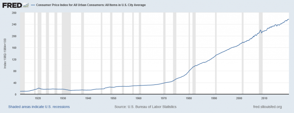
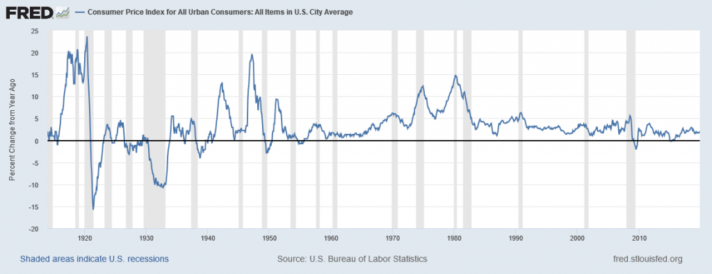
The first two waves of inflation are easy to characterize in historical terms: they are right after World War I and World War II. However, there are also two periods of severe negative inflation—called deflation—in the early decades of the twentieth century: one following the deep 1920-21 recession of and the other during the 1930s Great Depression of the 1930s. (Since inflation is a time when the buying power of money in terms of goods and services is reduced, deflation will be a time when the buying power of money in terms of goods and services increases.) For the period from 1900 to about 1960, the major inflations and deflations nearly balanced each other out, so the average annual rate of inflation over these years was only about 1% per year. A third wave of more severe inflation arrived in the 1970s and departed in the early 1980s.
Times of recession or depression often seem to be times when the inflation rate is lower, as in the recession of 1920–1921, the Great Depression, the recession of 1980–1982, and the Great Recession in 2008–2009. There were a few months in 2009 that were deflationary, but not at an annual rate. High levels of unemployment typically accompany recessions, and the total demand for goods falls, pulling the price level down. Conversely, the rate of inflation often, but not always, seems to start moving up when the economy is growing very strongly, like right after wartime or during the 1960s. The frameworks for macroeconomic analysis, that we developed in other chapters, will explain why recession often accompanies higher unemployment and lower inflation, while rapid economic growth often brings lower unemployment but higher inflation.
Inflation Around the World
Around the rest of the world, the pattern of inflation has been very mixed. Many industrialized countries, not just the United States, had relatively high inflation rates in the 1970s. For example, in 1975, Japan’s inflation rate was over 8% and the inflation rate for the United Kingdom was almost 25%. In the 1980s, inflation rates came down in the United States and in Europe and have largely stayed down.
Countries with controlled economies in the 1970s, like the Soviet Union and China, historically had very low rates of measured inflation—because prices were forbidden to rise by law, except for the cases where the government deemed a price increase to be due to quality improvements. However, these countries also had perpetual shortages of goods, since forbidding prices to rise acts like a price ceiling and creates a situation where quantity demanded often exceeds quantity supplied. As Russia and China made a transition toward more market-oriented economies, they also experienced outbursts of inflation, although we should regard the statistics for these economies as somewhat shakier. Inflation in China averaged about 10% per year for much of the 1980s and early 1990s, although it has dropped off since then. Russia experienced hyperinflation—an outburst of high inflation—of 2,500% per year in the early 1990s, although by 2006 Russia’s consumer price inflation had dipped below 10% per year. The closest the United States has ever reached hyperinflation was during the 1860–1865 Civil War, in the Confederate states.
Many countries in Latin America experienced raging inflation during the 1980s and early 1990s, with inflation rates often well above 100% per year. In 1990, for example, both Brazil and Argentina saw inflation climb above 2000%. Certain countries in Africa experienced extremely high rates of inflation, sometimes bordering on hyperinflation, in the 1990s. Nigeria, the most populous country in Africa, had an inflation rate of 75% in 1995.
In the early 2000s, the problem of inflation appears to have diminished for most countries, at least in comparison to the worst times of recent decades. In recent years, the world’s worst example of hyperinflation was in Zimbabwe, where at one point the government was issuing bills with a face value of $100 trillion (in Zimbabwean dollars)—that is, the bills had $100,000,000,000,000 written on the front, but were almost worthless. In many countries, the memory of double-digit, triple-digit, and even quadruple-digit inflation is not very far in the past. Currently, Venezuela is experiencing a spat of hyperinflation as well. We will discuss hyperinflation in more depth later in the book.
