
8 The Aggregate Market
10.1 macroeconomic perspectives on demand and supply
Some Facts about the Business Cycle
We are now going to begin to learn about the aggregate economy. That is, instead of looking at the supply and demand of a single good, we will begin to think about the supply and demand of everything in an economy. We will cover the basics in this chapter. The goal of learning this is to understand the impact that business cycles have on the macroeconomy and then what we can do to reduce the intensity of the business cycles. But, before we begin, it is important to think about the characteristics of a business cycle:
- Economic fluctuations are irregular meaning that they do not occur in a predictable fashion.
- Economic fluctuations vary in intensity.
- As output (real GDP) declines, other variables decline as well:
- Consumption
- Investment
- Orders for Durable Goods
- Residential Construction
- As output (real GDP) declines, other variables increase:
- Unemployment Rate
- Unemployment Insurance Payments
- Business Inventories (because goods were produced but not sold)
Note: This is a very short list. There are many other variables that are impacted as well. These are just the ones that will be most important to this class.
From: OpenStax Macroeconomics (http://cnx.org/content/col12190/1.4), Chapter 11.1
Say’s Law
Those economists who emphasize the role of supply in the macroeconomy often refer to the work of a famous early nineteenth century French economist named Jean-Baptiste Say (1767–1832). Say’s law is: “Supply creates its own demand.” As a matter of historical accuracy, it seems clear that Say never actually wrote down this law and that it oversimplifies his beliefs, but the law lives on as useful shorthand for summarizing a point of view.
The intuition behind Say’s law is that each time a good or service is produced and sold, it generates income that is earned for someone: a worker, a manager, an owner, or those who are workers, managers, and owners at firms that supply inputs along the chain of production. We alluded to this earlier in our discussion of the National Income approach to measuring GDP. The forces of supply and demand in individual markets will cause prices to rise and fall. The bottom line remains, however, that every sale represents income to someone, and so, Say’s law argues, a given value of supply must create an equivalent value of demand somewhere else in the economy. Because Jean-Baptiste Say, Adam Smith, and other economists writing around the turn of the nineteenth century who discussed this view were known as “classical” economists, modern economists who generally subscribe to the Say’s law view on the importance of supply for determining the size of the macroeconomy are called neoclassical economists.
If supply always creates exactly enough demand at the macroeconomic level, then (as Say himself recognized) it is hard to understand why periods of recession and high unemployment should ever occur. To be sure, even if total supply always creates an equal amount of total demand, the economy could still experience a situation of some firms earning profits while other firms suffer losses. Nevertheless, a recession is not a situation where all business failures are exactly counterbalanced by an offsetting number of successes. A recession is a situation in which the economy as a whole is shrinking in size, business failures outnumber the remaining success stories, and many firms end up suffering losses and laying off workers.
Say’s law that supply creates its own demand does seem a good approximation for the long run. Over periods of some years or decades, as the productive power of an economy to supply goods and services increases, total demand in the economy grows at roughly the same pace. However, over shorter time horizons of a few months or even years, recessions or even depressions occur in which firms, as a group, seem to face a lack of demand for their products.
Keynes’ Law
The alternative to Say’s law, with its emphasis on supply, is Keynes’ law: “Demand creates its own supply.” As a matter of historical accuracy, just as Jean-Baptiste Say never wrote down anything as simpleminded as Say’s law, John Maynard Keynes never wrote down Keynes’ law, but the law is a useful simplification that conveys a certain point of view.
When Keynes wrote his influential work The General Theory of Employment, Interest, and Money during the 1930s Great Depression, he pointed out that during the Depression, the economy’s capacity to supply goods and services had not changed much. U.S. unemployment rates soared higher than 20% from 1933 to 1935, but the number of possible workers had not increased or decreased much. Factories closed, but machinery and equipment had not disappeared. Technologies that had been invented in the 1920s were not un-invented and forgotten in the 1930s. Thus, Keynes argued that the Great Depression—and many ordinary recessions as well—were not caused by a drop in the ability of the economy to supply goods as measured by labor, physical capital, or technology. He argued the economy often produced less than its full potential, not because it was technically impossible to produce more with the existing workers and machines, but because a lack of demand in the economy as a whole led to inadequate incentives for firms to produce. In such cases, he argued, the level of GDP in the economy was not primarily determined by the potential of what the economy could supply, but rather by the amount of total demand.
Keynes’ law seems to apply fairly well in the short run of a few months to a few years, when many firms experience either a drop in demand for their output during a recession or so much demand that they have trouble producing enough during an economic boom. However, demand cannot tell the whole macroeconomic story, either. After all, if demand was all that mattered at the macroeconomic level, then the government could make the economy as large as it wanted just by pumping up total demand through a large increase in the government spending component or by legislating large tax cuts to push up the consumption component. Economies do, however, face genuine limits to how much they can produce, limits determined by the quantity of labor, physical capital, technology, and the institutional and market structures that bring these factors of production together. These constraints on what an economy can supply at the macroeconomic level do not disappear just because of an increase in demand.
Combining Insights
Two insights emerge from this overview of Say’s law with its emphasis on macroeconomic supply and Keynes’ law with its emphasis on macroeconomic demand. The first conclusion, which is not exactly a hot news flash, is that an economic approach focused only on the supply side or only on the demand side can be only a partial success. We need to take into account both supply and demand. The second conclusion is that since Keynes’ law applies more accurately in the short run and Say’s law applies more accurately in the long run, the tradeoffs and connections between the three goals of macroeconomics may be different in the short run and the long run.
10.2 building a model of aggregate demand and aggregate supply
From: OpenStax Macroeconomics (http://cnx.org/content/col12190/1.4), Chapter 11.2
Aggregate Demand
Aggregate demand (AD) refers to the amount of total spending on domestic goods and services in an economy. (Strictly speaking, AD is what economists call total planned expenditure, but just think of aggregate demand as total spending.) It includes all four components of demand: consumption, investment, government spending, and net exports (exports minus imports). This demand is determined by a number of factors, but one of them is the price level—recall though, that the price level is an index number such as the GDP deflator that measures the average price of the things we buy. The aggregate demand (AD) curve shows the total spending on domestic goods and services at each price level.
Figure 10.1 presents an aggregate demand (AD) curve. Just like the aggregate supply curve, the horizontal axis shows real GDP and the vertical axis shows the price level. The AD curve slopes down, which means that increases in the price level of outputs lead to a lower quantity of total spending. The reasons behind this shape are related to how changes in the price level affect the different components of aggregate demand. The following components comprise aggregate demand: consumption spending (C), investment spending (I), government spending (G), and spending on exports (X) minus imports (M): C + I + G + X – M.
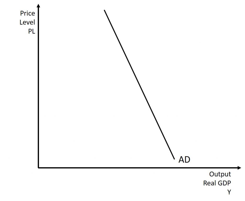
The wealth effect holds that as the price level increases, the buying power of savings that people have stored up in bank accounts and other assets will diminish, eaten away to some extent by inflation. Because a rise in the price level reduces people’s wealth, consumption spending will fall as the price level rises.
The interest rate effect is that as prices for outputs rise, the same purchases will take more money or credit to accomplish. This additional demand for money and credit will push interest rates higher. In turn, higher interest rates will reduce borrowing by businesses for investment purposes and reduce borrowing by households for homes and cars—thus reducing consumption and investment spending.
The foreign price effect points out that if prices rise in the United States while remaining fixed in other countries, then goods in the United States will be relatively more expensive compared to goods in the rest of the world. U.S. exports will be relatively more expensive, and the quantity of exports sold will fall. U.S. imports from abroad will be relatively cheaper, so the quantity of imports will rise. Thus, a higher domestic price level, relative to price levels in other countries, will reduce net export expenditures.
Among economists all three of these effects are controversial, in part because they do not seem to be very large. For this reason, the aggregate demand curve in Figure 10.1 slopes downward fairly steeply. The steep slope indicates that a higher price level for final outputs reduces aggregate demand for all three of these reasons, but that the change in the quantity of aggregate demand as a result of changes in price level is not very large.
Short-run Aggregate Supply and Potential GDP
To build a useful macroeconomic model, we need a model that shows what determines total supply or total demand for the economy, and how total demand and total supply interact at the macroeconomic level. We call this the aggregate demand/aggregate supply model. This module will explain aggregate supply, aggregate demand, and the equilibrium between them. The following modules will discuss the causes of shifts in aggregate supply and aggregate demand.
Firms make decisions about what quantity to supply based on the profits they expect to earn. They determine profits, in turn, by the price of the outputs they sell and by the prices of the inputs, like labor or raw materials, that they need to buy. Short-run aggregate supply (SRAS) refers to the total quantity of output (i.e. real GDP) firms will produce and sell. The short-run aggregate supply (SRAS) curve shows the total quantity of output (i.e. real GDP) that firms will produce and sell at each price level.
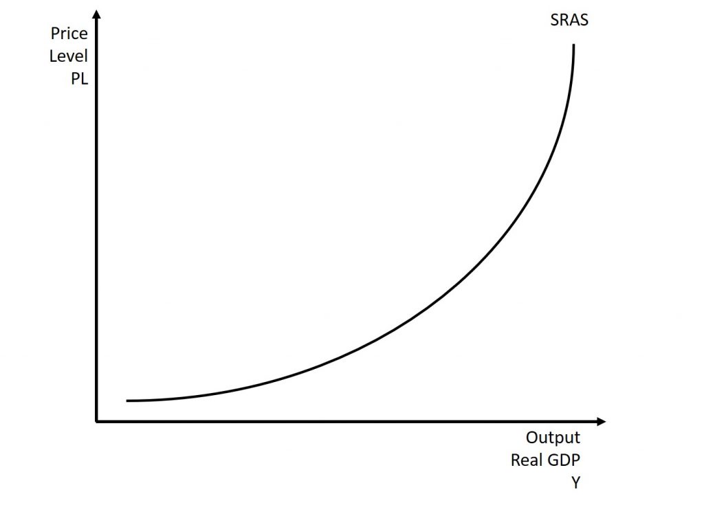
Figure 10.2 shows an aggregate supply curve. In the following paragraphs, we will walk through the elements of the diagram one at a time: the horizontal and vertical axes, the aggregate supply curve itself. We will also discover the relative of the short-run aggregate supply curve which is the potential GDP vertical line, also referred to as the long-run aggregate supply curve (LRAS).
The diagram’s horizontal axis shows real GDP—that is, the level of GDP adjusted for inflation. The vertical axis shows the price level, which measures the average price of all goods and services produced in the economy. In other words, the price level in the AD-AS model is the CPI or GDP Deflator. Remember that the price level is different from the inflation rate. Visualize the price level as an index number, like the Consumer Price Index, while the inflation rate is the percentage change in the price level over time.
As the price level rises, real GDP rises as well. Why? The price level on the vertical axis represents prices for final goods or outputs bought in the economy—i.e. the GDP deflator—not the price level for intermediate goods and services that are inputs to production. Thus, the SRAS curve describes how suppliers will react to a higher price level for final outputs of goods and services, while holding the prices of inputs like labor and energy constant. If firms across the economy face a situation where the price level of what they produce and sell is rising, but their costs of production are not rising, then the lure of higher profits will induce them to expand production. In other words, a short-run aggregate supply curve shows how producers as a group will respond to an increase in aggregate demand.
A SRAS curve’s slope changes from nearly flat at its far left to nearly vertical at its far right. At the far left of the aggregate supply curve, the level of output in the economy is far below potential GDP, which we define as the amount of real GDP an economy can produce by fully employing its existing levels of labor, physical capital, and technology, in the context of its existing market and legal institutions. At these relatively low levels of output, levels of unemployment are high, and many factories are running only part-time, or have closed their doors. In this situation, a relatively small increase in the prices of the outputs that businesses sell—while assuming no rise in input prices—can encourage a considerable surge in the quantity of aggregate supply because so many workers and factories are ready to swing into production.
As the GDP increases, however, some firms and industries will start running into limits: perhaps nearly all of the expert workers in a certain industry will have jobs or factories in certain geographic areas or industries will be running at full speed. In the SRAS curve’s intermediate area, a higher price level for outputs continues to encourage a greater quantity of output—but as the increasingly steep upward slope of the aggregate supply curve shows, the increase in real GDP in response to a given rise in the price level will not be as large.
Economists typically draw the short-run aggregate supply curve to cross the potential GDP line, or LRAS. This is shown in Figure 10.3. This shape may seem puzzling: How can an economy produce at an output level which is higher than its “potential” or “full employment” GDP? The economic intuition here is that if prices for outputs were high enough, producers would make fanatical efforts to produce: all workers would be on double-overtime, all machines would run 24 hours a day, seven days a week. Such hyper-intense production would go beyond using potential labor and physical capital resources fully, to using them in a way that is not sustainable in the long term. Thus, it is possible for production to sprint above potential GDP, but only in the short run.
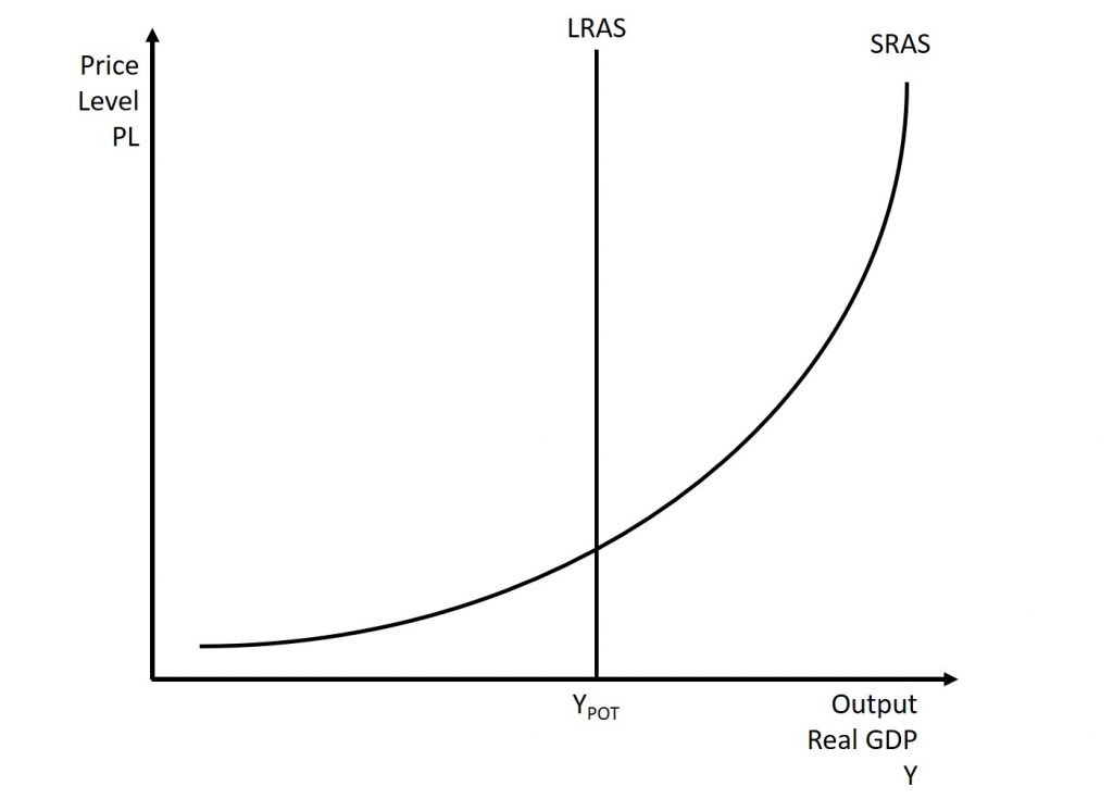
At the far right, the short-run aggregate supply curve becomes nearly vertical. At this quantity, higher prices for outputs cannot encourage additional output, because even if firms want to expand output, the inputs of labor and machinery in the economy are fully employed. When an economy is operating at its potential GDP, machines and factories are running at capacity, and the unemployment rate is relatively low—at the natural rate of unemployment. For this reason, potential GDP is sometimes also called full-employment GDP.
Equilibrium in the Aggregate Demand and Aggregate Supply Model
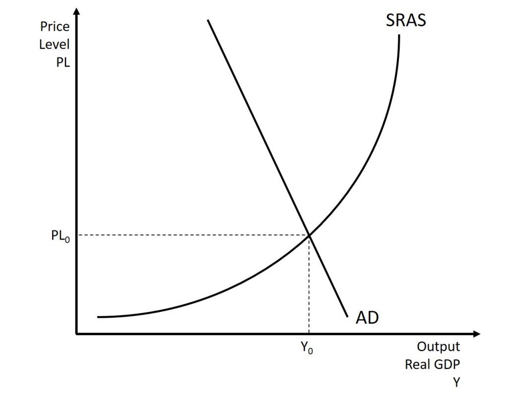
The intersection of the short-run aggregate supply and aggregate demand curves shows the equilibrium level of real GDP and the equilibrium price level in the economy. At a relatively low price level for output, firms have little incentive to produce, although consumers would be willing to purchase a large quantity of output. As the price level rises, short-run aggregate supply rises and aggregate demand falls until the equilibrium point is reached.
Figure 10.4 combines the AD curve from Figure 10.1 and the SRAS curve from Figure 10.2 and places them both on a single diagram.
Is AD/SRAS Micro or Macro?
These aggregate supply and demand models and the microeconomic analysis of demand and supply in particular markets for goods, services, labor, and capital have a superficial resemblance, but they also have many underlying differences.
For example, the vertical and horizontal axes have distinctly different meanings in macroeconomic and microeconomic diagrams. The vertical axis of a microeconomic demand and supply diagram expresses a price (or wage or rate of return) for an individual good or service. This price is implicitly relative: it is intended to be compared with the prices of other products (for example, the price of pizza relative to the price of fried chicken). In contrast, the vertical axis of an aggregate supply and aggregate demand diagram expresses the level of a price index like the Consumer Price Index or the GDP deflator—combining a wide array of prices from across the economy. The price level is absolute: it is not intended to be compared to any other prices since it is essentially the average price of all products in an economy. The horizontal axis of a microeconomic supply and demand curve measures the quantity of a particular good or service. In contrast, the horizontal axis of the aggregate demand and aggregate supply diagram measures GDP, which is the sum of all the final goods and services produced in the economy, not the quantity in a specific market.
In addition, the economic reasons for the shapes of the curves in the macroeconomic model are different from the reasons behind the shapes of the curves in microeconomic models. Demand curves for individual goods or services slope down primarily because of the existence of substitute goods, not the wealth effects, interest rate, and foreign price effects associated with aggregate demand curves. The slopes of individual supply and demand curves can have a variety of different slopes, depending on the extent to which quantity demanded and quantity supplied react to price in that specific market, but the slopes of the SRAS and AD curves are much the same in every diagram (although as we shall see in later chapters, short-run and long-run perspectives will emphasize different parts of the AS curve).
In short, just because the AD/SRAS diagram has two lines that cross, do not assume that it is the same as every other diagram where two lines cross. The intuitions and meanings of the macro and micro diagrams are only distant cousins from different branches of the economics family tree.
10.3 shifts in aggregate supply
From: OpenStax Macroeconomics (http://cnx.org/content/col12190/1.4), Chapter 11.3
The original equilibrium in the AD/SRAS diagram will shift to a new equilibrium if the SRAS or AD curve shifts. When the SRAS curve shifts to the right, then at every price level, producers supply a greater quantity of real GDP. When the SRAS curve shifts to the left, then at every price level, producers supply a lower quantity of real GDP. This module discusses two of the most important factors that can lead to shifts in the SRAS curve: productivity growth and changes in input prices.
How Changes in Input Costs Shift the SRAS Curve
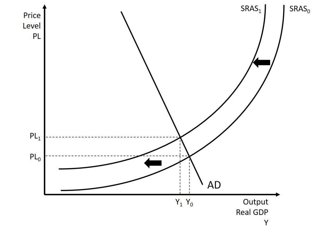
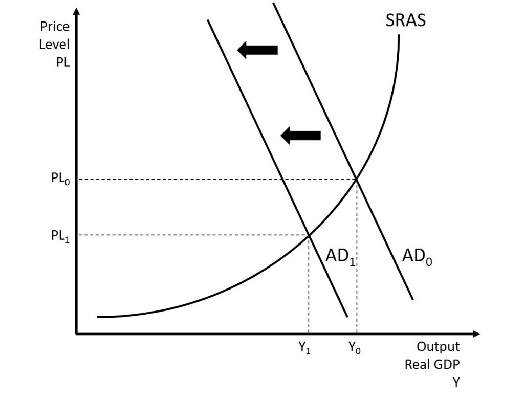
Higher prices for inputs that are widely used across the entire economy can have a macroeconomic impact on aggregate supply. Examples of such widely used inputs include labor and energy products. Increases in the price of such inputs will cause the SRAS curve to shift to the left, which means that at each given price level for outputs, a higher price for inputs will discourage production because it will reduce the possibilities for earning profits. Figure 10.5 shows the aggregate supply curve shifting to the left, from SRAS0 to SRAS1. The movement from the original equilibrium to the new equilibrium will bring a nasty set of effects: reduced GDP or recession, higher unemployment because the economy is now further away from potential GDP, and an inflationary higher price level as well. In the 1970s, this pattern of a shift to the left in SRAS leading to a stagnant economy with high unemployment and inflation was nicknamed stagflation.
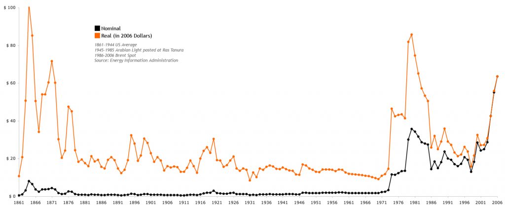
Conversely, a decline in the price of a key input like oil will shift the SRAS curve to the right, providing an incentive for more to be produced at every given price level for outputs. From 1985 to 1986, for example, the average price of crude oil fell by almost half, from $24 a barrel to $12 a barrel. Similarly, from 1997 to 1998, the price of a barrel of crude oil dropped from $17 per barrel to $11 per barrel. In both cases, the plummeting oil price led to a situation like that which we presented earlier in Figure 10.4, where the outward shift of SRAS to the right allowed the economy to expand, unemployment to fall, and inflation to decline.
Along with energy prices, two other key inputs that may shift the SRAS curve are the cost of labor, or wages, and the cost of imported goods that we use as inputs for other products. In these cases as well, the lesson is that lower prices for inputs cause SRAS to shift to the right, while higher prices cause it to shift back to the left. Note that, unlike changes in productivity, which we will discuss shortly, changes in input prices do not generally cause LRAS to shift, only SRAS.
The Oil Crisis of 1973
From: https://en.wikipedia.org/wiki/1973_oil_crisis
The 1973 oil crisis began in October 1973 when the members of the Organization of Arab Petroleum Exporting Countries proclaimed an oil embargo. The embargo was targeted at nations perceived as supporting Israel during the Yom Kippur War.[1] The initial nations targeted were Canada, Japan, the Netherlands, the United Kingdom and the United States with the embargo also later extended to Portugal, Rhodesia and South Africa. By the end of the embargo in March 1974,[2] the price of oil had risen nearly 400%, from US$3 per barrel to nearly $12 globally; US prices were significantly higher. The embargo caused an oil crisis, or “shock”, with many short- and long-term effects on global politics and the global economy.[3] It was later called the “first oil shock”, followed by the 1979 oil crisis, termed the “second oil shock”.
By 1969, American domestic output of oil could not keep pace with increasing demand. In 1925, oil had accounted for one-fifth of American energy use; by the time World War II started one-third of America’s energy needs was met by oil. Oil started to replace coal as a preferred fuel source. It was used to heat homes and generate electricity, and it was the only fuel that could be used for air transport. In 1920, American oilfields accounted for nearly two-thirds of global oil production. In 1945, US production had increased to just over two-thirds. The US had been able to meet its own energy needs independently in the decade between 1945 and 1955, but was importing 350 million barrels per year by the late 1950s, mostly from Venezuela and Canada. In 1973, US production had declined to 16.5% of global output.[4][5]
The Organization of the Petroleum Exporting Countries (OPEC), was founded by five oil producing countries at a Baghdad conference on September 14, 1960. The five founding members of OPEC were Venezuela, Iraq, Saudi Arabia, Iran and Kuwait.[10] OPEC was organized after the oil companies slashed the posted price of oil, but the posted price of oil remained consistently higher than the market price of oil between 1961 and 1972.[11]
In 1963, the Seven Sisters controlled 86% of the oil produced by OPEC countries, but by 1970 the rise of “independent oil companies” had decreased their share to 77%. The entry of three new oil producers—Algeria, Libya and Nigeria—meant that by 1970 81 oil companies were doing business in the Middle East.[12][13]
In September 1973, Richard Nixon said, “Oil without a market, as Mr. Mossadegh learned many, many years ago, does not do a country much good”, referring to the 1951 nationalization of the Iranian oil industry, but between October 1973 and February 1974 the OPEC countries raised by posted price fourfold to nearly $12.[17]
Arab oil producing countries had attempted to use oil as leverage to influence political events on two prior occasions—the first was the Suez Crisis in 1956 when the United Kingdom, France and Israel invaded Egypt. During the conflict the Syrians sabotaged both the Trans-Arabian Pipeline and the Iraq–Baniyas pipeline, which disrupted the supply of oil to Western Europe.[21][22] The second instance was when war broke out between Egypt and Israel in 1967, but despite continued Egyptian and Syrian enmity against Israel, the embargo lasted only a few months.[5] Most scholars agree that the 1967 embargo was ineffective.[23]
Although some members of the Organization of Arab Petroleum Exporting Countries (OAPEC) supported the use of oil as a weapon to influence the political outcome of the Arab–Israeli conflict, Saudi Arabia had traditionally been the strongest supporter of separating oil from politics. The Saudis were wary of the tactic due to the availability of oil from non-Arab oil producing countries, and in the decades leading up to the crisis, the region’s conservative monarchies had grown dependent on Western support to ensure their continued survival as Nasserism gained traction. On the other hand, Algeria, Iraq and Libya had strongly supported the use of oil as a weapon in the conflict.[21] Arab newspapers like the Egyptian Al-Ahram, Lebanese An-Nahar and Iraqi Al-Thawra had historically been supportive of the use of oil as a weapon.[24]
On October 6, 1973, Egypt attacked the Bar Lev Line in the Sinai Peninsula and Syria launched an offensive in the Golan Heights, both of which had been occupied by Israel during the 1967 Six-Day War. On October 12, 1973, US president Richard Nixon authorized Operation Nickel Grass, a strategic airlift to deliver weapons and supplies to Israel in order to replace its materiel losses,[25] after the Soviet Union began sending arms to Syria and Egypt.[26] The following day, on October 17, Arab oil producers cut production by 5% and instituted an oil embargo against Israel’s allies: the United States, the Netherlands, Rhodesia, South Africa, and Portugal.[8] Saudi Arabia only consented to the embargo after Nixon’s promise of $2.2 billion in military aid to Israel.[27] The embargo was accompanied by gradual monthly production cuts—by December, production had been cut to 25% of September levels.[27] This contributed to a global recession and increased tension between the United States and its European allies, who faulted the US for provoking an embargo by providing assistance to Israel.[28] OAPEC demanded a complete Israeli withdrawal from all territories beyond the 1949 Armistice border.[27][29]
The embargo lasted from October 1973 to March 1974.[21] Since Israeli forces did not withdraw to the 1949 Armistice Line, the majority of scholars believe that the embargo was a failure. Roy Licklieder, in his 1988 book Political Power and the Arab Oil Weapon, concluded that the embargo was a failure because the countries that were targeted by the embargo did not change their policies on the Arab–Israeli conflict. Licklieder believed that any long term changes were caused by the OPEC increase in the posted price of oil, and not the OAPEC embargo. Daniel Yergin, on the other hand, has said that the embargo “remade the international economy”.[29]
Over the long term, the oil embargo changed the nature of policy in the West towards increased exploration, alternative energy research, energy conservation and more restrictive monetary policy to better fight inflation.[30]
The Effects of the Embargo
The effects of the embargo were immediate. OPEC forced oil companies to increase payments drastically. The price of oil quadrupled by 1974 from US$3 to nearly US$12 per barrel ($75 per cubic meter), equivalent in 2018 dollars to a price rise from $17 to $61 per barrel.[3] The historic price of oil is shown below in Figure 10.6. This price increase had a dramatic effect on oil exporting nations, for the countries of the Middle East who had long been dominated by the industrial powers were seen to have taken control of a vital commodity. The oil-exporting nations began to accumulate vast wealth.
In the United States, scholars argue that there already existed a negotiated settlement based on equality between both parties prior to 1973. The possibility that the Middle East could become another superpower confrontation with the USSR was of more concern to the US than oil. Further, interest groups and government agencies more worried about energy were no match for Kissinger’s dominance.[39] In the US production, distribution and price disruptions “have been held responsible for recessions, periods of excessive inflation, reduced productivity, and lower economic growth.”[40] Some researchers regard the 1973 “oil price shock” and the accompanying 1973–74 stock market crash as the first discrete event since the Great Depression to have a persistent effect on the US economy.[41]
The embargo had a negative influence on the US economy by causing immediate demands to address the threats to U.S. energy security.[42] On an international level, the price increases changed competitive positions in many industries, such as automobiles. Macroeconomic problems consisted of both inflationary and deflationary impacts.[43] The embargo left oil companies searching for new ways to increase oil supplies, even in rugged terrain such as the Arctic. Finding oil and developing new fields usually required five to 10 years before significant production.[44]
The average US retail price of a gallon of regular gasoline rose 43% from 38.5¢ in May 1973 to 55.1¢ in June 1974. State governments asked citizens not to put up Christmas lights. Oregon banned Christmas and commercial lighting altogether.[45] Politicians called for a national gasoline rationing program.[46] Nixon asked gasoline retailers to voluntarily not sell gasoline on Saturday nights or Sundays; 90% of gas station owners complied, which produced long lines of motorists wanting to fill up their cars while they still could.[45]
A few months later, the crisis eased. The embargo was lifted in March 1974 after negotiations at the Washington Oil Summit, but the effects lingered throughout the 1970s. The dollar price of energy increased again the following year, amid the weakening competitive position of the dollar in world markets.
Before the energy crisis, large, heavy, and powerful cars were popular. By 1971, the standard engine in a Chevrolet Caprice was a 400-cubic inch (6.5 liter) V8. The wheelbase of this car was 121.5 inches (3,090 mm), and Motor Trend‘s 1972 road test of the similar Chevrolet Impala achieved no more than 15 highway miles per gallon. In the 15 years prior to the 1973 oil crisis, gasoline prices in the U.S. had lagged well behind inflation.[79]
The crisis reduced the demand for large cars.[54] Japanese imports, primarily the Toyota Corona, the Toyota Corolla, the Datsun B210, the Datsun 510, the Honda Civic, the Mitsubishi Galant (a captive import from Chrysler sold as the Dodge Colt), the Subaru DL, and later the Honda Accord all had four cylinder engines that were more fuel efficient than the typical American V8 and six cylinder engines. Japanese imports became mass-market leaders with unibody construction and front-wheel drive, which became de facto standards.
Compact trucks were introduced, such as the Toyota Hilux and the Datsun Truck, followed by the Mazda Truck (sold as the Ford Courier), and the Isuzu-built Chevrolet LUV. Mitsubishi rebranded its Forte as the Dodge D-50 a few years after the oil crisis. Mazda, Mitsubishi and Isuzu had joint partnerships with Ford, Chrysler, and GM, respectively. Later, the American makers introduced their domestic replacements (Ford Ranger, Dodge Dakota and the Chevrolet S10/GMC S-15), ending their captive import policy.
Economical imports succeeded alongside heavy, expensive vehicles. In 1976, Toyota sold 346,920 cars (average weight around 2,100 lbs), while Cadillac sold 309,139 cars (average weight around 5,000 lbs).
The Oil Crisis of 1979
The 1979 (or second) oil crisis or oil shock occurred in the world due to decreased oil output in the wake of the Iranian Revolution. Despite the fact that global oil supply decreased by only ~4%, widespread panic resulted, driving the price far higher. The price of crude oil more than doubled to $39.50 per barrel over the next 12 months, and long lines once again appeared at gas stations, as they had in the 1973 oil crisis.[2]
In 1980, following the outbreak of the Iran–Iraq War, oil production in Iran nearly stopped, and Iraq’s oil production was severely cut as well. Economic recessions were triggered in the United States and other countries. Oil prices did not subside to pre-crisis levels until the mid-1980s.
After 1980, oil prices began a 20-year decline, except for a brief rebound during the Gulf War, eventually reaching a 60 percent fall-off during the 1990s. As with the 1973 crisis, global politics and power balance were impacted. Oil exporters such as Mexico, Nigeria, and Venezuela expanded production; the Soviet Union became the top world producer; North Sea and Alaskan oil flooded the market. It seemed that the United States of America and Norway had much more oil reserves than forecasted in the 1970s. OPEC lost influence.
The oil crisis had mixed effects in the United States, due to some parts of the country being oil-producing regions and other parts being oil-consuming regions. Richard Nixon had imposed price controls on domestic oil. Gasoline controls were repealed, but controls on domestic US oil remained.
The Jimmy Carter administration began a phased deregulation of oil prices on April 5, 1979, when the average price of crude oil was US$15.85 per barrel (42 US gallons (160 L)). Starting with the Iranian revolution, the price of crude oil rose to $39.50 per barrel over the next 12 months (its all-time highest real price until March 3, 2008.)[8] Deregulating domestic oil price controls allowed U.S. oil output to rise sharply from the large Prudhoe Bay fields, while oil imports fell sharply.
Due to memories of oil shortage in 1973, motorists soon began panic buying, and long lines appeared at gas stations, as they had six years earlier during the 1973 oil crisis.[10]
As the average vehicle of the time consumed between two and three liters (about 0.5–0.8 gallons) of gasoline (petrol) an hour while idling, it was estimated that Americans wasted up to 150,000 barrels (24,000 m3) of oil per day idling their engines in the lines at gas stations.[11]
How Productivity Growth Shifts the AS Curves
In the long run, the most important factor shifting the AS curves is productivity growth. Productivity means how much output can be produced with a given quantity of labor. One measure of this is output per worker or GDP per capita. Over time, productivity grows so that the same quantity of labor can produce more output.
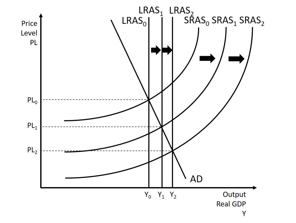
Historically, the real growth in GDP per capita in an advanced economy like the United States has averaged about 2% to 3% per year, but productivity growth has been faster during certain extended periods like the 1960s and the late 1990s through the early 2000s, or slower during periods like the 1970s. A higher level of productivity shifts the SRAS curve to the right, because with improved productivity, firms can produce a greater quantity of output at every price level. Figure 10.7 shows an outward shift in productivity over two time periods. The SRAS curve shifts out from SRAS0 to SRAS1 to SRAS2, and well as corresponding shifts in the equilibrium. Note that with increased productivity, workers can produce more GDP. Thus, full employment corresponds to a higher level of potential GDP, which we show as a rightward shift of the LRAS curve from LRAS0 to LRAS1 to LRAS2.
A shift in the SRAS curve to the right will result in a greater real GDP and downward pressure on the price level, if aggregate demand remains unchanged. However, if this shift in SRAS results from gains in productivity growth, which we typically measure in terms of a few percentage points per year, the effect will be relatively small over a few months or even a couple of years.
Supply Shocks: Shifts of the SRAS and/or LRAS Curve(s)
The aggregate supply curve can also shift due to shocks to input goods or labor. For example, an unexpected early freeze could destroy a large number of agricultural crops, a shock that would shift the SRAS curve to the left since there would be fewer agricultural products available at any given price. The change would not be permanent and would therefore likely only affect the SRAS curve leaving the LRAS curve stationary. This is shown earlier in Figure 10.5.
Similarly, shocks to the labor market can affect aggregate supply. An extreme example might be an overseas war that required a large number of workers to cease their ordinary production in order to go fight for their country. In this case, SRAS and LRAS would both shift to the left because there would be fewer workers available to produce goods at any given price.
The impact a supply shock has on the AS curves depends on the severity of the event. A poor harvest, mentioned earlier, is only likely to affect the short-run as it will not change the long-run productive capabilities of the country. On the other hand, if a war destroys farmland and makes it unusable, the effects are likely to be more permanent and could cause a shift in the LRAS.
10.4 Shifts in aggregate demand
From: OpenStax Macroeconomics (http://cnx.org/content/col12190/1.4), Chapter 11.4
As we mentioned previously, the components of aggregate demand are consumption spending (C), investment spending (I), government spending (G), and spending on exports (X) minus imports (M). A shift of the AD curve to the right means that at least one of these components increased so that a greater amount of total spending would occur at every price level. A shift of the AD curve to the left means that at least one of these components decreased so that a lesser amount of total spending would occur at every price level. Here, the discussion will sketch two broad categories that could cause AD curves to shift: changes in consumer or firm behavior and changes in government tax or spending policy.
How Changes in Consumers and Firms Can Affect AD
When consumers feel more confident about the future of the economy, they tend to consume more. If business confidence is high, then firms tend to spend more on investment, believing that the future payoff from that investment will be substantial. Conversely, if consumer or business confidence drops, then consumption and investment spending decline.
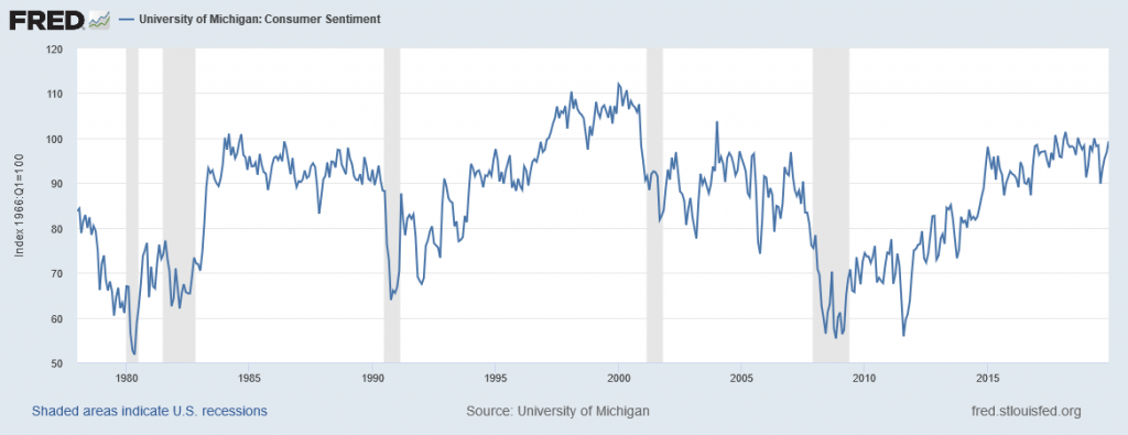
The University of Michigan publishes a survey of consumer confidence and constructs an index of consumer confidence each month. The survey results are then reported at http://www.sca.isr.umich.edu , which break down the change in consumer confidence among different income levels. According to that index, consumer confidence averaged around 90 prior to the Great Recession, and then it fell to below 60 in late 2008, which was the lowest it had been since 1980. Since then, confidence has climbed from a 2011 low of 55.8 back to a level in the low 80s, which economists consider close to a healthy state. The most recent graph is given below in Figure 10.8.
The Organization for Economic Development and Cooperation (OECD) publishes one measure of business confidence: the “business tendency surveys”. The OECD collects business opinion survey data for 21 countries on future selling prices and employment, among other business climate elements. After sharply declining during the Great Recession, the measure has risen above zero again and is back to long-term averages (the indicator dips below zero when business outlook is weaker than usual). Of course, either of these survey measures is not very precise. They can however, suggest when confidence is rising or falling, as well as when it is relatively high or low compared to the past.
Because economists associate a rise in confidence with higher consumption and investment demand, it will lead to an outward shift in the AD curve, and a move of the equilibrium, to a higher quantity of output and a higher price level, as Figure 10.9 shows.

Consumer and business confidence often reflect macroeconomic realities; for example, confidence is usually high when the economy is growing briskly and low during a recession. However, economic confidence can sometimes rise or fall for reasons that do not have a close connection to the immediate economy, like a risk of war, election results, foreign policy events, or a pessimistic prediction about the future by a prominent public figure. U.S. presidents, for example, must be careful in their public pronouncements about the economy. If they offer economic pessimism, they risk provoking a decline in confidence that reduces consumption and investment and shifts AD to the left, and in a self-fulfilling prophecy, contributes to causing the recession that the president warned against in the first place.
Figure 10.10 shows a shift of AD to the left, and the corresponding movement of the equilibrium, to a lower quantity of output and a lower price level.
Another factor that can affect aggregate demand is wealth. If people or businesses feel wealthier, or, at a minimum, that they can now afford more for a reason other than price, they will buy more than they previously did, all else equal. The opposite also holds. This idea of purchasing power will be discussed in the next section when we examine the role of government on aggregate demand.
How Government Macroeconomic Policy Choices Affect AD
Government spending is one component of AD. Thus, higher government spending will cause AD to shift to the right while lower government spending will cause AD to shift to the left. For example, in the United States, government spending declined by 3.2% of GDP during the 1990s, from 21% of GDP in 1991, and to 17.8% of GDP in 1998. However, from 2005 to 2009, the peak of the Great Recession, government spending increased from 19% of GDP to 21.4% of GDP. If changes of a few percentage points of GDP seem small to you, remember that since GDP was about $14.4 trillion in 2009, a seemingly small change of 2% of GDP is equal to close to $300 billion.
Tax policy can affect consumption and investment spending, too. Tax cuts for individuals will tend to increase consumption demand, while tax increases will tend to diminish it. Tax policy can also pump up investment demand by offering lower tax rates for corporations or tax reductions that benefit specific kinds of investment. Shifting C or I will shift the AD curve as a whole.
During a recession, when unemployment is high and many businesses are suffering low profits or even losses, the U.S. Congress often passes tax cuts. During the 2001 recession, for example, the U.S. Congress enacted a tax cut into law. At such times, the political rhetoric often focuses on how people experiencing hard times need relief from taxes.
Government spending and tax rate changes can be useful tools to affect aggregate demand. We will discuss these in greater detail in the upcoming chapters. Other policy tools can shift the aggregate demand curve as well. For example, as we will discuss in the next unit, the Federal Reserve can affect interest rates and credit availability. Higher interest rates tend to discourage borrowing and thus reduce both household spending on big-ticket items like houses and cars and investment spending by business. Conversely, lower interest rates will stimulate consumption and investment demand. Interest rates can also affect exchange rates, which in turn will have effects on the export and import components of aggregate demand.
Clarifying the details of these alternative policies and how they affect the components of aggregate demand can wait for later. Here, the key lesson is that a shift of the aggregate demand curve to the right leads to a greater real GDP and to upward pressure on the price level. Conversely, a shift of aggregate demand to the left leads to a lower real GDP and a lower price level. Whether these changes in output and price level are relatively large or relatively small, and how the change in equilibrium relates to potential GDP, depends on whether the shift in the AD curve is happening in the AS curve’s relatively flat or relatively steep portion.
10.5 The data of macroeconomics in the aggregate model
From: OpenStax Macroeconomics (http://cnx.org/content/col12190/1.4), Chapter 7.5
GDP: Growth and Recession
In the AD/AS diagram, long-run economic growth due to productivity increases over time will be represented by a gradual shift to the right of aggregate supply. The vertical LRAS line representing potential GDP (or the “full employment level of GDP”) will gradually shift to the right over time as well. Earlier Figure 10.5 showed a pattern of economic growth over three years, with the AS curve shifting slightly out to the right each year. However, the factors that determine the speed of this long-term economic growth rate—like investment in physical and human capital, technology, and whether an economy can take advantage of catch-up growth—do not appear directly in the AD/AS diagram.
In the short run, GDP falls and rises in every economy, as the economy dips into recession or expands out of recession.
The AD/AS diagram illustrates recessions when the equilibrium level of real GDP is substantially below potential GDP. From another standpoint, in years of resurgent economic growth the equilibrium will typically be close to potential GDP.
Unemployment
We described two types of unemployment in the Unemployment chapter. Short run variations in unemployment (cyclical unemployment) are caused by the business cycle as the economy expands and contracts. Over the long run, in the United States, the unemployment rate typically hovers around 5% (give or take one percentage point or so), when the economy is healthy. In many of the national economies across Europe, the unemployment rate in recent decades has only dropped to about 10% or a bit lower, even in good economic years. We call this baseline level of unemployment that occurs year-in and year-out the natural rate of unemployment and we determine it by how well the structures of market and government institutions in the economy lead to a matching of workers and employers in the labor market. Potential GDP can imply different unemployment rates in different economies, depending on the natural rate of unemployment for that economy.
The AD/AS diagram shows cyclical unemployment by how close the economy is to the potential or full GDP employment level. Relatively low cyclical unemployment for an economy occurs when the level of output is close to potential GDP. Conversely, high cyclical unemployment arises when the output is substantially to the left of potential GDP on the AD/AS diagram. Although we do not show the factors that determine the natural rate of unemployment separately in the AD/AS model, they are implicitly part of what determines potential GDP or full employment GDP in a given economy.
Inflation
Inflation fluctuates in the short run. Higher inflation rates have typically occurred either during or just after economic booms: for example, the biggest spurts of inflation in the U.S. economy during the twentieth century followed the wartime booms of World War I and World War II. Conversely, rates of inflation generally decline during recessions. As an extreme example, inflation actually became negative—a situation called “deflation”—during the Great Depression. Even during the relatively short 1991-1992 recession, the inflation rate declined from 5.4% in 1990 to 3.0% in 1992. During the relatively short 2001 recession, the rate of inflation declined from 3.4% in 2000 to 1.6% in 2002. During the deep recession of 2007–2009, the inflation rate declined from 3.8% in 2008 to –0.4% in 2009. Some countries have experienced bouts of high inflation that lasted for years. In the U.S. economy since the mid–1980s, inflation does not seem to have had any long-term trend to be substantially higher. Instead, it has stayed in the 1–5% range annually.
The AD/AS framework implies two ways that inflationary pressures may arise. One possible trigger is if aggregate demand continues to shift to the right when the economy is already at or near potential GDP and full employment, thus pushing the macroeconomic equilibrium into the SRAS curve’s steep portion.When there is a shift of aggregate demand to the right, the new equilibrium is clearly at a higher price level than the original equilibrium. In this situation, the aggregate demand in the economy has soared so high that firms in the economy are not capable of producing additional goods, because labor and physical capital are fully employed, and so additional increases in aggregate demand can only result in a rise in the price level.
An alternative source of inflationary pressures can occur due to a rise in input prices that affects many or most firms across the economy—perhaps an important input to production like oil or labor—and causes the aggregate supply curve to shift back to the left. The SRAS curve’s shift to the left also increases the price level at the new equilibrium. In effect, the rise in input prices ends up, after the final output is produced and sold, passing along in the form of a higher price level for outputs.
The AD/AS diagram shows only a one-time shift in the price level. It does not address the question of what would cause inflation either to vanish after a year, or to sustain itself for several years. There are two explanations for why inflation may persist over time. One way that continual inflationary price increases can occur is if the government continually attempts to stimulate aggregate demand in a way that keeps pushing the AD curve when it is already in the SRAS curve’s steep portion. A second possibility is that, if inflation has been occurring for several years, people might begin to expect a certain level of inflation. If they do, then these expectations will cause prices, wages and interest rates to increase annually by the amount of the inflation expected. These two reasons are interrelated, because if a government fosters a macroeconomic environment with inflationary pressures, then people will grow to expect inflation. However, the AD/AS diagram does not show these patterns of ongoing or expected inflation in a direct way.
