
Data Visualization
A general term describing any effort to help people understand the significance of data by placing it in a visual context. Patterns, trends and correlations that might go undetected in text-based data can be exposed and recognized easier with data visualization software. There are two pioneers of this concept; Hans Rosling from Sweden who created the GapMinder tool we we will learn a little more about later and Edward Tufte from Yale. Tufte talks a lot about models that summarize, show, and explain something relevant. Their purpose is to lead to consequential actions.
As we have discussed before, our minds are used to looking for patterns. If we spot a pattern we more quickly recognize what we are seeing and can usually get to an answer. Pattern recognition most likely ties back to man’s tribal period when hunting for food and protecting the tribe were 2 community goals. Searching the landscape around him, early man was looking for threats or opportunities. What is that movement over there? Is that a tiger hiding in the grass or an antelope. Once I identify what I am seeing I know what to do. I have a response
A recent NY Time article by journalist Kate Murphy included the following:
“I attended a Thanksgiving dinner several years ago where the hostess, without warning family and friends, broke with tradition and served salmon instead of turkey, roasted potatoes instead of mashed, raspberry coulis instead of cranberry sauce and … you get the idea.
While a few guests mustered the politesse to say the meal was “something else,” most reacted with undisguised dismay. Some seethed. Others sulked. One young guest actually cried. No one had seconds.
It wasn’t that the meal itself was bad. In fact, the meal was outstanding. The problem was that it wasn’t the meal everyone was expecting.
When there are discrepancies between expectations and reality, all kinds of distress signals go off in the brain. It doesn’t matter if it’s a holiday ritual or more mundane habit like how you tie your shoes; if you can’t do it the way you normally do it, you’re biologically engineered to get upset.”
“Our brains are statistical organs that are built simply to predict what will happen next,” said Karl Friston, a professor of neuroscience at University College London. In other words, we have evolved to minimize surprise.
This makes sense because, in prehistoric times, faulty predictions could lead to some very unpleasant surprises — like a tiger eating you or sinking in quicksand. So-called prediction errors (like finding salmon instead of turkey on your plate on Thanksgiving) send us into a tizzy because our brains interpret them as a potential threat. Routines, rituals and habits arise from the primitive part of our brains telling us, “Keep doing what you’ve been doing, because you did it before, and you didn’t die.”
Routines and rituals also conserve precious brainpower. It turns out our brains are incredibly greedy when it comes to energy consumption, sucking up 20 percent of calories while accounting for only 2 percent of overall body weight. When our routines are disrupted, we have to make new predictions about the world — gather information, consider options and make choices. And that has a significant metabolic cost.
Dr. Friston said that our brains, when uncertain, can become like overheated computers: “The amount of updating you have to do in the face of new evidence scores the complexity of your processing, and that can be measured in joules or blood flow or temperature of your brain.” That exertion, combined with the primordial sense of threat, produces negative emotions like fear, anxiety, hopelessness, apprehension, anger, irritability and stress.
Sounds like finding patterns makes us more comfortable. Do you like doing puzzles> How do you start a jigsaw puzzle what do you do first?
Sorting is a natural activity to begin understanding a problem. Most of us do it naturally and instinctively.
For Example:
Suppose I tell you that a bat and ball together cost $1.10.
The bat costs a dollar more than the ball. How much does the ball cost?
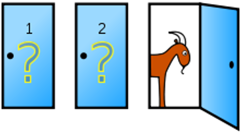
Monty Hall Problem
Suppose you’re on a game show, and you’re given the choice of three doors: Behind one door is a car; behind the others, goats. You pick a door, say No. 1, and the host, who knows what’s behind the doors, opens another door, say No. 3, which has a goat. He then says to you, “Do you want to trade?“
Is it to your advantage to switch your choice?
Data Visualization Patterns
Philip Tetlock Dan Gartner, Super Forecasting, Broadway Books 2015
Dual system Model
System 1 and System 2
System 1 sees patterns and answers quickly – Hunch? First answer is usually correct?
System 2 Interrogates the answer. Does it stand up to scrutiny? I s it based on evidence? Takes time, resources.
System 1 answer comes first, only then does system 2 get involved (sometimes).
Cognitive Reflection Test – answer seems reasonable we stop analyzing. Go with strong hunches.
“In the Paleolithic world in which our brains evolved, that’s not a bad way of making decisions. Gathering all evidence and mulling it over may be the best way to produce accurate answers, but a hunter-gatherer who consults statistics on lions before deciding whether to worry about the shadow in the grass isn’t likely to live long enough to bequeath his accuracy-maximizing genes to the next generation.
Snap judgements are sometimes essential.”
In the Paleolithic world if I am hunting I am scanning my environment looking for food what am I doing?
As I cast my gaze around my brain is looking through multiple visual images looking for the food. Am I sorting, looking at patterns, trying to find the anomaly? Not just trees, trees with a mammoth hiding?
If I am protecting my clan isn’t it the same? Scanning visual images for a threat?
Pattern recognition? Which is Scanning, Sorting or filtering, and selecting.
During WWII, the Navy tried to determine where they needed to armor their aircraft to ensure they came back home. They ran an analysis of where planes had been shot up, and came up with this.
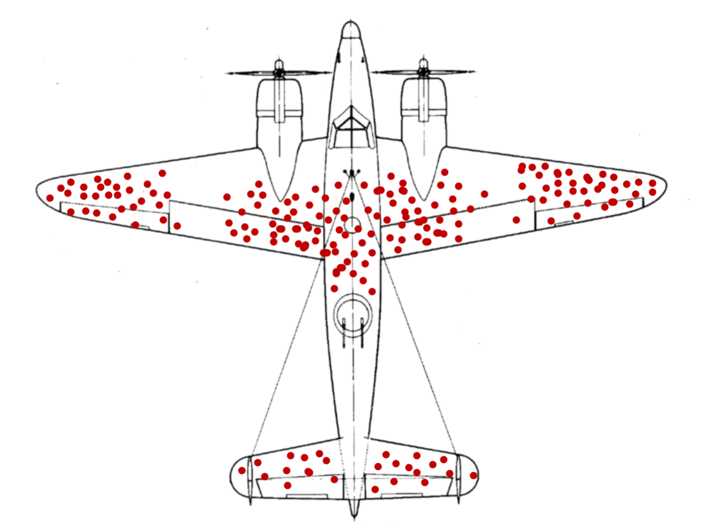
Survivorship Bias
Author: McGeddon
Creative Commons Attribution-Share Alike 4.0 International
Obviously the places that needed to be up-armored are the wingtips, the central body, and the elevators. That’s where the planes were all getting shot up.
Abraham Wald, a statistician, disagreed. He thought they should better armor the nose area, engines, and mid-body. Which was crazy, of course. That’s not where the planes were getting shot.
Example:
Suppose I show you this data in a spreadsheet:
Or would it be more relevant as a Data Visualization
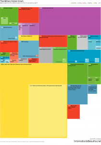
Data visualizations built around economic and social matters are surefire ways to get your audience thinking and also have an inherent shareability (a product of the times and the human condition, I suppose). David McCandless’s The Billion Dollar Gram is a visualization that provides context to the incomprehensibly large monetary figures we hear in the media.
The Most Influential Data Visualizations of all Time
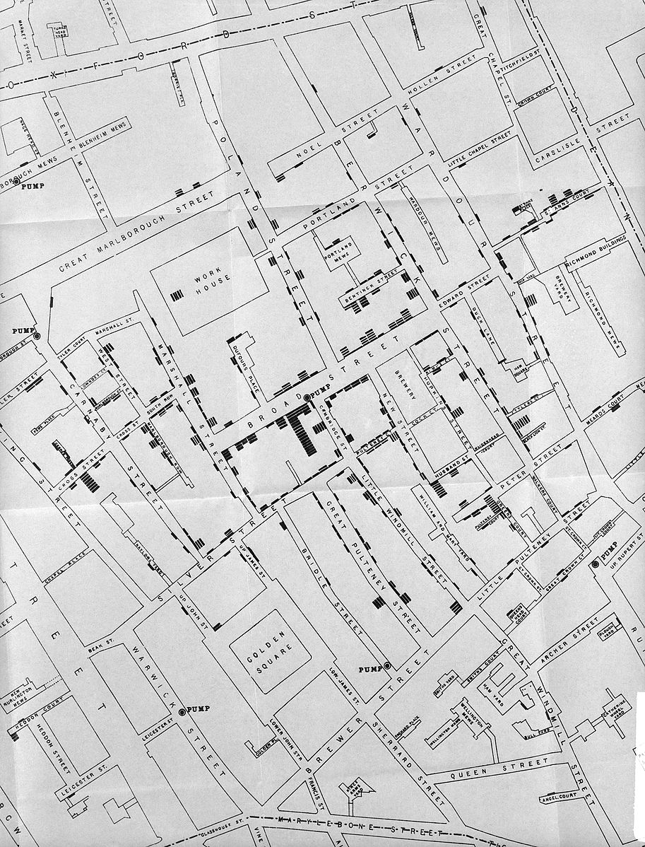
London Cholera Epidemic (1853) – John Snow
Snow was a skeptic of the then-dominant miasma theory that stated that diseases such as cholera and bubonic plague were caused by pollution or a noxious form of “bad air”. The germ theory of disease had not yet been developed, so Snow did not understand the mechanism by which the disease was transmitted. His observation of the evidence led him to discount the theory of foul air.
By talking to local residents, he identified the source of the outbreak as the public water pump on Broad Street. Although Snow’s chemical and microscope examination of a water sample from the Broad Street pump did not conclusively prove its danger, his studies of the pattern of the disease were convincing enough to persuade the local council to disable the well pump by removing its handle. This action has been commonly credited as ending the outbreak.
Snow used a dot map to illustrate the cluster of cholera cases around the pump. He also used statistics to illustrate the connection between the quality of the water source and cholera cases. He showed that homes supplied by the Southwark and Vauxhall Waterworks Company, which was taking water from sewage-polluted sections of the Thames, had a cholera rate fourteen times that of those supplied by Lambeth Waterworks Company, which obtained water from the upriver, cleaner Seething Wells.[24][25] Snow’s study was a major event in the history of public health and geography. It is regarded as the founding event of the science of epidemiology.
 Attribution 4.0 International (CC BY 4.0)
Copyrighted work available under Creative Commons Attribution only license CC BY 4.0 http://creativecommons.org/licenses/by/4.0/
Credit: Wellcome Library, London. Wellcome Images images@wellcome.ac.uk http://wellcomeimages.org Street Map of Soho, around Golden Square, illustrating incidences of cholera deaths during the period of the Cholera Epidemic, 1853. c. 1850 On the mode of communication of cholera Snow, John Published: 1855
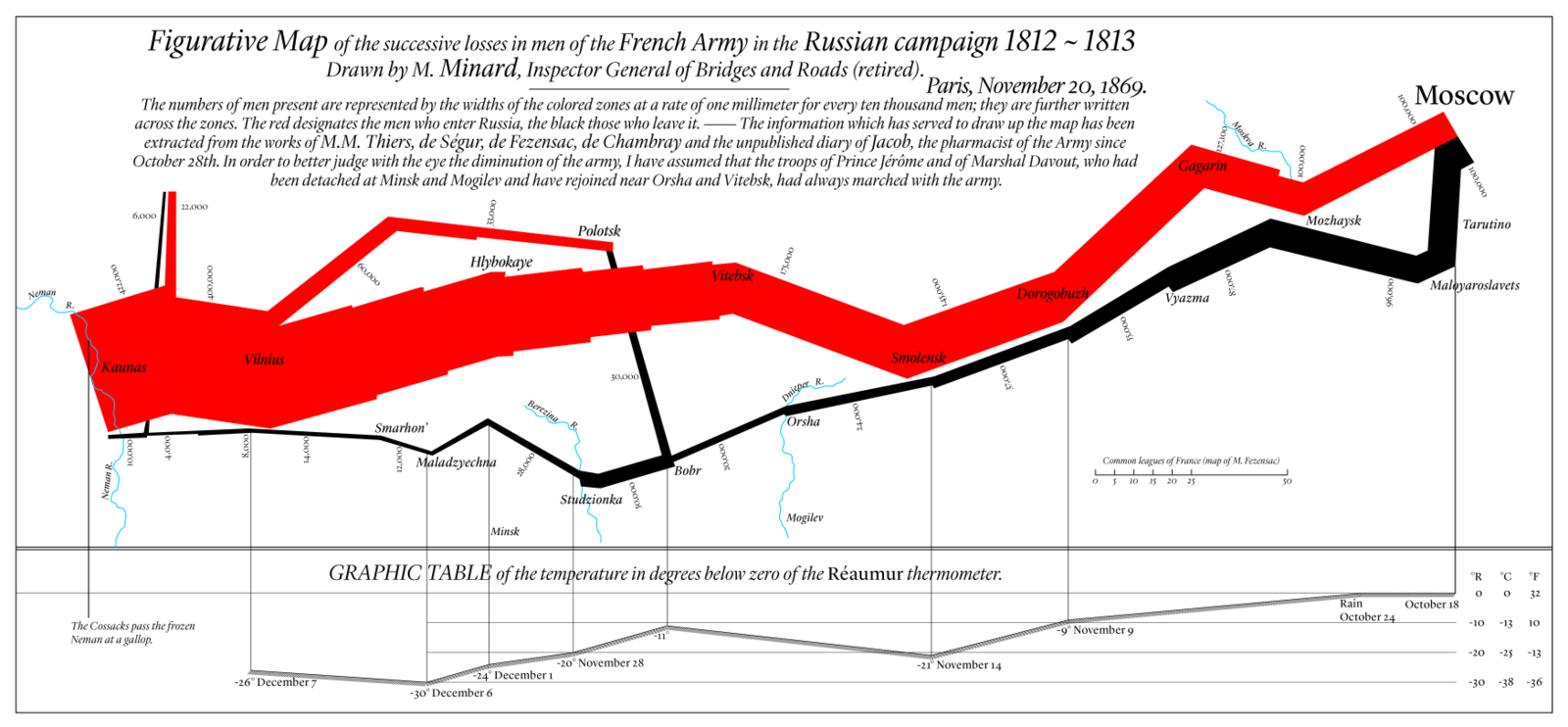
The March on Moscow (Napoleons Army)
Charles Minard is best known for his cartographic depiction of numerical data on a map of Napoleon’s disastrous losses suffered during the Russian campaign of 1812. The illustration depicts Napoleon’s army departing the Polish-Russian border. A thick band illustrates the size of his army at specific geographic points during their advance and retreat. It displays six types of data in two dimensions: the number of Napoleon’s troops; the distance traveled; temperature; latitude and longitude; direction of travel; and location relative to specific dates without making mention of Napoleon; Minard’s interest lay with the travails and sacrifices of the soldiers.
 Creative Commons Attribution-Share Alike 4.0 International
Author: DkEgy
Redrawing of Charles Minard’s Napoleon Map
War Morality
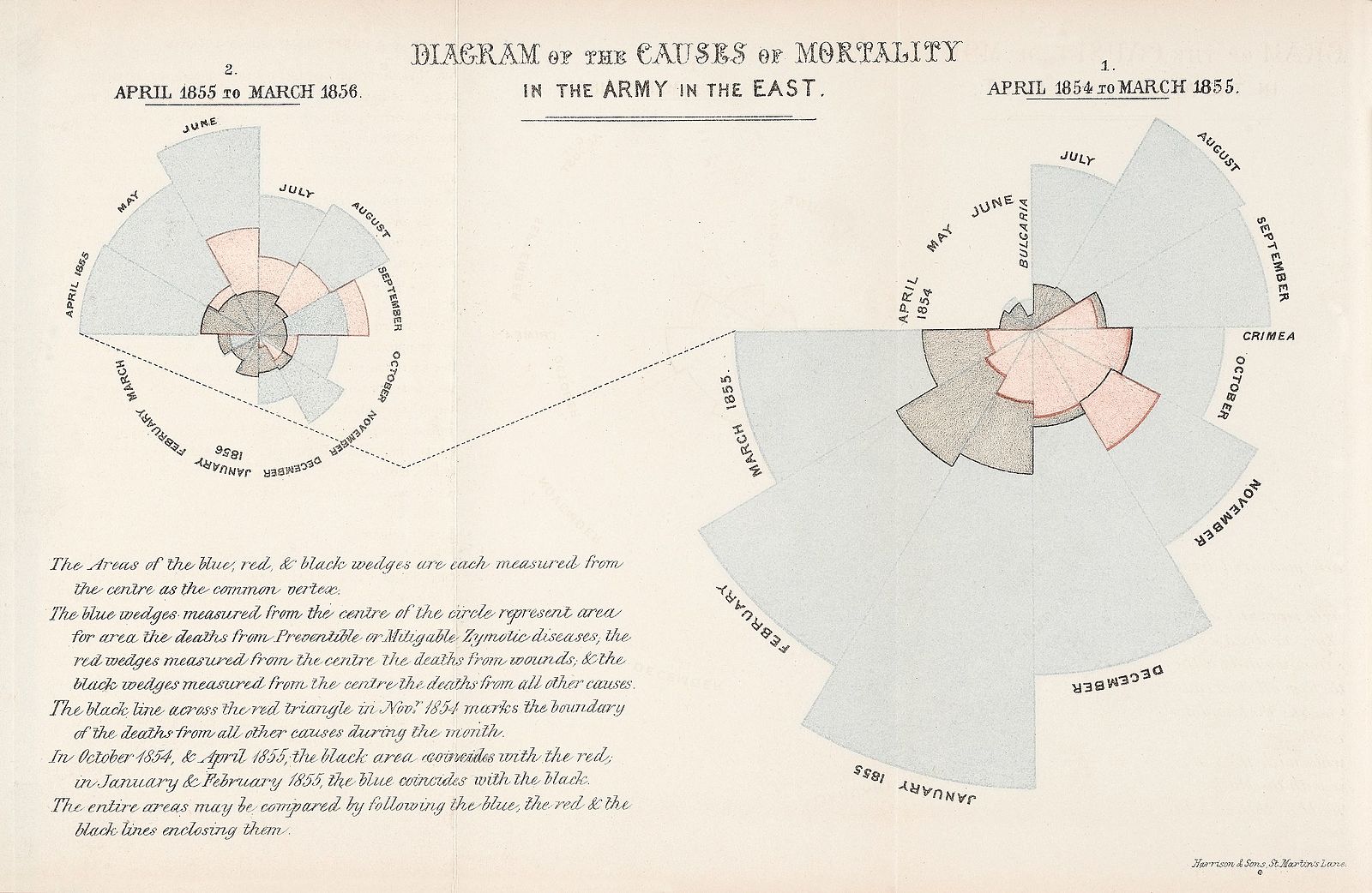
Exceptional data visualizations do have the power to effect widespread change. Florence Nightingale’s legendary 1858 infographic ‘Diagram of the causes of mortality in the Army in the East’ (hereafter referred to as ‘Mortality Diagram’) helped convince Queen Victoria to adapt Nightingale’s recommendations for war medicine and sanitation practices. These would later become standard practice worldwide, and eventually help save the lives of countless soldiers throughout history. Nightingale’s infographic has the distinction of being one of the first data visualizations to shape policy in this way, and with its striking, innovative, and adaptive design, it is not surprising that it is still regarded as one of the most influential infographics of all time.
During the British campaign in Crimea, Nightingale served as “Superintendent of the female nursing establishment in the English General Military Hospitals in Turkey.” During her posting, she saw in cold detail the means by which soldiers were dying in droves. She observed that while the battles took their toll, by far the greatest killer was not the war itself but the de-prioritization of the soldiers fighting it.
A lack of resources allocated for hygienic facilities, proper nutrition, adequate medical care and a host of other factors had led illness (preventable or mitigatable zymotic diseases) to skyrocket in hospitals and camps. Hospital conditions were especially appalling because “there were no blankets, beds, furniture, food, or cooking utensils, and there were rats and fleas everywhere.” Unsurprisingly, far more men were dying there, of largely preventable illness, than on the battlefield or from wounds sustained on it.
Example of polar area diagram by Florence Nightingale (1820–1910).
This “Diagram of the causes of mortality in the army in the East” was published in Notes on Matters Affecting the Health, Efficiency, and Hospital Administration of the British Army and sent to Queen Victoria in 1858.
This graphic indicates the number of deaths that occurred from preventable diseases (in blue), those that were the results of wounds (in red), and those due to other causes (in black).
The legend reads:
The Areas of the blue, red, & black wedges are each measured from the center as the common vertex.
The blue wedges measured from the center of the circle represent area for area the deaths from Preventable or Mitigatable Zymotic diseases, the red wedges measured from the center the deaths from wounds, & the black wedges measured from the center the deaths from all other causes.
The black line across the red triangle in Nov. 1854 marks the boundary of the deaths from all other causes during the month.
In October 1854, & April 1855, the black area coincides with the red, in January & February 1856, the blue coincides with the black.
The entire areas may be compared by following the blue, the red, & the black lines enclosing them.
Copyrighted work available under Creative Commons Attribution only licence CC BY 4.0 http://creativecommons.org/licenses/by/4.0/
Credit: Wellcome Library, London. Wellcome Images images@wellcome.ac.uk http://wellcomeimages.org Two colour charts showing the causes of mortality in the army in the East. 1858 Notes on matters affecting the health, efficiency, and hospital administration of the British Army : founded chiefly on the experience of the late war / Florence Nightingale Published: 1858.
Gapminder (Hans Rosling)
Screen shot of https://www.gapminder.org/tools/ data visualization tool.
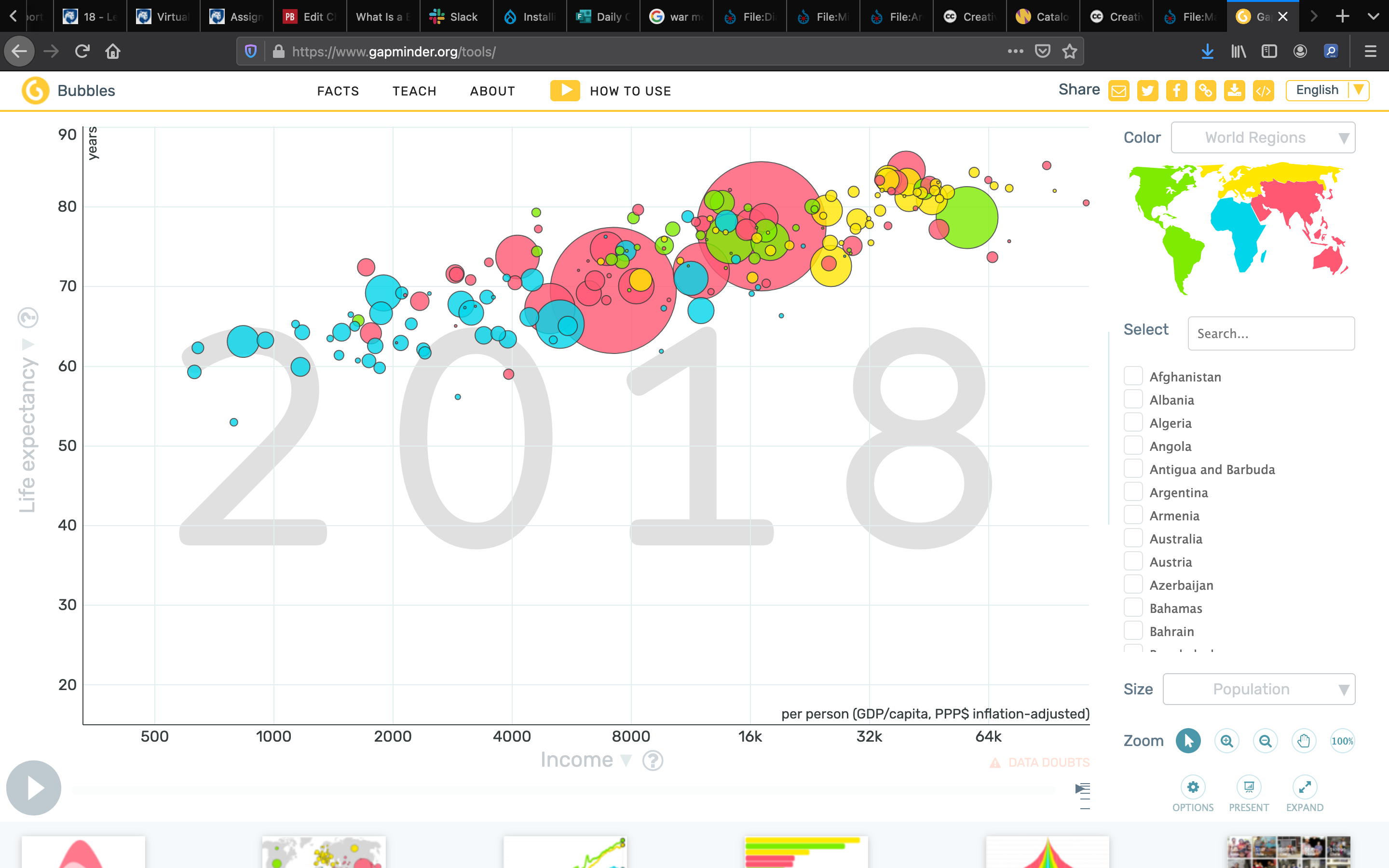
Hans Rosling
https://www.youtube.com/watch?v=hVimVzgtD6w
http://www.gapminder.org/tools/#_state_time_value=1841;;&chart-type=bubbles
Links for additional content:
informationisbeautiful.net mountains-out-of-molehills
Neil Halloran’s ‘The Fallen of World War II’
Information is beautiful – David McCandless
