
Module 2: Descriptive Statistics
Section Exercises
Barbara Illowsky & OpenStax et al.
Stem-and-Leaf Graphs (Stemplots), Line Graphs, and Bar Graphs
1. The miles per gallon rating for 30 cars are shown below (lowest to highest). 19, 19, 19, 20, 21, 21, 25, 25, 25, 26, 26, 28, 29, 31, 31, 32, 32, 33, 34, 35, 36, 37, 37, 38, 38, 38, 38, 41, 43, 43
3. The data are the prices of different laptops at an electronics store. Round each value to the nearest ten. 249, 249, 260, 265, 265, 280, 299, 299, 309, 319, 325, 326, 350, 350, 350, 365, 369, 389, 409, 459, 489, 559, 569, 570, 610
In a survey, 40 people were asked how many times they visited a store before making a major purchase. The results are shown in the table.
| Number of times in store | Frequency |
|---|---|
| 1 | 4 |
| 2 | 10 |
| 3 | 16 |
| 4 | 6 |
| 5 | 4 |
| Years since last purchase | Frequency |
|---|---|
| 0 | 2 |
| 1 | 8 |
| 2 | 13 |
| 3 | 22 |
| 4 | 16 |
| 5 | 9 |
Several children were asked how many TV shows they watch each day. The results of the survey are shown in the table.
| Number of TV Shows | Frequency |
|---|---|
| 0 | 12 |
| 1 | 18 |
| 2 | 36 |
| 3 | 7 |
| 4 | 2 |
| Seasons | Number of students | Proportion of population |
|---|---|---|
| Spring | 8 | 24% |
| Summer | 9 | 26% |
| Autumn | 11 | 32% |
| Winter | 6 | 18% |
5. Using the data from Mrs. Ramirez’s math class supplied in the tables, construct a bar graph showing the percentages.
| High School | Science competition population | Overall student population |
|---|---|---|
| Alabaster | 28.9% | 8.6% |
| Concordia | 7.6% | 23.2% |
| Genoa | 12.1% | 15.0% |
| Mocksville | 18.5% | 14.3% |
| Tynneson | 24.2% | 10.1% |
| West End | 8.7% | 28.8% |
7. Use the data from the David County science competition supplied in the table above. Construct a bar graph that shows the county-wide population percentage of students at each school.
8. Student grades on a chemistry exam were: 77, 78, 76, 81, 86, 51, 79, 82, 84, 99
- Construct a stem-and-leaf plot of the data.
- Are there any potential outliers? If so, which scores are they? Why do you consider them outliers?
9. The table contains the 2010 obesity rates in U.S. states and Washington, DC.
| State | Percent (%) | State | Percent (%) | State | Percent (%) |
|---|---|---|---|---|---|
| Alabama | 32.2 | Kentucky | 31.3 | North Dakota | 27.2 |
| Alaska | 24.5 | Louisiana | 31.0 | Ohio | 29.2 |
| Arizona | 24.3 | Maine | 26.8 | Oklahoma | 30.4 |
| Arkansas | 30.1 | Maryland | 27.1 | Oregon | 26.8 |
| California | 24.0 | Massachusetts | 23.0 | Pennsylvania | 28.6 |
| Colorado | 21.0 | Michigan | 30.9 | Rhode Island | 25.5 |
| Connecticut | 22.5 | Minnesota | 24.8 | South Carolina | 31.5 |
| Delaware | 28.0 | Mississippi | 34.0 | South Dakota | 27.3 |
| Washington, DC | 22.2 | Missouri | 30.5 | Tennessee | 30.8 |
| Florida | 26.6 | Montana | 23.0 | Texas | 31.0 |
| Georgia | 29.6 | Nebraska | 26.9 | Utah | 22.5 |
| Hawaii | 22.7 | Nevada | 22.4 | Vermont | 23.2 |
| Idaho | 26.5 | New Hampshire | 25.0 | Virginia | 26.0 |
| Illinois | 28.2 | New Jersey | 23.8 | Washington | 25.5 |
| Indiana | 29.6 | New Mexico | 25.1 | West Virginia | 32.5 |
| Iowa | 28.4 | New York | 23.9 | Wisconsin | 26.3 |
| Kansas | 29.4 | North Carolina | 27.8 | Wyoming | 25.1 |
- Use a random number generator to randomly pick eight states. Construct a bar graph of the obesity rates of those eight states.
- Construct a bar graph for all the states beginning with the letter “A.”
- Construct a bar graph for all the states beginning with the letter “M.”
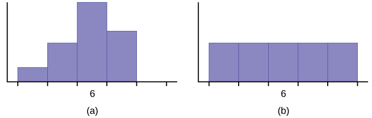
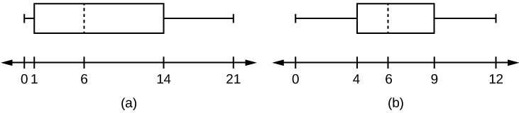
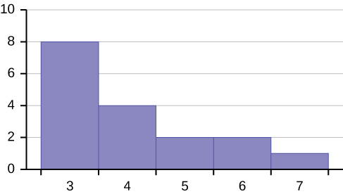
Histograms, Frequency Polygons, and Time Series Graphs
10. Sixty-five randomly selected car salespersons were asked the number of cars they generally sell in one week. Fourteen people answered that they generally sell three cars; nineteen generally sell four cars; twelve generally sell five cars; nine generally sell six cars; eleven generally sell seven cars. Complete the table.
| Data Value (# cars) | Frequency | Relative Frequency | Cumulative Relative Frequency |
|---|---|---|---|
11. What does the frequency column in Table sum to? Why?
13. What is the difference between relative frequency and frequency for each data value in Table?
15. To construct the histogram for the data in Table, determine appropriate minimum and maximum x and y values and the scaling. Sketch the histogram. Label the horizontal and vertical axes with words. Include numerical scaling.
16. Construct a frequency polygon for the following:
-
Pulse Rates for Women Frequency 60–69 12 70–79 14 80–89 11 90–99 1 100–109 1 110–119 0 120–129 1 -
Actual Speed in a 30 MPH Zone Frequency 42–45 25 46–49 14 50–53 7 54–57 3 58–61 1 -
Tar (mg) in Nonfiltered Cigarettes Frequency 10–13 1 14–17 0 18–21 15 22–25 7 26–29 2
17. Construct a frequency polygon from the frequency distribution for the 50 highest ranked countries for depth of hunger.
| Depth of Hunger | Frequency |
|---|---|
| 230–259 | 21 |
| 260–289 | 13 |
| 290–319 | 5 |
| 320–349 | 7 |
| 350–379 | 1 |
| 380–409 | 1 |
| 410–439 | 1 |
18. Use the two frequency tables to compare the life expectancy of men and women from 20 randomly selected countries. Include an overlayed frequency polygon and discuss the shapes of the distributions, the center, the spread, and any outliers. What can we conclude about the life expectancy of women compared to men?
| Life Expectancy at Birth – Women | Frequency |
|---|---|
| 49–55 | 3 |
| 56–62 | 3 |
| 63–69 | 1 |
| 70–76 | 3 |
| 77–83 | 8 |
| 84–90 | 2 |
| Life Expectancy at Birth – Men | Frequency |
|---|---|
| 49–55 | 3 |
| 56–62 | 3 |
| 63–69 | 1 |
| 70–76 | 1 |
| 77–83 | 7 |
| 84–90 | 5 |
19. Construct a times series graph for (a) the number of male births, (b) the number of female births, and (c) the total number of births.
| Sex/Year | 1855 | 1856 | 1857 | 1858 | 1859 | 1860 | 1861 |
| Female | 45,545 | 49,582 | 50,257 | 50,324 | 51,915 | 51,220 | 52,403 |
| Male | 47,804 | 52,239 | 53,158 | 53,694 | 54,628 | 54,409 | 54,606 |
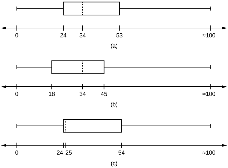
| Total | 93,349 | 101,821 | 103,415 | 104,018 | 106,543 | 105,629 | 107,009 |
| Sex/Year | 1862 | 1863 | 1864 | 1865 | 1866 | 1867 | 1868 | 1869 |
| Female | 51,812 | 53,115 | 54,959 | 54,850 | 55,307 | 55,527 | 56,292 | 55,033 |
| Male | 55,257 | 56,226 | 57,374 | 58,220 | 58,360 | 58,517 | 59,222 | 58,321 |
| Total | 107,069 | 109,341 | 112,333 | 113,070 | 113,667 | 114,044 | 115,514 | 113,354 |
| Sex/Year | 1871 | 1870 | 1872 | 1871 | 1872 | 1827 | 1874 | 1875 |
| Female | 56,099 | 56,431 | 57,472 | 56,099 | 57,472 | 58,233 | 60,109 | 60,146 |
| Male | 60,029 | 58,959 | 61,293 | 60,029 | 61,293 | 61,467 | 63,602 | 63,432 |
| Total | 116,128 | 115,390 | 118,765 | 116,128 | 118,765 | 119,700 | 123,711 | 123,578 |
20. The following data sets list full time police per 100,000 citizens along with homicides per 100,000 citizens for the city of Detroit, Michigan during the period from 1961 to 1973.
| Year | 1961 | 1962 | 1963 | 1964 | 1965 | 1966 | 1967 |
| Police | 260.35 | 269.8 | 272.04 | 272.96 | 272.51 | 261.34 | 268.89 |
| Homicides | 8.6 | 8.9 | 8.52 | 8.89 | 13.07 | 14.57 | 21.36 |
| Year | 1968 | 1969 | 1970 | 1971 | 1972 | 1973 |
| Police | 295.99 | 319.87 | 341.43 | 356.59 | 376.69 | 390.19 |
| Homicides | 28.03 | 31.49 | 37.39 | 46.26 | 47.24 | 52.33 |
- Construct a double time series graph using a common x-axis for both sets of data.
- Which variable increased the fastest? Explain.
- Did Detroit’s increase in police officers have an impact on the murder rate? Explain.
21. Suppose that three book publishers were interested in the number of fiction paperbacks adult consumers purchase per month. Each publisher conducted a survey. In the survey, adult consumers were asked the number of fiction paperbacks they had purchased the previous month. The results are as follows:
| # of books | Freq. | Rel. Freq. |
|---|---|---|
| 0 | 10 | |
| 1 | 12 | |
| 2 | 16 | |
| 3 | 12 | |
| 4 | 8 | |
| 5 | 6 | |
| 6 | 2 | |
| 8 | 2 |
| # of books | Freq. | Rel. Freq. |
|---|---|---|
| 0 | 18 | |
| 1 | 24 | |
| 2 | 24 | |
| 3 | 22 | |
| 4 | 15 | |
| 5 | 10 | |
| 7 | 5 | |
| 9 | 1 |
| # of books | Freq. | Rel. Freq. |
|---|---|---|
| 0–1 | 20 | |
| 2–3 | 35 | |
| 4–5 | 12 | |
| 6–7 | 2 | |
| 8–9 | 1 |
- Find the relative frequencies for each survey. Write them in the charts.
- Using either a graphing calculator, computer, or by hand, use the frequency column to construct a histogram for each publisher’s survey. For Publishers A and B, make bar widths of one. For Publisher C, make bar widths of two.
- In complete sentences, give two reasons why the graphs for Publishers A and B are not identical.
- Would you have expected the graph for Publisher C to look like the other two graphs? Why or why not?
- Make new histograms for Publisher A and Publisher B. This time, make bar widths of two.
- Now, compare the graph for Publisher C to the new graphs for Publishers A and B. Are the graphs more similar or more different? Explain your answer.
22. Often, cruise ships conduct all on-board transactions, with the exception of gambling, on a cashless basis. At the end of the cruise, guests pay one bill that covers all onboard transactions. Suppose that 60 single travelers and 70 couples were surveyed as to their on-board bills for a seven-day cruise from Los Angeles to the Mexican Riviera. Following is a summary of the bills for each group.
| Amount($) | Frequency | Rel. Frequency |
|---|---|---|
| 51–100 | 5 | |
| 101–150 | 10 | |
| 151–200 | 15 | |
| 201–250 | 15 | |
| 251–300 | 10 | |
| 301–350 | 5 |
| Amount($) | Frequency | Rel. Frequency |
|---|---|---|
| 100–150 | 5 | |
| 201–250 | 5 | |
| 251–300 | 5 | |
| 301–350 | 5 | |
| 351–400 | 10 | |
| 401–450 | 10 | |
| 451–500 | 10 | |
| 501–550 | 10 | |
| 551–600 | 5 | |
| 601–650 | 5 |
- Fill in the relative frequency for each group.
- Construct a histogram for the singles group. Scale the x-axis by $50 widths. Use relative frequency on the y-axis.
- Construct a histogram for the couples group. Scale the x-axis by $50 widths. Use relative frequency on the y-axis.
- Compare the two graphs:
- List two similarities between the graphs.
- List two differences between the graphs.
- Overall, are the graphs more similar or different?
- Construct a new graph for the couples by hand. Since each couple is paying for two individuals, instead of scaling the x-axis by $50, scale it by $100. Use relative frequency on the y-axis.
- Compare the graph for the singles with the new graph for the couples:
- List two similarities between the graphs.
- Overall, are the graphs more similar or different?
- How did scaling the couples graph differently change the way you compared it to the singles graph?
- Based on the graphs, do you think that individuals spend the same amount, more or less, as singles as they do person by person as a couple? Explain why in one or two complete sentences.
22. Twenty-five randomly selected students were asked the number of movies they watched the previous week. The results are as follows.
| # of movies | Frequency | Relative Frequency | Cumulative Relative Frequency |
|---|---|---|---|
| 0 | 5 | ||
| 1 | 9 | ||
| 2 | 6 | ||
| 3 | 4 | ||
| 4 | 1 |
- Construct a histogram of the data.
- Complete the columns of the chart.
Use the following information to answer the next two exercises:
Suppose one hundred eleven people who shopped in a special t-shirt store were asked the number of t-shirts they own costing more than $19 each.
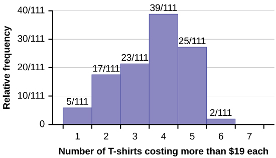
23. The percentage of people who own at most three t-shirts costing more than $19 each is approximately:
- 21
- 59
- 41
- Cannot be determined
- cluster
- simple random
- stratified
- convenience
25. Following are the 2010 obesity rates by U.S. states and Washington, DC.
| State | Percent (%) | State | Percent (%) | State | Percent (%) |
|---|---|---|---|---|---|
| Alabama | 32.2 | Kentucky | 31.3 | North Dakota | 27.2 |
| Alaska | 24.5 | Louisiana | 31.0 | Ohio | 29.2 |
| Arizona | 24.3 | Maine | 26.8 | Oklahoma | 30.4 |
| Arkansas | 30.1 | Maryland | 27.1 | Oregon | 26.8 |
| California | 24.0 | Massachusetts | 23.0 | Pennsylvania | 28.6 |
| Colorado | 21.0 | Michigan | 30.9 | Rhode Island | 25.5 |
| Connecticut | 22.5 | Minnesota | 24.8 | South Carolina | 31.5 |
| Delaware | 28.0 | Mississippi | 34.0 | South Dakota | 27.3 |
| Washington, DC | 22.2 | Missouri | 30.5 | Tennessee | 30.8 |
| Florida | 26.6 | Montana | 23.0 | Texas | 31.0 |
| Georgia | 29.6 | Nebraska | 26.9 | Utah | 22.5 |
| Hawaii | 22.7 | Nevada | 22.4 | Vermont | 23.2 |
| Idaho | 26.5 | New Hampshire | 25.0 | Virginia | 26.0 |
| Illinois | 28.2 | New Jersey | 23.8 | Washington | 25.5 |
| Indiana | 29.6 | New Mexico | 25.1 | West Virginia | 32.5 |
| Iowa | 28.4 | New York | 23.9 | Wisconsin | 26.3 |
| Kansas | 29.4 | North Carolina | 27.8 | Wyoming | 25.1 |
26. Construct a bar graph of obesity rates of your state and the four states closest to your state. Hint: Label the x-axis with the states.
Measures of the Location of the Data
27. Listed are 29 ages for Academy Award winning best actors in order from smallest to largest.
18; 21; 22; 25; 26; 27; 29; 30; 31; 33; 36; 37; 41; 42; 47; 52; 55; 57; 58; 62; 64; 67; 69; 71; 72; 73; 74; 76; 77
- Find the 40th percentile.
- Find the 78th percentile.
28. Listed are 32 ages for Academy Award winning best actors in order from smallest to largest.
18; 18; 21; 22; 25; 26; 27; 29; 30; 31; 31; 33; 36; 37; 37; 41; 42; 47; 52; 55; 57; 58; 62; 64; 67; 69; 71; 72; 73; 74; 76; 77
- Find the percentile of 37.
- Find the percentile of 72.
29. Jesse was ranked 37th in his graduating class of 180 students. At what percentile is Jesse’s ranking?
- For runners in a race, a low time means a faster run. The winners in a race have the shortest running times. Is it more desirable to have a finish time with a high or a low percentile when running a race?
- The 20th percentile of run times in a particular race is 5.2 minutes. Write a sentence interpreting the 20th percentile in the context of the situation.
- A bicyclist in the 90th percentile of a bicycle race completed the race in 1 hour and 12 minutes. Is he among the fastest or slowest cyclists in the race? Write a sentence interpreting the 90th percentile in the context of the situation.
- For runners in a race, a higher speed means a faster run. Is it more desirable to have a speed with a high or a low percentile when running a race?
- The 40th percentile of speeds in a particular race is 7.5 miles per hour. Write a sentence interpreting the 40th percentile in the context of the situation.
30. On an exam, would it be more desirable to earn a grade with a high or low percentile? Explain.
31. Mina is waiting in line at the Department of Motor Vehicles (DMV). Her wait time of 32 minutes is the 85th percentile of wait times. Is that good or bad? Write a sentence interpreting the 85th percentile in the context of this situation.
32. In a survey collecting data about the salaries earned by recent college graduates, Li found that her salary was in the 78th percentile. Should Li be pleased or upset by this result? Explain.
33. In a study collecting data about the repair costs of damage to automobiles in a certain type of crash tests, a certain model of car had $1,700 in damage and was in the 90th percentile. Should the manufacturer and the consumer be pleased or upset by this result? Explain and write a sentence that interprets the 90th percentile in the context of this problem.
- Students’ GPAs and scores on standardized tests (SATs and ACTs) are entered into a formula that calculates an “admissions index” score. The admissions index score is used to set eligibility standards intended to meet the goal of admitting the top 12% of high school students in the state. In this context, what percentile does the top 12% represent?
- Students whose GPAs are at or above the 96th percentile of all students at their high school are eligible (called eligible in the local context), even if they are not in the top 12% of all students in the state. What percentage of students from each high school are “eligible in the local context”?
35. Suppose that you are buying a house. You and your realtor have determined that the most expensive house you can afford is the 34th percentile. The 34th percentile of housing prices is $240,000 in the town you want to move to. In this town, can you afford 34% of the houses or 66% of the houses?
70th percentile = _______
38. Six hundred adult Americans were asked by telephone poll, “What do you think constitutes a middle-class income?” The results are in the table. Also, include left endpoint, but not the right endpoint.
| Salary ($) | Relative Frequency |
|---|---|
| < 20,000 | 0.02 |
| 20,000–25,000 | 0.09 |
| 25,000–30,000 | 0.19 |
| 30,000–40,000 | 0.26 |
| 40,000–50,000 | 0.18 |
| 50,000–75,000 | 0.17 |
| 75,000–99,999 | 0.02 |
| 100,000+ | 0.01 |
- What percentage of the survey answered “not sure”?
- What percentage think that middle-class is from $25,000 to $50,000?
- Construct a histogram of the data.
- Should all bars have the same width, based on the data? Why or why not?
- How should the <20,000 and the 100,000+ intervals be handled? Why?
- Find the 40th and 80th percentiles
- Construct a bar graph of the data
39. Given the following box plot:
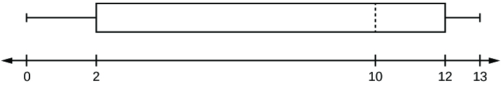
- which quarter has the smallest spread of data? What is that spread?
- which quarter has the largest spread of data? What is that spread?
- find the interquartile range (IQR).
- are there more data in the interval 5–10 or in the interval 10–13? How do you know this?
- which interval has the fewest data in it? How do you know this?
- 0–2
- 2–4
- 10–12
- 12–13
- need more information
40. The following box plot shows the U.S. population for 1990, the latest available year.
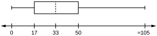
- Are there fewer or more children (age 17 and under) than senior citizens (age 65 and over)? How do you know?
- 12.6% are age 65 and over. Approximately what percentage of the population are working age adults (above age 17 to age 65)?
Box Plots
41. In a survey of 20-year-olds in China, Germany, and the United States, people were asked the number of foreign countries they had visited in their lifetime. The following box plots display the results.
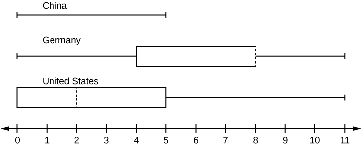
- In complete sentences, describe what the shape of each box plot implies about the distribution of the data collected.
- Have more Americans or more Germans surveyed been to over eight foreign countries?
- Compare the three box plots. What do they imply about the foreign travel of 20-year-old residents of the three countries when compared to each other?
42. Given the following box plot, answer the questions.
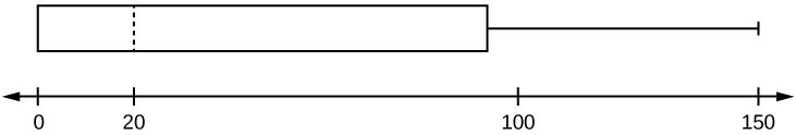
- Think of an example (in words) where the data might fit into the above box plot. In 2–5 sentences, write down the example.
- What does it mean to have the first and second quartiles so close together, while the second to third quartiles are far apart?
43. Given the following box plots, answer the questions.
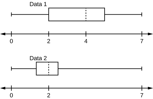
- In complete sentences, explain why each statement is false.
- Data 1 has more data values above two than Data 2 has above two.
- The data sets cannot have the same mode.
- For Data 1, there are more data values below four than there are above four.
- For which group, Data 1 or Data 2, is the value of “7” more likely to be an outlier? Explain why in complete sentences.
44. A survey was conducted of 130 purchasers of new BMW 3 series cars, 130 purchasers of new BMW 5 series cars, and 130 purchasers of new BMW 7 series cars. In it, people were asked the age they were when they purchased their car. The following box plots display the results.
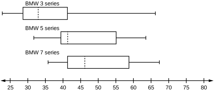
- In complete sentences, describe what the shape of each box plot implies about the distribution of the data collected for that car series.
- Which group is most likely to have an outlier? Explain how you determined that.
- Compare the three box plots. What do they imply about the age of purchasing a BMW from the series when compared to each other?
- Look at the BMW 5 series. Which quarter has the smallest spread of data? What is the spread?
- Look at the BMW 5 series. Which quarter has the largest spread of data? What is the spread?
- Look at the BMW 5 series. Estimate the interquartile range (IQR).
- Look at the BMW 5 series. Are there more data in the interval 31 to 38 or in the interval 45 to 55? How do you know this?
- Look at the BMW 5 series. Which interval has the fewest data in it? How do you know this?
- 31–35
- 38–41
- 41–64
| # of movies | Frequency |
|---|---|
| 0 | 5 |
| 1 | 9 |
| 2 | 6 |
| 3 | 4 |
| 4 | 1 |
Construct a box plot of the data.
46. Santa Clara County, CA, has approximately 27,873 Japanese-Americans. Their ages are as follows:
| Age Group | Percent of Community |
|---|---|
| 0–17 | 18.9 |
| 18–24 | 8.0 |
| 25–34 | 22.8 |
| 35–44 | 15.0 |
| 45–54 | 13.1 |
| 55–64 | 11.9 |
| 65+ | 10.3 |
- Construct a histogram of the Japanese-American community in Santa Clara County, CA. The bars will not be the same width for this example. Why not? What impact does this have on the reliability of the graph?
- What percentage of the community is under age 35?
- Which box plot most resembles the information above?
Measures of the Center of the Data
47. Find the mean for the following frequency tables.
-
Grade Frequency 49.5–59.5 2 59.5–69.5 3 69.5–79.5 8 79.5–89.5 12 89.5–99.5 5 -
Daily Low Temperature Frequency 49.5–59.5 53 59.5–69.5 32 69.5–79.5 15 79.5–89.5 1 89.5–99.5 0 -
Points per Game Frequency 49.5–59.5 14 59.5–69.5 32 69.5–79.5 15 79.5–89.5 23 89.5–99.5 2
Use the following information to answer the next three exercises: The following data show the lengths of boats moored in a marina. The data are ordered from smallest to largest: 161719202021232425252526262727272829303233333435373940
48. Calculate the mean.
50. Identify the mode.
Use the following information to answer the next three exercises: Sixty-five randomly selected car salespersons were asked the number of cars they generally sell in one week. Fourteen people answered that they generally sell three cars; nineteen generally sell four cars; twelve generally sell five cars; nine generally sell six cars; eleven generally sell seven cars. Calculate the following:
51. sample mean = x⎯⎯ = _______
52. median = _______
53. mode = _______
54. The most obese countries in the world have obesity rates that range from 11.4% to 74.6%. This data is summarized in the following table.
| Percent of Population Obese | Number of Countries |
|---|---|
| 11.4–20.45 | 29 |
| 20.45–29.45 | 13 |
| 29.45–38.45 | 4 |
| 38.45–47.45 | 0 |
| 47.45–56.45 | 2 |
| 56.45–65.45 | 1 |
| 65.45–74.45 | 0 |
| 74.45–83.45 | 1 |
- What is the best estimate of the average obesity percentage for these countries?
- The United States has an average obesity rate of 33.9%. Is this rate above average or below?
- How does the United States compare to other countries?
55. The table gives the percent of children under five considered to be underweight. What is the best estimate for the mean percentage of underweight children?
| Percent of Underweight Children | Number of Countries |
|---|---|
| 16–21.45 | 23 |
| 21.45–26.9 | 4 |
| 26.9–32.35 | 9 |
| 32.35–37.8 | 7 |
| 37.8–43.25 | 6 |
| 43.25–48.7 | 1 |
56. Javier and Ercilia are supervisors at a shopping mall. Each was given the task of estimating the mean distance that shoppers live from the mall. They each randomly surveyed 100 shoppers. The samples yielded the following information.
| Javier | Ercilia | |
|---|---|---|
| x⎯⎯ | 6.0 miles | 6.0 miles |
| s | 4.0 miles | 7.0 miles |
- How can you determine which survey was correct ?
- Explain what the difference in the results of the surveys implies about the data.
- If the two histograms depict the distribution of values for each supervisor, which one depicts Ercilia’s sample? How do you know?
- If the two box plots depict the distribution of values for each supervisor, which one depicts Ercilia’s sample? How do you know?
Use the following information to answer the next three exercises: We are interested in the number of years students in a particular elementary statistics class have lived in California. The information in the following table is from the entire section.
| Number of years | Frequency | Number of years | Frequency |
|---|---|---|---|
| Total = 20 | |||
| 7 | 1 | 22 | 1 |
| 14 | 3 | 23 | 1 |
| 15 | 1 | 26 | 1 |
| 18 | 1 | 40 | 2 |
| 19 | 4 | 42 | 2 |
| 20 | 3 |
- 8
- 11
- 15
- 35
58. What is the mode?
- 19
- 19.5
- 14 and 20
- 22.65
59. Is this a sample or the entire population?
- sample
- entire population
- neither
Skewness and the Mean, Median, and Mode
Use the following information to answer the next three exercises: State whether the data are symmetrical, skewed to the left, or skewed to the right.
60. 11122223333333344455
61. 161719222222222223
62. 87878787878889899091
64. When the data are symmetrical, what is the typical relationship between the mean and median?
65. What word describes a distribution that has two modes?
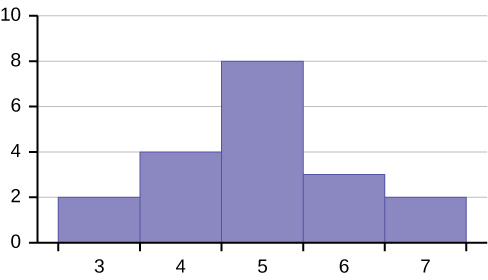
66. Describe the shape of this distribution.
67. Describe the relationship between the mode and the median of this distribution.
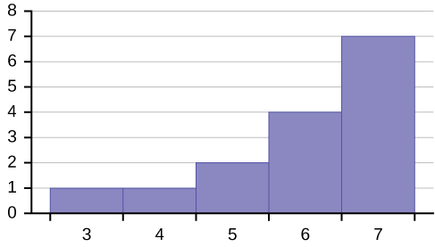
78. Describe the relationship between the mean and the median of this distribution.
79. Describe the shape of this distribution.
80. Describe the relationship between the mode and the median of this distribution.
81. Are the mean and the median the exact same in this distribution? Why or why not?
82. Describe the shape of this distribution.
83. Describe the relationship between the mode and the median of this distribution.
84. Describe the relationship between the mean and the median of this distribution.
85. The mean and median for the data are the same.
86. 345566667777777, Is the data perfectly symmetrical? Why or why not?
87. Which is the greatest, the mean, the mode, or the median of the data set? 111112121212131517222222
89. Of the three measures, which tends to reflect skewing the most, the mean, the mode, or the median? Why?
91. The median age of the U.S. population in 1980 was 30.0 years. In 1991, the median age was 33.1 years.
- What does it mean for the median age to rise?
- Give two reasons why the median age could rise.
- For the median age to rise, is the actual number of children less in 1991 than it was in 1980? Why or why not?
Measures of the Spread of the Data
Use the following information to answer the next two exercises:
The following data are the distances between 20 retail stores and a large distribution center. The distances are in miles. 29; 37; 38; 40; 58; 67; 68; 69; 76; 86; 87; 95; 96; 96; 99; 106; 112; 127; 145; 150
92. Use a graphing calculator or computer to find the standard deviation and round to the nearest tenth.
93. Find the value that is one standard deviation below the mean.
94. Two baseball players, Fredo and Karl, on different teams wanted to find out who had the higher batting average when compared to his team. Which baseball player had the higher batting average when compared to his team?
| Baseball Player | Batting Average | Team Batting Average | Team Standard Deviation |
|---|---|---|---|
| Fredo | 0.158 | 0.166 | 0.012 |
| Karl | 0.177 | 0.189 | 0.015 |
- above the mean
- below the mean
Find the standard deviation for the following frequency tables using the formula. Check the calculations with the TI 83/84.
96. Find the standard deviation for the following frequency tables using the formula. Check the calculations with the TI 83/84.
-
Grade Frequency 49.5–59.5 2 59.5–69.5 3 69.5–79.5 8 79.5–89.5 12 89.5–99.5 5 -
Daily Low Temperature Frequency 49.5–59.5 53 59.5–69.5 32 69.5–79.5 15 79.5–89.5 1 89.5–99.5 0 -
Points per Game Frequency 49.5–59.5 14 59.5–69.5 32 69.5–79.5 15 79.5–89.5 23 89.5–99.5 2
- μ = 1000 FTES
- median = 1,014 FTES
- σ = 474 FTES
- first quartile = 528.5 FTES
- third quartile = 1,447.5 FTES
- n = 29 years
97. A sample of 11 years is taken. About how many are expected to have a FTES of 1014 or above? Explain how you determined your answer.
99. The population standard deviation = _____
100. What percent of the FTES were from 528.5 to 1447.5? How do you know?
101. What is the IQR? What does the IQR represent?
Additional Information: The population FTES for 2005–2006 through 2010–2011 was given in an updated report. The data are reported here.
| Year | 2005–06 | 2006–07 | 2007–08 | 2008–09 | 2009–10 | 2010–11 |
| Total FTES | 1,585 | 1,690 | 1,735 | 1,935 | 2,021 | 1,890 |
103. Calculate the mean, median, standard deviation, the first quartile, the third quartile and the IQR. Round to one decimal place.
105. Compare the IQR for the FTES for 1976–77 through 2004–2005 with the IQR for the FTES for 2005-2006 through 2010–2011. Why do you suppose the IQRs are so different?
106. Three students were applying to the same graduate school. They came from schools with different grading systems. Which student had the best GPA when compared to other students at his school? Explain how you determined your answer.
| Student | GPA | School Average GPA | School Standard Deviation |
|---|---|---|---|
| Thuy | 2.7 | 3.2 | 0.8 |
| Vichet | 87 | 75 | 20 |
| Kamala | 8.6 | 8 | 0.4 |
- Why is Kenji considered a better runner than Nedda, even though Nedda ran faster than he?
- Who is the fastest runner with respect to his or her class? Explain why.
The most obese countries in the world have obesity rates that range from 11.4% to 74.6%. This data is summarized in Table 14.
| Percent of Population Obese | Number of Countries |
|---|---|
| 11.4–20.45 | 29 |
| 20.45–29.45 | 13 |
| 29.45–38.45 | 4 |
| 38.45–47.45 | 0 |
| 47.45–56.45 | 2 |
| 56.45–65.45 | 1 |
| 65.45–74.45 | 0 |
| 74.45–83.45 | 1 |
109. What is the best estimate of the average obesity percentage for these countries? What is the standard deviation for the listed obesity rates? The United States has an average obesity rate of 33.9%. Is this rate above average or below? How “unusual” is the United States’ obesity rate compared to the average rate? Explain.
| Percent of Underweight Children | Number of Countries |
|---|---|
| 16–21.45 | 23 |
| 21.45–26.9 | 4 |
| 26.9–32.35 | 9 |
| 32.35–37.8 | 7 |
| 37.8–43.25 | 6 |
| 43.25–48.7 | 1 |
110. What is the best estimate for the mean percentage of underweight children? What is the standard deviation? Which interval(s) could be considered unusual? Explain.
111. Twenty-five randomly selected students were asked the number of movies they watched the previous week. The results are as follows:
| # of movies | Frequency |
|---|---|
| 0 | 5 |
| 1 | 9 |
| 2 | 6 |
| 3 | 4 |
| 4 | 1 |
- Find the sample mean [latex]overline{x}[/latex].
- Find the approximate sample standard deviation, s.
112. Forty randomly selected students were asked the number of pairs of sneakers they owned. Let X = the number of pairs of sneakers owned. The results are as follows:
| X | Frequency |
|---|---|
| 1 | 2 |
| 2 | 5 |
| 3 | 8 |
| 4 | 12 |
| 5 | 12 |
| 6 | 0 |
| 7 | 1 |
- Find the sample mean[latex]overline{x}[/latex]
- Find the sample standard deviation, s
- Construct a histogram of the data.
- Complete the columns of the chart.
- Find the first quartile.
- Find the median.
- Find the third quartile.
- Construct a box plot of the data.
- What percent of the students owned at least five pairs?
- Find the 40th percentile.
- Find the 90th percentile.
- Construct a line graph of the data
- Construct a stemplot of the data
113. Following are the published weights (in pounds) of all of the team members of the San Francisco 49ers from a previous year. 177; 205; 210; 210; 232; 205; 185; 185; 178; 210; 206; 212; 184; 174; 185; 242; 188; 212; 215; 247; 241; 223; 220; 260; 245; 259; 278; 270; 280; 295; 275; 285; 290; 272; 273; 280; 285; 286; 200; 215; 185; 230; 250; 241; 190; 260; 250; 302; 265; 290; 276; 228; 265
- Organize the data from smallest to largest value.
- Find the median.
- Find the first quartile.
- Find the third quartile.
- Construct a box plot of the data.
- The middle 50% of the weights are from _______ to _______.
- If our population were all professional football players, would the above data be a sample of weights or the population of weights? Why?
- If our population included every team member who ever played for the San Francisco 49ers, would the above data be a sample of weights or the population of weights? Why?
- Assume the population was the San Francisco 49ers. Find:
- the population mean, μ.
- the population standard deviation, σ.
- the weight that is two standard deviations below the mean.
- When Steve Young, quarterback, played football, he weighed 205 pounds. How many standard deviations above or below the mean was he?
- That same year, the mean weight for the Dallas Cowboys was 240.08 pounds with a standard deviation of 44.38 pounds. Emmit Smith weighed in at 209 pounds. With respect to his team, who was lighter, Smith or Young? How did you determine your answer?
114. One hundred teachers attended a seminar on mathematical problem solving. The attitudes of a representative sample of 12 of the teachers were measured before and after the seminar. A positive number for change in attitude indicates that a teacher’s attitude toward math became more positive. The 12 change scores are as follows:
3 8–12 05–31–16 5–2
- What is the mean change score?
- What is the standard deviation for this population?
- What is the median change score?
- Find the change score that is 2.2 standard deviations below the mean.
115. Refer to the figure to determine which of the following are true and which are false. Explain your solution to each part in complete sentences.
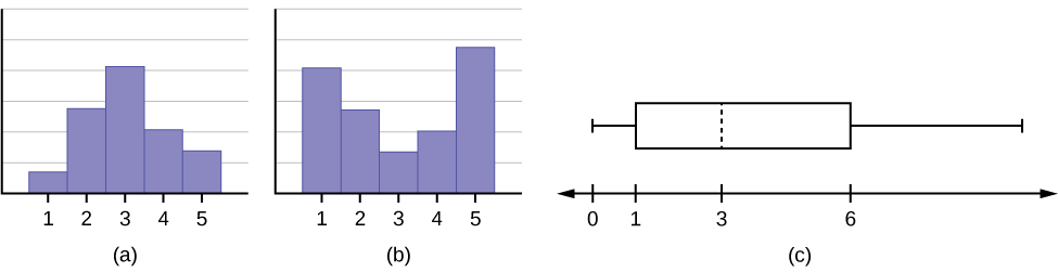
- The medians for all three graphs are the same.
- We cannot determine if any of the means for the three graphs is different.
- The standard deviation for graph b is larger than the standard deviation for graph a.
- We cannot determine if any of the third quartiles for the three graphs is different.
- Organize the data in a chart.
- Find the median, the first quartile, and the third quartile.
- Find the 65th percentile.
- Find the 10th percentile.
- Construct a box plot of the data.
- The middle 50% of the conferences last from _______ days to _______ days.
- Calculate the sample mean of days of engineering conferences.
- Calculate the sample standard deviation of days of engineering conferences.
- Find the mode.
- If you were planning an engineering conference, which would you choose as the length of the conference: mean; median; or mode? Explain why you made that choice.
- Give two reasons why you think that three to five days seem to be popular lengths of engineering conferences.
117. A survey of enrollment at 35 community colleges across the United States yielded the following figures:
6414; 1550; 2109; 9350; 21828; 4300; 5944; 5722; 2825; 2044; 5481; 5200; 5853; 2750; 10012; 6357; 27000; 9414; 7681; 3200; 17500; 9200; 7380; 18314; 6557; 13713; 17768; 7493; 2771; 2861; 1263; 7285; 28165; 5080; 11622
- Organize the data into a chart with five intervals of equal width. Label the two columns “Enrollment” and “Frequency.”
- Construct a histogram of the data.
- If you were to build a new community college, which piece of information would be more valuable: the mode or the mean?
- Calculate the sample mean.
- Calculate the sample standard deviation.
- A school with an enrollment of 8000 would be how many standard deviations away from the mean?
Use the following information to answer the next two exercises.
X = the number of days per week that 100 clients use a particular exercise facility.
| x | Frequency |
|---|---|
| 0 | 3 |
| 1 | 12 |
| 2 | 33 |
| 3 | 28 |
| 4 | 11 |
| 5 | 9 |
| 6 | 4 |
- 5
- 80
- 3
- 4
119. The number that is 1.5 standard deviations BELOW the mean is approximately _____
- 0.7
- 4.8
- –2.8
- Cannot be determined
120. Suppose that a publisher conducted a survey asking adult consumers the number of fiction paperback books they had purchased in the previous month. The results are summarized in the table.
| # of books | Freq. | Rel. Freq. |
|---|---|---|
| 0 | 18 | |
| 1 | 24 | |
| 2 | 24 | |
| 3 | 22 | |
| 4 | 15 | |
| 5 | 10 | |
| 7 | 5 | |
| 9 | 1 |
- Are there any outliers in the data? Use an appropriate numerical test involving the IQR to identify outliers, if any, and clearly state your conclusion.
- If a data value is identified as an outlier, what should be done about it?
- Are any data values further than two standard deviations away from the mean? In some situations, statisticians may use this criteria to identify data values that are unusual, compared to the other data values. (Note that this criteria is most appropriate to use for data that is mound-shaped and symmetric, rather than for skewed data.)
- Do parts a and c of this problem give the same answer?
- Examine the shape of the data. Which part, a or c, of this question gives a more appropriate result for this data?
- Based on the shape of the data which is the most appropriate measure of center for this data: mean, median or mode?
